sometimes you see a piece of code so beautiful you simply must commit it to physical media in the most elegant way you know
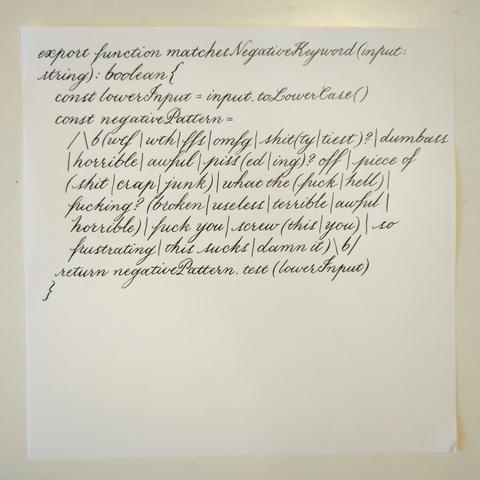
sometimes you see a piece of code so beautiful you simply must commit it to physical media in the most elegant way you know
Comparison of the effect of different inks.
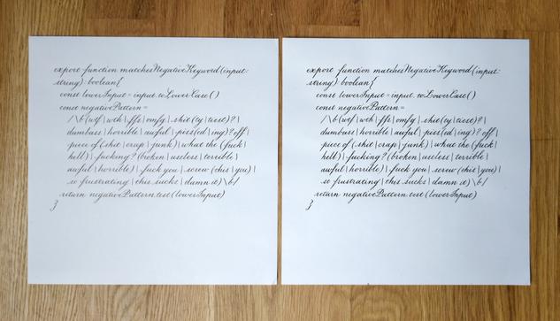
Photo #1 is kind of shit but you can hopefully tell how the fountain pen ink allows for thinner lines. The one on the left is done with more watery fountain pen ink (Private Reserve Ultra Black), the one on the right with thicker India ink (Speedball). Both done with a Hunt #22 nib on Tomoe River paper. (The #22 is rather stiff; I could get finer lines with a different nib.)
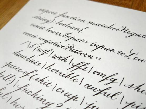
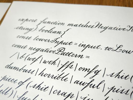
The inks have different sorts of sheen as well. The India ink is slightly glossier and pure black, whereas the fountain pen ink is a little more matte with warmer sheen.
The advantages of India ink are that 1) you can use it on thinner or lower-quality paper without bleeding, whereas fountain pen ink bleeds easily (this one is the least bleedy of the ones I have); 2) flourishes with a lot of thin strokes often need a thicker ink to be shown off to their full effect, especially with very large letters; and 3) it is more water-resistant and permanent.
You can't use India ink in fountain pens because it'll clog them up! You can use fountain pen ink with dip pen nibs, but they may need a binder like gum arabic to thicken them sufficiently.