I need your ideas

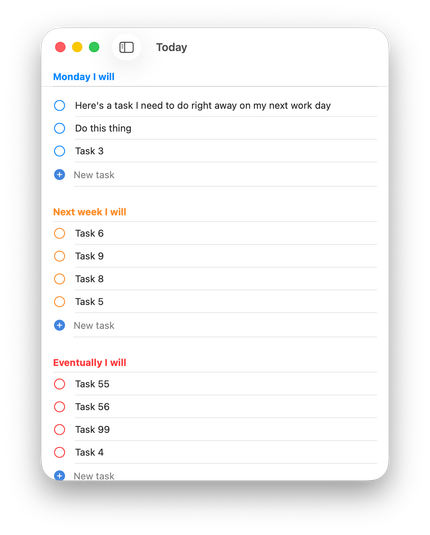
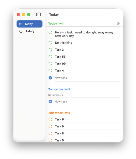
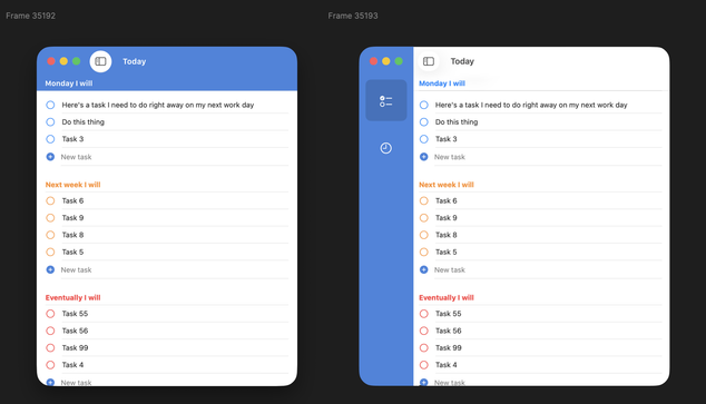
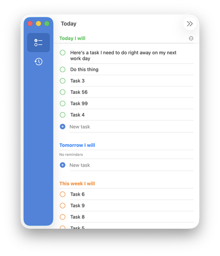
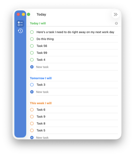
Been building a little Mac app (for myself but increasingly maybe for release) and the design is very native-standard on purpose

The lack of strong color drives me nuts but I can't figure out how to add it while maintaining the liquid glass design ethos đŸ€”

I'd love to do a strong color bar like I've mocked up here, but SwiftUI & Tahoe get super cranky if you start trying to draw in the toolbar or sidebar area.

And the sidebar gets uncomfortably chonky to account for the new stoplights with extra padding

I could tint the glass sidebar which looks... ok? But it's still too chunky unless I ignore the stoplights but, ew. The whole things feels really fragile when I start trying to customize anything

Like hiding the dismiss toolbar button causes the old window radius to pop up 😅

Is the new liquid glass way to really just make every app look exactly the same unless there's big, pretty, photo content inside?

Surely there's a way to do this so I can quickly recognize my app's window in Mission Control but keep the app feeling at home in the new world?

@charliemchapman I feel like this was always the case with SwiftUI’s standard styling (nothing new with Liquid Glass)

Every app looks like Reminders unless you spend time customizing.

@charliemchapman top aligned radial gradients go a long way imo.

@ellenich @charliemchapman

This is a nice way to go. The Journal app does something similar and I’m taking inspiration from it for my new app.

@charliemchapman What if the different sections (today, tomorrow, etc) were little cards that each have a colored header? (Love this app idea btw!)
@charliemchapman Whatever you end up with, I salute you for the effort. Enough of the boring and the same. Also the “new world” is measurably crappy and riddled with UX issues, so the experiments now are more valuable than ever.
@charliemchapman Are you planning on having way more screen-items or even allow creation by user? Because a sidebar looks like huge overkill for 2 items. For only 2-3 you could integrate some sort of selector into the title bar — no overuse of screen space, always visible and accessible with single click, always visible labels.
@mrudokas @charliemchapman I was going to suggest exactly this.
@tuomas_h @mrudokas That actually is my current state before I started trying to find ways to inject more color

@charliemchapman @tuomas_h Great! So splash the color into the titlebar/toolbar area and try to restyle the selector to make sense.

The angle to this layout that seems to give additional appeal (at least for me personally) is that the app is about temporary lists and that fits the metaphor of notepad with tear out pages very well. Meaning that by distinctly coloring the top you are getting into visual language speaking this: