RE: https://mastodon.gamedev.place/@eniko/116279471062633993

ok this might be a zany ass idea but... what if... 320x200 but with 2 pixel tall dither as a stylistic choice? eh? eh? eh? :D

wake up babe new font just dropped

look ma, no text jumping*!

*in my wordwrapped typewriter text

i have 3 iterative functions here:

1. gets the next word (spaces/newlines count as a 1 character "word")
2. wraps words iteratively, recording width, max width, and height
3. uses the wrapping function to get the next word, then draws it 1 character at a time

it's quite a clean implementation

btw my font format for this project is *incredibly* sophisticated
at least i've made things easy for @foone
@eniko I'm always grateful for simple font formats!
@foone @eniko
How do you feel about vector font formats?
@eniko If only A was made of As, B of Bs and so on
@sobkas you could do that and it would still work :D
@eniko we heard you like ASCII so we put ASCII art inside your font so you can make ASCII art out of other ASCII art
@eniko I'm having flashbacks to Pixmap files when learning X11 programming in the mid-90s...
https://en.wikipedia.org/wiki/X_PixMap
@eniko games it's a pet hate of mine when games write out text a character at a time but only wrap once a word has gotten too long, making it jump from one line to the next. This is so much cleaner!
@Lacey it's impressive how many games do that, even those which are highly refined in other aspects. @eniko
@RedGlow @eniko exactly, it always feels lazy
@eniko bacon ipsum > lorem ipsum. imho. =)

@eniko Perfect! How are you managing wrapping?

EDIT: Wait, I suppose you're just not showing the text, right? It's formatted once and you just unroll it?

@Ronflaix i made an iterative wrapText function that goes word by word (spaces/newlines count as words) and which detects when a word goes over the wrap width, and bumps it to the next line

and then i made an iterative typewriter function that draws the text one character of a word at a time and which advances the wrapText iterator when it's done rendering the word

@eniko Ooh, clever! Thanks for the info!

@Ronflaix yeah i actually did the "lay it out once" thing in C# way back when but this seemed cleaner

that way i can also use wrapText to measure the full width+height of text by just iterating until it's done and reading the max width and height properties of the iterator

@Ronflaix oh right i also have an iterative function that gets the next word, which the wrapText function uses

so really its 3 iterators deep but that makes it sound more complex than it really is >_>

@eniko Yeah, it's generic but I see the design and if it makes the actual code flow easier, why not?

I suppose you also select glyphs variants on the fly? Positional variants, ligatures and all the bells & whistles too? :D

@Ronflaix oh god no :'D this is just a simple ascii font and so each character just has its pixel width, and the advance is width + the font's char spacing
@eniko I love text jumping as an example of one of those tricky little implementation details that game players take for granted.
@eniko holy shit, computing the wid
width of a word before you sta
start drawing it? Inconceivab
Inconceivable!
@eniko Thank you for saving my sanity by implementing this but also for giving me a name for the phenomenon so I don’t have to say “the thing where the text moves to the next line when it doesn’t fit”
@eniko Yeah, that's much more readable 👍
@eniko I could be convinced...
@eniko I like the second one.
@eldersea same picture just with/without crt filter
@eniko I really like how the second image looks, in part because the dither adds extra texture to everything. In particular, it makes the plants look like they have leaves.
Very cosy, sort of like tapestry
@eniko Tall? That sounds like you're just trying to spite the Commodore 64 :D

@eniko

Looks pretty good!

@eniko I'm curious if they did this in Amiga art. It feels like it. I think it works for this art too
@eniko I like it a lot. Has a more organic look than the standard checker board and reminds me of the texture of canvas.
@eniko 1) I really like the style, 2) it looks really good with that CRT filter, and 3) I'm impressed that this CRT filter doesn't moire when scaled in my browser which is often the case with CRT filters that people apply to pixel art. I'm wondering now if that's because of dithering or something else. It looks really good when scaled down slightly such that the scanlines almost wash out, which makes me think this would look great with super sampling or such.
@eniko I'm also wondering how well it holds up in motion with the video encodings typically used for streaming and youtube. I want to get the CRT look in some of my own projects without the usual downsides of CRT filters.

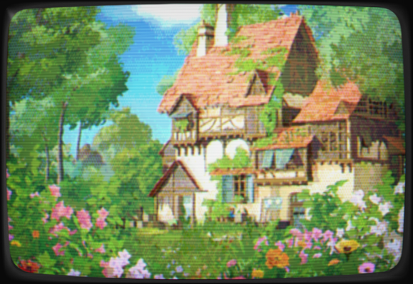
@aeva you might want to check out @JoshJers 's cathode retro https://cathoderetro.com/

i'm pretty sure you can turn off stuff like the shadow mask, which should help, just keeping the color bleed

this is what we used for kitsune tails and i was super happy with how that turned out

Cathode Retro

@eniko @aeva yep it's very customizable and if there's something you want to do and can't find how, don't hesitate to ask!

RE: https://mastodon.gamedev.place/@eniko/116065363439434334

@aeva i'm not sure, since i didn't make the CRT filter. this is just this application https://mattiasgustavsson.itch.io/crtview

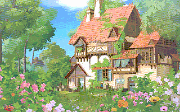
it's also not the final version since i had to use a different filter for dosbox, which looks more like this, although that image is significantly lower res