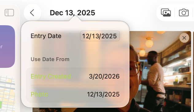
Perfect MacOS 26 Tahoe screenshot from the Journal app. Apple shipped this.
Another Tahoe gem. Are these buttons ("Update", "Open", "Update All") enabled or disabled? Are they even legible?
@gruber they’re certainly not legible!
@gruber I love this picking Apple everyone is doing on little layout issues. It’s the hard core usability issues that really piss me off. …the inconsistent non-front ’click through’ behaviors in Music.app, the 'where do I grab the corner to resize' windows, the Finder window sliders being activated when trying to select a bottom item when in column views, etc. It’s insane. Let’s talk more about those.
@gruber Let me bring the mini-Music.app window to the front. Oops. I just made the up-next queue sliding pane expand. Oh, but I can’t click through to the play/pause icon (even though I CAN see it) without first clicking the window to bring it to the front and active. And so on.
@gruber This is approaching a modern day Apple Maps level of debacle.
@gruber I helped my 85 year old parents fill out their NCAA brackets on Wednesday night. We used my mom’s old touchbar MacBook Pro which hadn’t been updated in years. Pretty sure it was on Yosemite. It looked amazing to my eyes.
@biggsjm @gruber the earliest Touch Bar MBP shipped with Sierra, 2 releases after Yosemite. But there weren’t that many significant design changes since the Yosemite redesign was only 2 years old.
@butternut @gruber Thanks - I love the CA names but I lost track of what came out when after the cat releases :)
@gruber “A chaotic situation where everything seems to go wrong. It is often caused by incompetence, communication failure, or a complex environment.” AKA Clusterfuck.
@gruber Well, they certainly do vaguely look like buttons...
@gruber That reminds me of when I tried using the Graphite accent color. That same App Store screen made me switch back instantly.
@gruber I have my OS Theme set to "Multicolor" and for the longest time I thought there was an error loading my calendar... Actually, I still think there's an error.
@glass @gruber Same. This has caught me out several times in the last week alone (there *was* an error—just not the one highlighted by the red text!).

@gruber I think this is the BorderedButtonStyle that has been around on iOS for a few years. It’s definitely not new, though maybe it wasn’t used on macOS before. So, I assume it follows the old iOS rule: it uses the tint color so it’s active. Otherwise it would be desaturated.

Legible? Definitely not.

@gruber Is this the default “highlight” color? I think they need to disable the “choose your own” preference and just make it blue or whatever until they get their shit together.
@conlan Default color on Citrus Neo.
@gruber Ah, even more unforgivable.
@gruber is "Update All" even a button? Why is it so different from the others?
@gruber
Just for funsies, I booted up my old PowerPC G4 PowerMac in the cellar for half an hour. Lots of online incompatibility, but oh those user interface guidelines taken seriously... 🙃
@gruber at least you’ve got good taste in apps
@gruber I hate to be fair to Tahoe because it needs to burn at a stake, but in this particular instance, Sequoia does not seem to fare better at all.

@tuomas_h @gruber Yep, sadly nothing new — just more of untested, fresh, and exciting colors.

Graphite was mutilated for a while now, I stopped using it long ago because of contrast issues. As designers are the primary audience, you would think it would get attention at the supposedly design heavy company.

Yellow also always was more or less a complete disaster.

@mrudokas @tuomas_h I swore by Graphite for years in the early days of Mac OS X. Maybe for the first entire decade. It used to be very usable, and high contrast. The current look is so washed out. It's ... gross.
@gruber WTF? And it looks even worse when choosing the yellow ’theme’ in Appearance Settings! Seems like nobody tested it… 🤢

@gruber We’re all old enough to remember Kaleidoscope and other tools when customization and giving the ability to users to make their Macs utterly unreadable was a feature.

Now it’s something we all complain about.

@gruber Mine seem normal. Are you sure there's not an odd setting in Settings/Appearance somewhere?
@rogerschutte My screenshot is from a Citrus MacBook Neo using the default citrus accent color.
@gruber the default tint colour on the indigo MacBook Neo makes all buttons look disabled.
@gruber It certainly is more obvious in Dark Mode … one wonders if that is the mode the "designers" mostly use now
@gruber why is everything green?
@gruber setting aside questions of bad design. Isn't this possibly a separate issue of bad QA?
@gruber I have Automatic Updates off and the Updates badge in the sidebar only appears after I've clicked on the section 😒
@gruber From insanely great to greatly insane.
@gruber they look disabled and are barely legible to me, a person with no eyesight issues
@gruber another from today, I changed my ‘timer finished’ tone and hit X because I assumed ‘Set’ was disabled. It’s not.