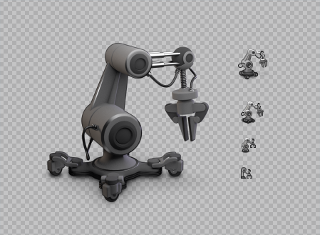
I love the finely crafted icons of the past -- pure nostalgia of my biggest inspiration, webOS. I am reminded of Rich Dellinger's 3D icons that weren't soulless renderings, but finely adjusted for the tiny canvas.

But in reality, there was nobody to hand-render every nightly build icon. It never happened.

How do you feel about the current minimalist style with a lower entry barrier versus the elaborate designs of the past?

https://blog.jimmac.eu/posts/builder-nightly/

#gnome #design #webos #UI #icon

Builder Nightly | Jakub Steiner

Designing an icon to tell nightly builds apart from the stable app.

Builder Nightly | Jakub Steiner
@jimmac the most important thing to note is how much work used to go in our nice illustrations. The minimal icons we use today are done in minutes, we use to spend days or even weeks for a single application icon back then.
@lapz Thank you for that old fart energy, mate :)
@jimmac you can always count on me for that, ya know 😀