 Chris S.
 Héliographe
If you put the Apple icons in reverse it looks like the portfolio of someone getting really really good at icon design

@heliographe_studio More like really good at illustration, not good at icon design. Icons are intentionally simple for legibility.
There's a reason danger signs are iconographic and not illustrative; wood chipper and acid warnings would be too horrific to look at.


@glent @heliographe_studio That isn't a cultural thing; plenty of standardized iconography exists in Japan for warnings, traffic signals and signs, etc. In this case you'd be hard pressed to find clear icons for those four specific dangers.
Japan is well known for its iconography. It's flag is literally iconic of the rising sun. Emoji originated in Japan which is pretty much an iconographic alphabet.

@loke @glent @heliographe_studio In both cases those are very iconographic. Silhouettes with clear poses, details like faces and skin tones are removed, etc.
The only difference is that the sign is clarified to indicate that they're guarding, while the old one look like they're in active combat.
@soviut @heliographe_studio “Illustration and skeuomorphism don't usually lend themselves well to this.”
Saying this based on? I can recognise and differentiate between old Apple skeumorphic icons on any display and context, and I didn't even use an Apple product before 2024.
@librarysquirrel @heliographe_studio Silhouettes mostly. There's a reason you could recognize every pokémon when they did the "who's that pokémon" bit in the show; their silhouettes are intentionally designed to be very unique. The character design in Team Fortress 2 is similar; you can identify what class a player is at a glance even in dimly lit areas of the map.
The same goes for icons; they should be highly recognizable under any viewing conditions. We don't all run our phones at full brightness, we're glancing at them when we get a notification that disappears quickly, etc.
@librarysquirrel @heliographe_studio It's more than that; there's visual rhythm, feature size, contrast, colour depth, etc.
The icons aren't the rectangles, the icons are the image inside the rectangles. The rectangles are usually an indicator that something is clickable, like a button. Icons on their own don't necessarily convey click-ability. An example would be the battery indicator on your phone.
A lot of effort goes into designing icons that are legible, identifiable, and most importantly accessible. They serve a functional purpose that goes far beyond their aesthetics and cater to a much wider audience than just you.
@soviut @heliographe_studio Interesting then that everywhere I read hear and see people complaining they can't distinguish icons and notice interactive elements and failing to interact with them properly, all from very computer literate to those who only know how to operate facebook and the caller app on their phones (of which, many in my family).
If they're in rectangles, especially in the way they are nowadays in Android and iOS, they _are_ rectangles, when the colour etc of those rectangles are used as distinctive features.
I also have some mild accessibility needs as my sight issues while nothing near blindness still render current design trends detrimental to my experience. And rarely if ever do I hear any praise from actual disabled people on that front. Icons are one aspect, as these "squircle" icons require me to focus my sight more acutely than normal, and strain my eyes. Along with how light themes have become dark grey on bright white it means screens frequently give me splitting headaches.
As for clickability, it's contextual. A grid of icons on a phone screen or a line of icons on a dock perfectly signal clickability. People don't have much of an issue with file icons on desktop either, especially non techies I frequently observe or help out in family or at uni. Nor do they seem to think a tabular listing in Finder is inert.
(I am arguing based not on the rightmost icon in the OP but the two preceding it btw. But even the rightmost is better than left ones.)
@librarysquirrel @heliographe_studio I'm just telling you what the science says; modern icons, developed with care, are more accessible.
Better contrast, faster identifiability, they survive on small and large display sizes at near and far distances. They survive poor lighting conditions. They survive colour blindness, partial sightedness, neuro optical disorders, etc.
Cute illustrations were so Steve Jobs could show off that OSX had 32 bit colour and could scale icons with the GPU.
Personal preference and aesthetics don't beat the science.
@soviut @heliographe_studio Lukas Matis wrote an interesting post in 2010(!) about “Realism in UI Design” that touches on this:
https://ignorethecode.net/blog/2010/01/21/realism_in_ui_design/
In it, he differentiates between icons used for interactions — which need to follow the guidelines you outline — and application icons.
I agree with you that the style of realism shown in the Pages icons would be plain awful when applied to, e.g., icons on action buttons. And I agree with Lukas that app icons allow more artistic freedom. 😉
@heliographe_studio I really loved the artistic icons for their own sake. Nobody on earth thought, “well what the heck does this distinctly-shaped and painted pen and ink mean???”
whereas every single indistinct squirclet today makes me puzzle constantly when I’m trying to quickly switch apps.
app icons don’t require simplicity. they should be memorable and quick to identify at a glance!!!

@splendorr @heliographe_studio
And forcing us developers into the ugly squircle hell makes them all the same shape.
No way to remember what is what, everything looks just the same. Horrible, really.
I'd say it looks like someone getting decent at icon design, then getting worse -- in either direction. Both the extreme left and right are crap icons: one, too little information; the other too much. Neither does what an icon should do.
None of them are truly good. They all look like someone trying to make a mark and fulfill the vision of a 'design school' instead of someone trying to make a usable affordance.
None. Ever.
Icons are a tool.
They are a mnemonic place to click to perform a repeatable function.
An icon cannot be great; just as a hammer, a zipper, a doorknob, or a roll of toilet paper cannot be great.
They can be functional, or not, or somewhere in between. Functional is good, there is no great. Below functional is bad.
The best are functional, consistent, and predictable. They still aren't great, because an icon can't be great...it either fits or it doesn't.
If you change it, there needs to be a better reason than 'pretty' or 'we changed our branding'.
Forcing users to adapt to changing style guides is a great way to piss off users.
Too many people went to art and design schools and decided that icons needed to be "art" -- instead of tools.
I went to those schools as well. Most of my classmates never got the punchline:
Form should always follow function.
@johntimaeus @heliographe_studio
“None of them are truly good.”
“What’s an example of an icon you like?”
“I hate icons.”
Fantastic!
@kylehalevi @johntimaeus @heliographe_studio
I agree: the best is the one in the middle.
The orange ones are bland and lacking contrast, the one in the left is hard to understand. The ones on the right are too literal.
The middle one is clear, has excellent contrast, and it is nice to see.
Apple traditionally has had a tendency to fall in the skeuomorphist pitfall. Icons must be as recognizable as traffic signs, and should be beautiful and fit with the overall design. But being subtle is not one of Apple's design strengths.
I think other desktop OSs have had it better. Ubuntu default icons have a nice balance of aesthetics and function. Windows icons change so much that you can love one version and hate the next; but they usually keep them very functional.
@johntimaeus @heliographe_studio "An icon cannot be great; just as a hammer, a zipper, a doorknob, or a roll of toilet paper cannot be great."
I dunno about hammers and zippers, but I've run into some fantastic doorknobs and toilet paper rolls in my day.
@HuguesRoss @heliographe_studio
Maybe doorknob wasn't the best analogy, maybe elevator button instead.
As for toilet roll, I'm talking the paper, not the holder.
@HuguesRoss @heliographe_studio
I've seen some pretty elevator buttons, some with amazing craftsmanship, interesting geometry, and beautiful cast or etched typography. But they were actually less good than the standard round plastic with plain black numbers on a white background. They were harder to read and less instinctive to use which makes them bad design.

@heliographe_studio at OSX's height, the icons felt almost "edible".
I dunno why, but it's just that feel. They did so great with them.
I saw someone comment that Panther was ugly. No, it was well done, everything defined, everything had its place
@heliographe_studio My preference is for the inkwell, the original; but that one in the middle is pretty damned good!
If only Apple, like so many developers, would have a setting for choosing your preferred icon.
Left to right or vice-versa. Seems correct.
 Ian
Ian Joe Beam
 Glen T, heated, not stirred
 gren.elliot
 Elias Mårtenson
 skribe 🇺🇦
 Göktuğ Kayaalp
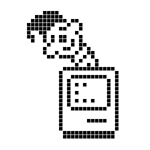 Jochen Wolters
 Susanna the Artist 🌻
 nina splendorr 🌻🏳️⚧️
 Brian Grinter
 NMDoerner
 John Timaeus
 Kyle Halevi
 Curioso 🍉 🇺🇦 (jgg)
 Boring Nondescript Little Worm
 Atle 🧇🧅
 Octavia Con Amore
  Succubard's Library
 sortius
 Fuzzbizz
 AC
AC Chloe G artist
 Aurélien Gâteau
 hearts
 freiheit🤖
 pedro 🍉
 Mike Cox
 a40YOStudent
 Zygmunt Krynicki
 Jon
Jon Khleedril
 (roll m3tti)
 Matt
Matt eobet
eobet it's B! Cavello 🐝
 ralen
ralen Vincent Lammens
 Josh Justice
 Klongeiger
 Hitorishibai™
 joshbuddy