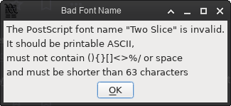
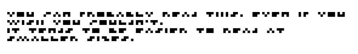
A 2-pixel tall pixel font. (!) https://joefatula.com/twoslice.html
(It’s a quiet celebration of redudancy built into languages.)
@mwichary Psychophysics is the study of this, if you hadn't heard the term!
@mwichary I probably inserted it into a comment when we were editing…
@mwichary Yeah, but how many fonts are twice as wide as they are high?
@mwichary 2002 Flash websites called, they want their font back :P

@mwichary
You can probably read this. Even if you wish you couldn’t.
It tends to be easier to read at smaller sizes.

edit: I just realized if I click the link and copy the text out it would decipher it too... sorry I liked the challenge of reading it!

@colinstu @mwichary the "even" took me forever to decipher for some reason.
@noodlejetski @colinstu @mwichary for me it was 'tends' - like, I knew it had to be that, but the 'd' didn't make sense

@curche @noodlejetski @mwichary oddly enough for me it was couldn't... I thought it was shouldn't but realized that would be an extra letter.. and the c matches the earlier ones.

Everything else kinda just clicked into view.

@colinstu
Oh lol yea! I didn't even realize I realized it was read/could even tho it could've been real/would or anything else.
Sentence recognition is weird. It makes more sense the more words you (try to) read.

@noodlejetski @mwichary

@colinstu Yeah, I didn’t alt text it for that reason!
@mwichary ok that’s some witchery. 😂
@mwichary XS size, XXS readability
@mwichary almost but not quite morse code.
@mwichary Wow, I can't believe that can actually be read, although I'm sure 3x3 would be a lot easier. I did have to scan through a bit until it "clicked" in my brain, then I jumped back to the start and read right through.
@mwichary the fuck i can read this???
@ElliesSurviving @mwichary I guess it works because we know the words already and our brains extrapolate to make sense of it :) 🤷‍♀️
@mwichary here’s a two pixel wide font (the guy also made another attempt at a two pixel tall font) https://stormgold.itch.io/picket-right-font
Picket Right font by stormgold

A font that's only 2px wide!

itch.io
@anselmschueler @mwichary it's the same name! and it looks identical? is that the same person?!? 🤪
@anselmschueler @mwichary That's actually a bit easier for me to decipher.
@mwichary I once found a 2-pixel-wide font. I'm (still) working on making a quilt based on it. https://craftinatorics.com/math/micro-font-quilt/
Micro-Font Quilt

Anselm "Two Sheds" Schüler (@[email protected])

@[email protected] here’s a two pixel wide font (the guy also made another attempt at a two pixel tall font) https://stormgold.itch.io/picket-right-font

ieji.de
@mwichary I'm too dyslexic to read it. What does it say?
@KaiserOfNone You can click through to the website to see it typeset properly, zoom in, copy/paste etc.! I screenshotted from the site.

@mwichary It is not possible to decipher the message, for me. 🤣 But I'm a visually impaired persons.

A alt-text would be nice 

@debby Here! https://birdbutt.com/@colinstu/115193008058148800

Or you can click through the site and then the message is regular HTML text.

Colin (@[email protected])

Content warning: spoilers

birdbutt.com
@mwichary it might have practical use as tactical language for blind people? Reminds me of a crossover of Braille and "normal" fonts.
@Schafstelze @mwichary
They're both six dots, just a different letter to dots mapping.
@mwichary This reminds me of those minimalist portrayals of cartoon characters in 3 or 4 pixels. Color and relative sizes encode enough information to tell you who they are supposed to be.
@mwichary Too much redundancy, please make a 1 pixel tall font.
That would be Morse code, right?
Pixel fonts

@mwichary That’s 2 (3?) pixel tall as well, just less readable 
@elefant If every uppercase letter is 2 pixels they might as well be 1. 😁
@mwichary The smaller you make the image the easier it is to read.
@mwichary I mostly struggled to read the word «tends»
Everything else was fine!
@mwichary took me a long time to figure out "tends." the rest I got.

@mwichary

FWIW, the only trouble I had reading was with the letter C.

@mwichary Hmm, uppercase=lowercase for some (not all) characters, uppercase H disconnected and =II, equal letters: B=Q, b=h=l, D=d=j, F=P=f=p, V=X=Y=v=x=y. That's a pity, because all this makes the font hardly usable.
The Roman numerals are smart but disconnected, and also equal to letters, obviously. If I was forced to invent 2-pixel-tall numerals, I'd go for a binary representation 4 pixels wide with a bar at the bottom (not for everyone...)
[#font, #fonts]
@mwichary Anyway, this reminds me of this 3x5 font I made for the Apple ][ & //e some 40 years ago:
@mwichary Unfortunately, back then I didn't know that it's better, even in a proportional font, to make the digits monospaced. And now I don't have the 6502 assembly code any more...
@mwichary WTF why can I read this? This shouldn't be possible.
@mwichary ...this is easier to read than many fonts i've seen used
@mwichary I think I want 3 pixels, it's too hard at just 2.
@mwichary FontForge is not happy about the name at all.
@mwichary This is the font I use for the small print on my contracts.

@mwichary ... ... ........ .... ....

.... .. ... .... ... .......

;)

@mwichary excellent for small print like licenses 😀