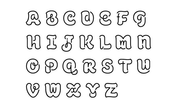
Suddenly and viscerally obsessed with these letterforms. Why has that never occurred to me, and why is it the first time I’m seeing the idea??

(Font is ALS Lamon by Dmitry Lamonov.)

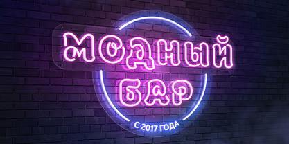
Just to show off, they did Cyrillic too!

(Small serious point: with a name like Dmitry Lamonov, it seems reasonable to assume Cyrillic is at worst familiar to them, and possibly even the thing they did first, and I don’t like the framing that Latin letters are necessarily any easier than any other script just because I’m more familiar with them. Just a silly, throwaway line that I have made waaaay too much of in writing this caveat 😅)

@chrisphin the Cyrilic looks cuter than the English alphabet one!
@chrisphin "Yo, we heard you like fonts so we put fonts in your fonts"
@chrisphin nice! They should’ve named it Schrödinger; the letters are simultaneously upper case and lower case 😜
@chrisphin Quite the achievement, but strangely unsettling to look at.
@chrisphin
Is there any region/script/dialect where the upper case n looks like the lower case n or is that a weird slip up in the drawing?
@tpoliaw Oh I hadn’t even clocked that. I think maybe he couldn’t make N work!

@chrisphin @tpoliaw Cursive? Remember cursive? XD

And common in the sorts of fonts you often see trying to look Medieval. You see it in churches sometimes right along with "H." It's familiar enough I used it in my 4×8 pixel fonts. Not so much a dialect thing as a stylistic choice. :)

@tpoliaw @chrisphin Certain variants of cursive?
@writeblankspace @chrisphin @tpoliaw Yes. But then the S is reversed; I think in those same cursive variants, like mine, the lowercase s would be different than that (and thus different from the uppercase s).
@chrisphin I'll be honest, this is hell for my dyslexia lol
@chrisphin oh wow this is beautiful on so many levels!!!
@chrisphin Beautiful work, and its curviness reminds me a bit of Burmese.
@chrisphin for some reason I think that letter Q is especially clever.
@ramin_hal9001 Yeah a few are weaker and a few are stronger. I like the G too!
@chrisphin Oh, very clever! And apart from the dots on lower-case i and j, I think each letter can be drawn in one line. It would be possible, though I suspect tricky, to handwrite the font.
@Knitronomicon Sounds like a challenge for you 😉
@chrisphin @beecycling oh that is magnificent! 👏🏻👏🏻👏🏻
@chrisphin such a shame about N though. 😆
@ToshInMacc
Possible enhancement for letter E for this very cool capital font in which each letter is nesting their cursive lowercases: take out its top fifth, and remplace it by the top third of F.
@chrisphin
@chrisphin @joel wow, those are particularly lovely, and apparently I'm even later than you to learning about them. 🥰
@chrisphin checkmate, Unicode
@chrisamaphone Won't somebody think of the codepoints!
@chrisphin The font does indeed look lovely, but how readable is it in practice? I had minor difficulties deciphering a few letters here...
@lisyarus I don't think any sane person would want to typeset body copy in it 😅 but as an exercise, or perhaps as a display face, it's of course totally valid. For example, here’s the Cyrillic variant used for a neon bar sign, where strict legibility isn't the only concern.
@chrisphin @chrisamaphone I think the reason you haven’t seen it before is that it is a freakishly brilliant execution of a novel idea. Really stunning.
@joXn @chrisamaphone Even the idea hadn’t occurred to me, though, never mind the beautiful execution, and it feels like it hasn’t occurred to many folks!
@chrisphin almost instantaneous, visceral and stomach wrenching No from everything above my neck.
@chrisphin
I didnt realized what you mean before I read your text. I though you were talking about the fact that every letter is made of a singular line

@chrisphin I was just talking with the 10-11yr olds I teach about how learning handwriting is kinda like inventing a font - once they've perfected formation and fluency, they will start generating their own style.

I'm going to hopefully inspire them further with this 🤩

Reblog by @cherdakyeda · 1 image

💬 4  🔁 16305  ❤️ 25690 · Original source (Mastodon post) Christopher Phin also posted a Cyrillic version that Dmitry Lamonov (Дмитрий Ламонов) created: "In 2017, [Lamonov] created the outlined /…

Tumblr