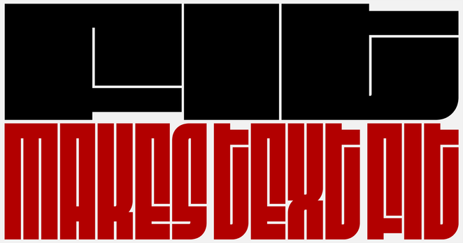
I made a typeface, it's called Flexflex 🔠

I've been working on this project on-and-off for many months. Very happy to finally release it!

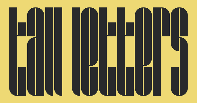
Flexflex is a typeface that responds to spatial requirements rather than imposing them. Built on a modular system, each letter can fit inside any given rectangular container and transforms continuously if its ratio changes. In theory, it's infinitely flexible.

For more information and interactive demos, see the website: https://ronikaufman.github.io/flexflex

More animations
@ronikaufman first one lowk giving amogus
@ronikaufman the changes in radius are cleverly arranged!
@ronikaufman "V" and "Y" are very similar. I would distinguish them a bit more. 🤔 But it's a fantastic idea.
@mogoh @ronikaufman Nice!
To my eye the X & I are hard to tell apart too.
@ronikaufman Ooooh! As a former typographer, I think that's brilliant! well done!
@ronikaufman I feel like this could be great as an actual font if that were possible, but I suppose it probably isn't?
@nazokiyoubinbou It would be great. I suppose it's not possible, but I don't know enough about font file formats to be sure
@ronikaufman @nazokiyoubinbou It is possible, build it as a variable font with width and height axes. See https://djr.com/fit for prior art.
Fit

Fit makes text fit

@simoncozens @nazokiyoubinbou Thanks, I need to see how to do that then
@simoncozens omg I can't read a word on that page  @ronikaufman @nazokiyoubinbou
@ronikaufman Yes, but does it use the GPU? 😏 @raph
@ronikaufman this is really cool and clever! Well done and thanks for sharing. I also really liked the sliders on the page showing in real time the way the font changes.
I'm not very fluent with JavaScript and examining the page to learn how to implement, I had a couple of questions. What's the suggested pattern for usage so it can fallback on plain HTML if JavaScript is disabled? Also, should it have an ARIA attribute for accessibility or would using it with HTML fallback be the preferred route for accessibility?
@shom Thank you! I'm not sure, I'm not an expert on accessibility, but I will look into it and improve the website. Thanks for the heads-up!
@ronikaufman This is pretty nifty - great work!
@ronikaufman SO many signage applications. I also appreciate the mono linear nature of this font.
@ronikaufman That's a beautiful typeface, good job!
@ronikaufman That is just... beautiful! ❤️
@ronikaufman there's an n missing in the header 'Implemetation' on the homepage 🤗
@ronikaufman very very cool though by using SVGs it does lose on accessibility...
@julia @ronikaufman would pure PostScript do better for accessibility?
@saper @ronikaufman well you couldn't use PostScript in a lot of contexts, including on the web, but I suppose you might be able to use it for that?

@julia The problem is that I don't think that the usual font file formats do not accept height/width parameters as input.

The code from ronikaufman@genart.social is a set of PostScript operators, so we could make it a Type 3 font using pure PostScript code., but then, again, something needs to execute that code and Type 3 was poorly supported anyway. Not sure it would be better for accessibility...

@saper the accessibility point is that a typeface, rather than svg images, would allow a screenreader to "see" the text instead of just saying "image". I was not aware of type 3 fonts, maybe those could be used to make such a thing work
@julia @saper maybe something could be done with alt text?

@saper @julia

As insanely complicated as it can get, Metafont, the font system underpinning TeX and its variants, actually does allow arbitrary height and width parameters. (And also another 58 parameters...)

It'll render to the necessary bitmap equivalents when your compiling to PDF, for example.

@ronikaufman

I don't know anything about typefaces or fonts but even I understand how AMAZING this is! Congrats on getting it out. Good job! 💪💪

@ronikaufman While I understand and applaud the programming chops required to create the typeface, as a dyslexic I can assure it it's totally non-readable. Nope. Nada. No way.
@econproph @ronikaufman
That is unfortunately the case. But I think there are other fonts that could be more useful to you, but don't serve the same purposes as these fonts.
@ronikaufman ooooooooooo I LIKE THIS. Congrats! Beautiful!
@ronikaufman Very clever, Roni, I love it!

@ronikaufman @vez There... you ruined it for me! Now I must keep thinking how to do this for Chinese ideographs :)

Awesome work. I'm loving it.

@ronikaufman Why no .ttf file?
I don't understand.
@ronikaufman This sounds amazing and totally subverts the "Don't stretch type" rule!
@ronikaufman I’ll mentally be calling it Fledc 😹 but I understand it was a design choice.
@ronikaufman my brain: Neat! I can't wait to see what cursed font rendering hack were needed for this"
The website: "It's JS an SVG"
Me: "That's way smarter indeed"
Cool stuff!
@ronikaufman Love your modular and SVG-based approach! I explored stretching letters too, but went with a different direction — using HTML and flexbox instead. Getting it into SVG felt a bit too tricky for me :-)
https://keymasterr.com/micro/tall-letters/
Tall Letters

Type and stretch... or design and share you own letters!

@ronikaufman Btw, since the letters are monospaced, would it help to use the vector-effect='non-scaling-stroke' property and allow them to fill all available space / resize freely?
@keymasterr I didn't know about that property, I'll check it out!

@ronikaufman as an example, it works like this (you can resize and distort svg dimensions without messing with stroke width)

https://codepen.io/keymasterr/pen/ZEZoMZR

Coil Loader CSS-only

...

@ronikaufman that's great! are there character variants to minimize ambiguities between letter shapes at the extreme aspect ratios? I can see somebody unfamiliar with the typeface very easily mistake a very squished X for a stylized I or a Y for a T
@ronikaufman not sure what the real world use case would be for, but the animation is mighty addicting 😍