 Greg Pierce
This is where I'm at so far on what an `inputAccessoryView` should look like on iOS 26. Thoughts?
Seems like it needs to be glass to connected with the keyboard, but needs to have separation and rounding for consistency.
This is where I'm at so far on what an `inputAccessoryView` should look like on iOS 26. Thoughts?
Seems like it needs to be glass to connected with the keyboard, but needs to have separation and rounding for consistency.
@agiletortoise I really don't like how Apple's new design takes up even more vertical space for the keyboard and accessory views.
As the for the glass design it looks strange with button shapes on top, especially on the right where one of them clips. Perhaps dropping the extra button shapes and putting a glass background around certain groups of elements.
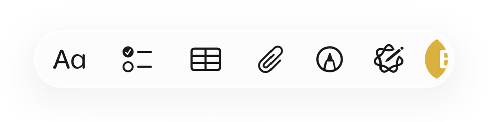
(A) (↩ ↪) (< > << >>) (🔍)
That said, I'm not sure what the dropdown arrow on the right does...
@ryanlintott The tint color is a user pref, it can be disabled, but it important for distinguishing functions for many. Not clear from GIF, but this is a horizontal scrolling view.
Don't love it at all, but trying to work with what we're being given. The rounding of the keyboard corners I feel like it problematic all-around and I hope will be rolled back in a later beta.
@agiletortoise Is there a way to have the accessory view look like an extension of the keyboard, and using a divider and some margin to act as separation?
Personally, to my iOS user but not developer eyes, it looks okay but it feels a bit off to have two elements hover over the content that are technically still linked, as in that accessory view only shows when the keyboard also shows.
Alternatively, maybe it would work better if the accessory view was always visible, hovering over the content at the bottom of the app, and then gets pushed up when the keyboard comes up.
@agiletortoise a lot going on there that I suspect is Apple and not your doing.
Assuming this a horizontal scrolling set of buttons, that drop down on the right with the button under it is a problem. It's letting the content show thru the glass when it should be the button first then the content.
That shatters the illusion and once I see it I would punt on this horizontal button bar. Perhaps they will improve it but if we know Apple the improvements will take years
 Ryan Lintott
 Adam Bonny
 Patrick McConnell
 Jordan Hipwell
 Junjie