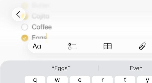
This is where I'm at so far on what an `inputAccessoryView` should look like on iOS 26. Thoughts?
Seems like it needs to be glass to connected with the keyboard, but needs to have separation and rounding for consistency.
This is where I'm at so far on what an `inputAccessoryView` should look like on iOS 26. Thoughts?
Seems like it needs to be glass to connected with the keyboard, but needs to have separation and rounding for consistency.