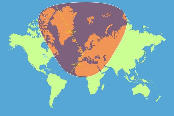
Another reasons to tut at the Mercator Map projection - how a circle with a radius of 5,000km, centred on Paris, looks according the Mercator map
@coffee @infobeautiful But what if we took the Goode Homolosine and made it completely useless!
@wcbdata @coffee @infobeautiful That's not completely useless. Not ideal for navigation, but it is a decent map of the Earth's oceans.
@Crow @wcbdata @coffee @infobeautiful Mercator is ideal for short-to-medium distance navigation, because it gives correct bearings between ant two points. However, that results in a course which is longer than the great circle route (except for due N-S bearings), so not a good plan for trans-oceanic journey planning.
@KimSJ @Crow @wcbdata @coffee @infobeautiful A navigator would never plan a transocean voyage on a mercator map. The professionals have special maps and/or can calculate the great circle courses without a map.
@dirkaufsee @KimSJ @wcbdata @coffee @infobeautiful I didn't make the claim that they would, merely that this map is not "completely" useless. If it's all you had, you could still potentially get where you're trying to sail.
@Crow @KimSJ @wcbdata @coffee @infobeautiful If you only have a Mercator as a navigator, you would calculate the great circle and the distance you have to travel on the Mercator map until you have to change the course by one degree.
@wcbdata @coffee @infobeautiful
Ocean-oriented Goode Homolosine

@coffee @infobeautiful Honestly, speaking as a map designer…I actually love the Mercator projection!

Mercator might distort circles and sizes, but it *doesn't* distort lines—a straight line on the globe will be straight on the map. This means that if you zoom in anywhere on Mercator, you'll have an accurate local map. Almost no maps have that property.

It might not be useful on a classroom wall, but Mercator powers things like Google Maps—it's incredibly useful.

@evannakita @coffee @infobeautiful , that doesn’t seem right. Isn’t a great circle a straight line on a globe? If so, I’m having a hard time visualizing one translating into a straight line on a Mercator projection. am I just suffering from lack of geometric imagination?

@Frannoval @evannakita @coffee @infobeautiful It'd be more accurate to say that Mercator doesn't distort *bearings*. A route on the Earth with a constant bearing compared to north (e.g., due northeast) follows a straight line on a Mercator projection regardless of where on the map it is. Most great circles don't have this property of a constant bearing along the circle (only the equator and circles of longitude do).

That's why Mercator was popular in the first place: it made a lot of sense for navigation, and was never intended to represent large areas accurately.

@coffee @infobeautiful Dymaxion, Pierce, Waterman.
D. I like Asimov, but not the rest.
P. Every bit of this.
W. I would love to own anything nice like that, and you'll probably grow to resent me entirely.
@coffee @infobeautiful Dymaxion seems very strange, but based on the description I should like it. Tell me more.

@musicman @coffee @infobeautiful
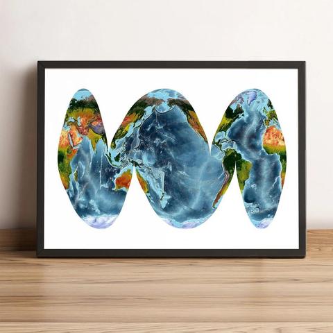
Dymaxion maps the globe onto an icosahedron, which is the regular polyhedron closest to a sphere, then unwraps the icosahedron

In the variant shown here, it's used to (over-)emphasise the connectedness of the landmasses

@coffee @infobeautiful

Tag yourself—

I'm Robinson-A Globe!

@coffee @infobeautiful personality type: mapmaker
@infobeautiful Mercator must have been a guitar player.

@infobeautiful

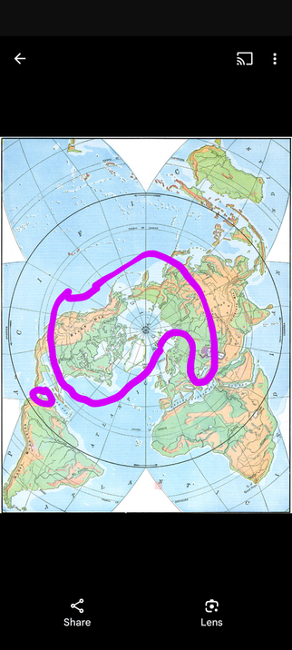
Then we have this map. A polar view of Russia and its satellites, #mairikkka, Panama, Canada and Greenland.

#cdnpoli #canada #mexico #fascism #antifa #elbowsup

@infobeautiful All projections have distortions, so why single out Mercator?
@MartyFouts @infobeautiful Exactly. Somebody just bickering about the Mercator really gives the impression that they don’t know much about map projections but have read the usual almost conspiracy theory level stories about the Mercator.
@tml
Casual Mercator bashing seems to be a US thing.
@MartyFouts @infobeautiful
@MartyFouts @infobeautiful I believe Mercator is the projection that people are most familiar with, which is in itself a good reason to critique it. Often people are so familiar with it that they think it accurately reflects how the world is. Pointing out Mercator's flaws is therefore useful. Showing people other projections, and discussing the flaws inherent in them, is a useful way of countering people's false assumptions about geography.

@bodhipaksa @infobeautiful The Mercator projection accurately reflects how the world is in some ways but not in others.

The issue is that people aren’t aware of which ways it is accurate and mistakenly assume that it is an equal area projection.

Mercator is good for computers, as it twist and stretch a sphere into a coordinate system. Trump having the same understanding of geography as a chimpanzee is really just bad luck.
Gergovie (@[email protected])

Attaché : 1 image @[email protected] @[email protected] There's no reason for a circle to become a sort of triangle during the projection. The trace of the 5000km radius circle should be something like that :

Piaille
@Gergovie @infobeautiful Hummm... Posting false "information" is not beautiful. 🤨
@infobeautiful All projections have problems. Draw that circle on a globe then turn the globe around, and you can’t even see the circle!
@infobeautiful But a straight line on a Mercator map follows a continuous bearing in the real world, which is useful if you can't easily measure your longitude.
@infobeautiful i have a map i inherited from a relative on the wall and i find it very funny that they insisted on slicing europe and asia in half to put the u.s.a in the centre, but because it's mercator, it's teeny tiny
@infobeautiful @arroz It's almost as if that Mercator projection had some kind of historic, important role to play. 🤔

@infobeautiful @knurd42

This was posted in October and it's still not true. The northern bound of your circle is not 5000km away because this would cross the north pole

(red and blue lines mark the ways to two points your "circle" cross. Both have not a 5000km distance)

@sman42 thx for mentioning it, unsharing this now

@infobeautiful What's the point of complaining about a map projection that you choose to use? If you care so much about area, choose an equal area projection. Similarly, if you care about preserving shape, select your projection appropriately.

There's nothing wrong Mercator or any other projection, it's all inevitable tradeoffs. Critique your own decision making.

@infobeautiful So, um, that's incorrect. The circle extends beyond 90 degree north, thereby expanding it to infinity, it doesn't close back to form a circle
@infobeautiful most interfaces these days are digital anyway. Why don't we switch to fully 3d globes for everything?

@infobeautiful

Here's an interactive version, the difference is pretty weird.

https://engaging-data.com/country-sizes-mercator/

It looks like 'size does matter', for political reasons.

Real Country Sizes Shown on Mercator Projection (Updated) - Engaging Data

This interactive map shows the real size of countries on a mercator projection map. The animation shows some countries shrinking to show their true size.

Engaging Data
@infobeautiful US foreign policy is being run by people who grew up with the Mercator projection.