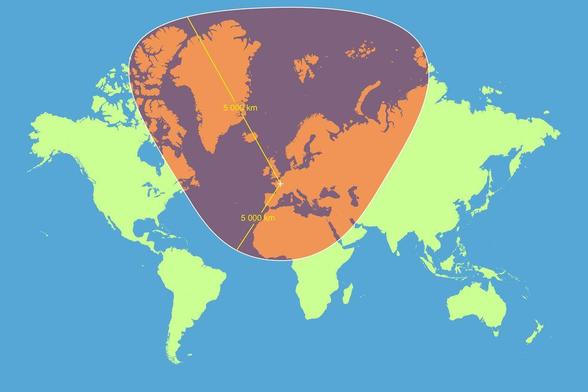
Another reasons to tut at the Mercator Map projection - how a circle with a radius of 5,000km, centred on Paris, looks according the Mercator map
Here's an interactive version, the difference is pretty weird.
https://engaging-data.com/country-sizes-mercator/
It looks like 'size does matter', for political reasons.
