For those using the mastodon.social web app, there's been an update to one of #Mastodon's core features, the compose form! Been working on it since end of November last year, so really excited to finally bring it to light. More is to come. Let me know how you like it!
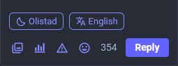
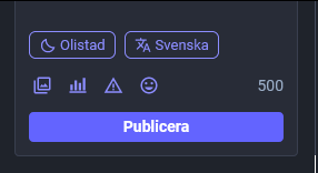
@Gargron Nice that the Publish button is full width, although as I started this reply I noticed the Reply button is not which is a strange UX. Also, good call to have the textarea follow the theme (it'll be annoying for a while cause it's "different", but I know it's better).
Just wanted to ask about the reasoning behind moving and labeling the privacy and language post settings?
(in the Publish UI there's space to have the language and privacy settings as icons in between the emoji and counter)