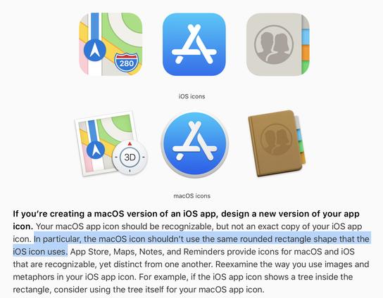
remember when
@louie @nicklockwood The move to uniform icon shapes is one of the many examples where recent Apple prioritised visual harmony to efficiency and usability. So much faster to differentiate icon by shape than colour only.
The dock is now also so much more boring. I used to LOVE Adium flapping its wings on new messages.