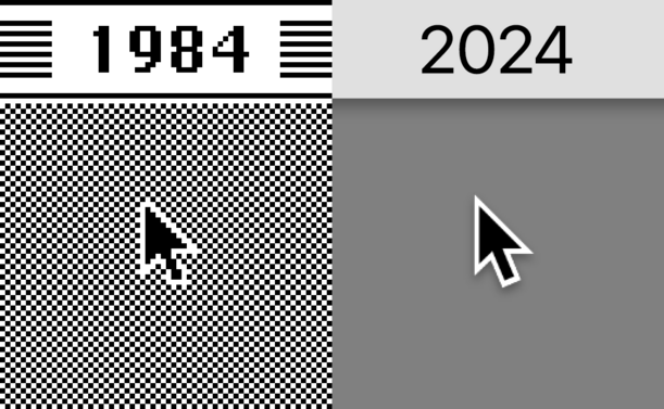
Whoever designed the Mac pointer hit a home run 40 years ago and it hasn't touched ground yet
@dukope Susan Kare.
Incredibly influential designer.
(Edit: Read the thread below: its perfection seems to be an artifact of the Mac's square pixel interpretation of the Lisa's bitmap arrow, which looked narrower because the pixels were vertical. But whoever drew it for the Lisa drew it just before Kare was at Apple!)
@dukope Huh. I’m pretty sure I’ve seen her bitmap sketches, but perhaps she was just mapping it out?
What have you found?
@JoshuaACNewman @dukope I think the Mac pointer came from Lisa. The Lisa pointer is, as far as I can tell, identical to the Mac one. I doubt Kare could have designed it; she was hired in early 1983, and the Lisa UI had been finalized by that point.
My guess is that the original pointer was designed by Bill Atkinson. He was one of the folks who visited PARC, so he'd seen the Alto pointer, and he also designed the Lisa UI (he invented the menu bar, too) https://www.folklore.org/Rosings_Rascals.html
@csilverman @JoshuaACNewman @dukope
It also looks surprisingly similar to some characters in the X11 Cursor font.
Somehow the rotten fruit company always got away with getting very detailed inspirations from 3rd parties.
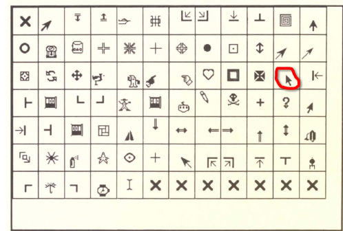
@yacc143 @JoshuaACNewman @dukope Going by the alt text of that image, those icons are from X11R3, which came out in 1988. The Apple Lisa came out in 1983, Mac was ’84. (I notice the wristwatch, pencil, i-beam, and spraycan icons are in there too; those were definitely by Susan Kare.)
Somebody did get some very detailed inspiration from a third party here, but it was not the rotten fruit company.
@csilverman @JoshuaACNewman @dukope
Yes, but I did not find any images of the font earlier. X was released mid 1980s, but was based on the W Window System, which on the modern Internet is missing in action.
|
| In 1984, Bob Scheifler of MIT replaced the synchronous protocol of W with an asynchronous alternative and named the result X.
|
https://lunduke.substack.com/p/w-the-window-system-before-x-that
@yacc143 @csilverman @JoshuaACNewman @dukope Many are those which have gone searching for a copy of W; none have succeeded.
By the way, X was first written for the VAXstation 100, which ROM has a mouse cursor which is pointing straight up rather than the diagonal left-up.

@csilverman @dukope Thank you!
My memory is that the Lisa cursor was skinnier? I’m curious how it evolved, too.
@JoshuaACNewman @dukope
That might've been because the Lisa had rectangular pixels instead of square ones (still blows my mind that there was ever a debate about the shape of pixels, but square pixels were not a self-evident truth in the early 80s).
I didn't do a pixel-by-pixel comparison of the Lisa and Mac pointers; I was just looking closely at screenshots, so they may vary slightly. The Mac arrow is definitely closer to the Lisa design than the Alto, though: larger arrowhead, shorter tail.

@JoshuaACNewman Hmm yeah, I think it's an aspect ratio thing. Check this out (this is a fantastic site to browse anyway, if you're into classic GUI design): https://guidebookgallery.org/screenshots/lisaos31
If you look at the small "wrong aspect ratio" text under the screenshots and click "ignore", you'll see the Lisa UI converted to use square pixels. At that point, the arrow looks like a pixel-for-pixel match of the Mac arrow.

"Whoever designed the Mac pointer hit a home run 40 years ago and it hasn't touched ground yet"
I believe this was the work of Susan Kare.

@dukope also compare to the granddaddy Xerox Alto cursor often reckoned to be the first to use this tilt angle
edit: image from https://actsofvolition.com/2018/11/a-briefish-history-of-mouse-cursors/

@dukope Susan Kare was responsible for much of the visual language of the original Macintosh, either as inventor, or having adapted and improved various aspects of the Apple Lisa GUI. But her WikiPedia page doesn't mention the mouse pointer icon explicitly. The Lisa pointer looks different, and less natural, in screenshots, however (it reminds me of the pointer in X).
@dukope For more about the development of the original Macintosh, I highly recommend

Like many a good logo, this cursor follows easily repeated geometric references. The left edge is vertical. The angle of the arrow's point is 45 degrees. The trailing edge of the right "wing" is horizontal. Being symmetrical, one needs only the arrow/stem length ratio and stem's length/width ratio to fully recreate it.

@dukope I would be interested to see whether the cursor from the original Xerox PARC GUI had a drop shadow. I know they made the arrow angle rather than appear straight up and down.
Either way, kudos also go to Doug Englebert when talking about mice and GUI developments :-)


