I really dislike this trend. Not just for the #Firefox logo, but logos in general

Sometimes, less isn't more. It's just less
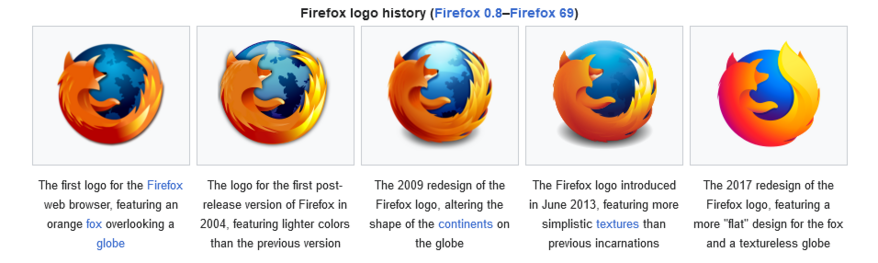
https://en.wikipedia.org/wiki/Firefox_logo

Firefox logo - Wikipedia

@cypnk It bugged me when they got rid of the ridge along the fox's back. I didn't mind the extra-firey tail on the second version in this.
@dlek I think 2009 was the best logo. It still had the back features and the tail was more interesting
@cypnk I like how the tail doesn't quite wrap around the edge of the globe, and the globe features are a tad more muted but not wiped out.
@cypnk Waiting for a blue/orange/red gradient circle as the logo.
@magsol Imma throw my spare ram sticks at it!
@cypnk I think the worse part is the rising sea level..