Reminder that Design should be not just about how it looks but also how it works...

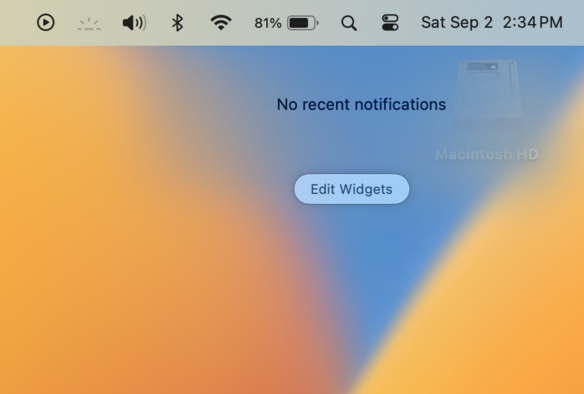
I was hoping since we can move Widgets onto the desktop that perhaps we'd get more spacing for Notifications but nope... 😒

You're a good designer if you can make something work well and is intuitive -- not merely just (in your opinion, making it look good).

Also this is the weirdest background fade I've ever seen... why? Why it like this?

No because look at how useful it used to be! Everything was clear, legible, none of this "on hover" bs... and look how many notifications you can have in the list view... wow!

Why does macOS continue to just regress?

@marioguzman Remember when there were no notifications? These were the times. The OS wouldn't annoy and beg for your attention all the time.
@marioguzman
My head canon is that they lost something culturally important with Forstall’s ouster, Jony was never a software designer, and neither is Dye.
@marioguzman I have no idea. Information density is awful these days and legibility went out the window a good few years ago 😞
@marioguzman what was the sherlocked app before this design… thinking… thinking…
@dk growl or growler or something like that? LOL
Growl, once a staple of the Mac desktop experience, has been retired

Apple’s Notification Center had already long ago replaced Growl in most cases.

Ars Technica
@dk @marioguzman growl was so good and so much better than native notifications. I absolutely loved the notification log to catch people’s skype-messages-in-the-wrong-chat-they-deleted.

@marioguzman it’s so bad!! My running theory is that Apple is bad at retaining talent, and shifts people around too often. There’s no way there’s a “Notifications Team,” and instead we’re seeing some work to bring things into visual alignment, then moving on to something else. Like all software, the problem is ultimately mismanagement because you KNOW people in the company are bothered by this, too!

It’s sooooo frustrating, whatever the reasons

@splendorr @marioguzman I arrive late to this thread, and I’m totally with you, Mario. I also share Nick’s theory. It would explain not only the UI regressions, but also the inconsistencies. I also think there are very few people left at Apple who have Mac OS UI experience going back to the days when Mac OS UI was almost flawless.

@marioguzman YES ITS SO BEAUTIFUL! Notifications drive me BANANAS all the time. They never show anything. You have to click click click with a nonsensical way to get something useful. And you have to hover and click to dismiss them.

Example: text messages, where you use to be able to click and just reply, now you have to click "show more” (because that makes sense!).

I hate them so much.

@marioguzman Notification Center in this visual incarnation always included that super heavy material blur. The “no recent notifications” seems new, I haven’t seen that in Ventura so far. Maybe due to no widgets?
@marioguzman progressive blurs seem to be their *thing* at the moment
@keir they look like a gross oily smudge on the display. 🤮

@marioguzman @keir I like it 🙃
It adds the necessary contrast with a potentially very busy background (that can include text) without needing a very heavy and strong drop shadow.

But it does look odd when it's just being applied to a lose block of text haha

@rafa @marioguzman yeah its a lot more noticable and looks a lot worse with no actual notifications there 😄
@marioguzman it’s meant for maximum rage induction in users
@marioguzman I think my favorite are Shortcuts error notifications, because they don’t stack at all. When my Apple TV (home hub) reboots and my thermostats can’t connect I get a new, non-stacking notification every 10 minutes. Who designed that?
@marioguzman I just want to know what happens when your driveway goes offline.
@barrymieny I have to open the gates by hand like a Neanderthal.