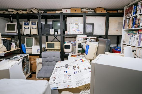
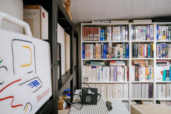
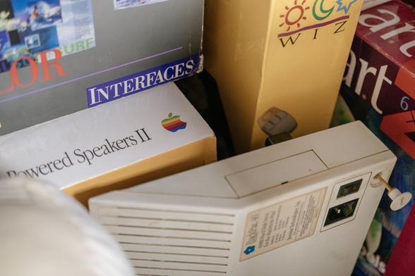
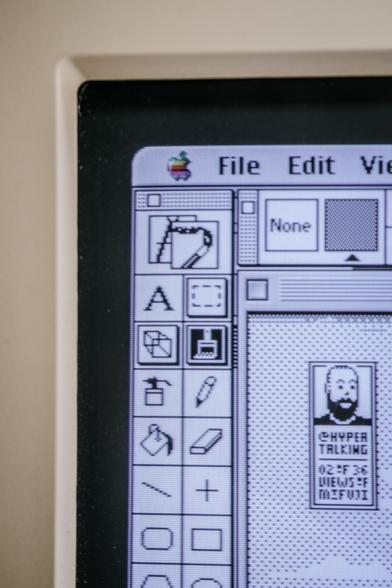
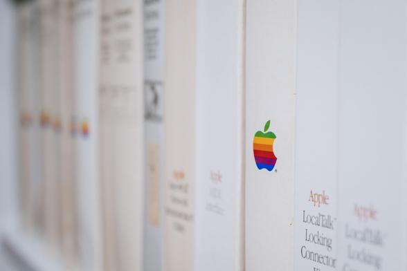
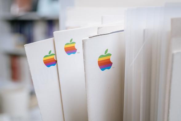
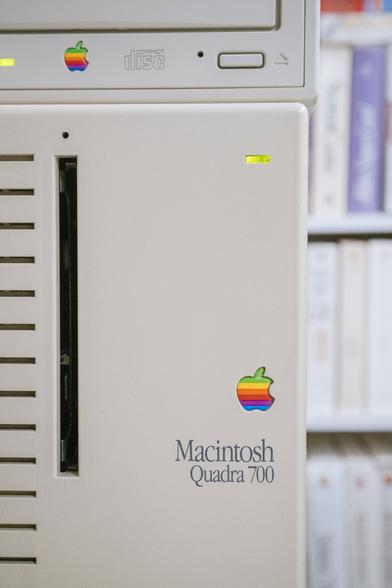
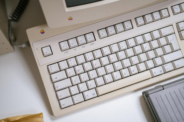
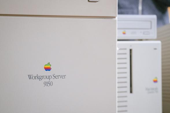
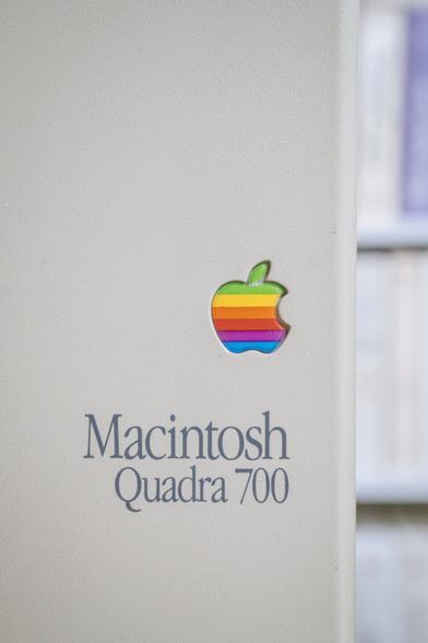
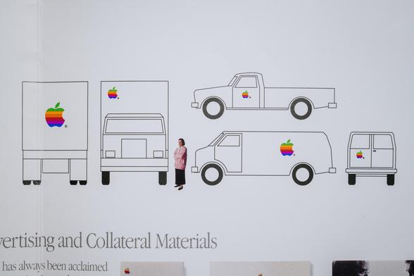
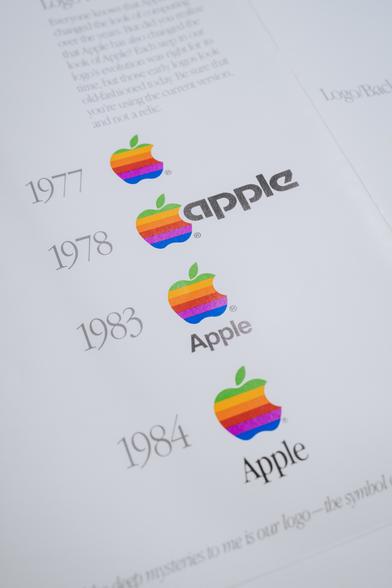
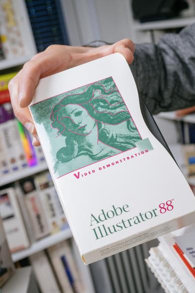
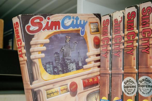
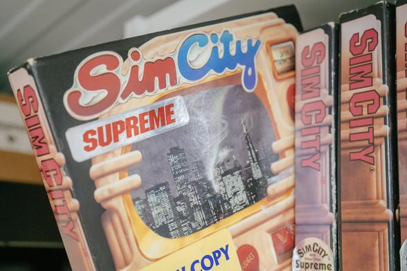
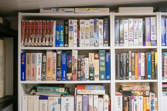
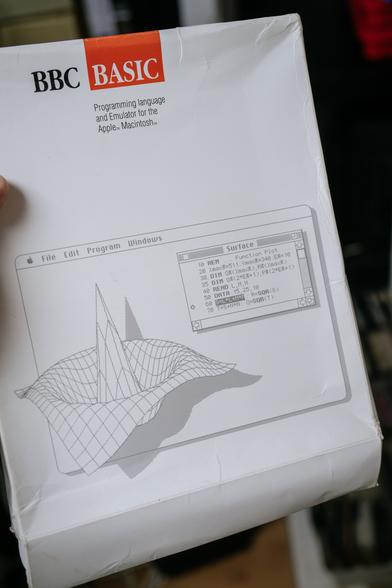
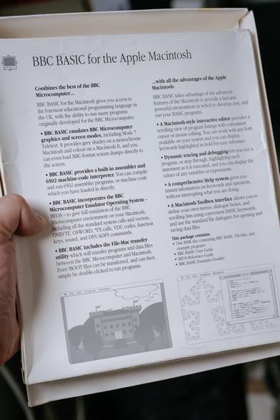
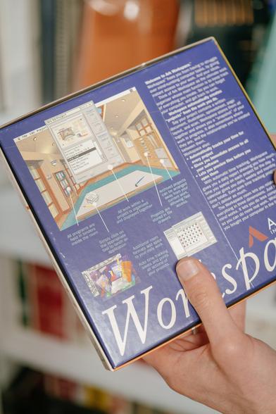
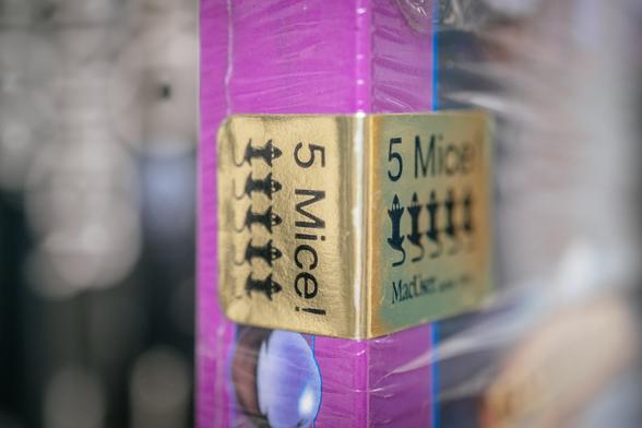
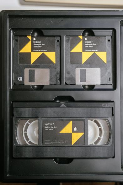
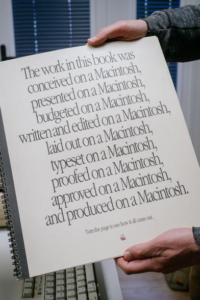
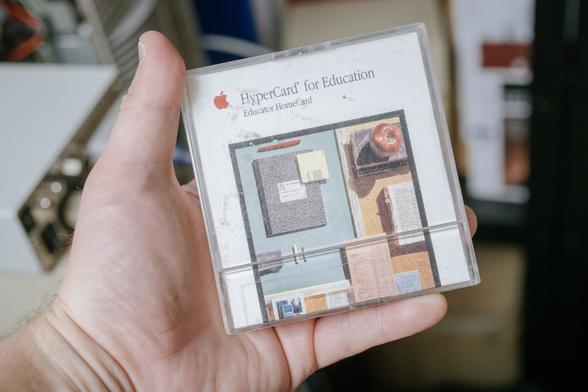
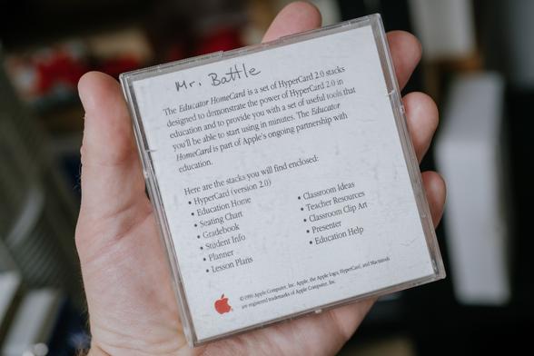
Last week, I had a chance to visit @hypertalking’s (James’s) excellent collection of Mac-related stuff. He’s particularly interested in collecting 1990s Macs, which is the era of Apple history I don’t have a lot of personal experience with, so it was doubly exciting.

Here are some 100 photos from that visit:

James’s work has recently gone viral! He meticulously recreated a few of Hokusai's views of Mount Fuji in the original Mac’s resolution and 1-bit colour.

I got to see them all in person! https://kottke.org/23/05/great-wave-off-kanagawa-in-all-its-1-bit-pixelized-glory

Great Wave Off Kanagawa, In All Its 1-Bit Pixelized Glory

As part of a project to reproduce all 36 of Hokusai’s views of Mount Fuji as 1-bit black & white pixel art, James Weiner dre

kottke.org
Anyway, on to the collection. There must be thousands of rainbow Apple logos in here.
…recessed or otherwise.
Love that you can see a little texture on this.
A fun (although maybe more pretentious than usual) “do” and “don’t” manual of using the Apple logo.
If you can’t afford six Pantone colors, you can always approximate them. Love, John.
Oh, no, not these.
These 1970s truck and van shapes are amazing.
What is this, a font picker.
“…with ’Illustrator‘ by Adobe.” Which James of course also has, in multiple editions!
(I got rate-limited by my Mastodon server. More later. 😢)
Somewhere here is also the first PowerPoint, around the time it’s been acquired by Microsoft. The manual is pretty impressive – it looks like a proper book.
Prince of Persia I and II in their cool respective boxes.
Apparently, SimCity – James has a huge collection of Mac-specific editions – got in trouble for putting Godzilla on its box… so that was changed to a tornado later.
The most ambitious crossover in history: BBC Basic for a Mac!!!

Microsoft Bob for a Mac! Sort of.

I have not heard of this before and I used to have a site cataloging GUIs.

5 mice award/rating from MacUser. Kinda cute?
There’s a lot of training and sales materials. Here’s one for System 7, explaining TrueType on prepared full-size transparencies. A fractal of obsolete tech.
Here are some materials explaining DTP. The first one is gorgeous. The second one… yeesh.
HyperCard! For education!
The diagram for the never-released Macintosh Office (server).
@mwichary “DeskTop” is quite an odd choice.
@mwichary This looks so familiar. My family's first computer was a Macintosh Plus and my parents used it for making newsletters and for their paper, we must have had some pretty similar sets of booklets around

Wow, BBC Basic for the Mac, complete with 6502 assembler and emulator. Published in 1989 by Human-Computer Interaction Ltd, which is David Johnson-Davies, former head of AcornSoft. What an offering - and how did the licensing work out, I wonder - the BBC were very protective.

Download it here - also a video preview
https://www.macintoshrepository.org/32524-bbc-basic-for-the-macintosh

Announcement: Little Acorns from Big Macs in Acorn User
https://archive.org/details/AcornUser083-Jun89/page/n8/mode/1up

@mwichary

#retrocomputing #bbcbasic #acornsoft #macintosh #applemac

BBC BASIC for the Macintosh - Macintosh Repository

BBC BASIC on the Mac? BBC BASIC for the Macintosh has been developed with the dual aim of providing an advanced interactive programming language...

@EdS @mwichary better yet download from the Macintosh Garden https://macintoshgarden.org/apps/bbc-basic-the-macintosh

that repository site you linked basically steals everything from the garden and makes money off it.

@mwichary If they wanted to sell Macs into British schools, BBC BASIC would have been table stakes!
@mwichary How did I not know this existed?!? Seems it’s available as abandonware: https://www.macintoshrepository.org/32524-bbc-basic-for-the-macintosh
BBC BASIC for the Macintosh - Macintosh Repository

BBC BASIC on the Mac? BBC BASIC for the Macintosh has been developed with the dual aim of providing an advanced interactive programming language...

@mwichary Blast, I’ve got the newer one. Now I have to buy another.
@mwichary oh man i forgot about that wavy side raised bezel…
@mwichary omg, this whole thread makes me so happy, but especially this. I haven’t seen that box since I was 14 or so. ❤️
@mwichary oh, I thought you were parodying a short news clip! 🤣
@mwichary hard to beat the 1978 font
@mwichary I had no idea they had a Year of #Helvetica (before 2014 or whenever it took over #iOS7).
@mwichary I had no idea about the 1983 version!
@mwichary I'd love to see more of this brand style guide. So detailed, lovely ❤️
Marcin Wichary (@[email protected])

Attached: 2 images A fun (although maybe more pretentious than usual) “do” and “don’t” manual of using the Apple logo.

Mastodon
Online Archive

Virtual access to Letterform Archive’s collection of lettering, typography, and graphic design.

@mwichary this whole thread is amazing, thank you
@mwichary @alexcox I have no recollection of that 1983 Helvetica treatment. Is that real?

@gruber @alexcox Letterform Archive has a better view of this doc: https://oa.letterformarchive.org/item?workID=lfa_mok_0122&targPic=lfa_mok_0122_003.jpg

I’ve also been puzzled by this. I know some of the early Lisa stuff was very Helvetica (e.g. this attached), and the date checks out, but I don’t remember the logo looking like this.

Online Archive

Virtual access to Letterform Archive’s collection of lettering, typography, and graphic design.

@mwichary @gruber @alexcox I was also surprised by this. Apple used various flavors of Helvetica as their main branding font (logo-adjacent) in 1983, but the logo lockup for those pieces uses Motter Tektura.
@andrewwatterson @mwichary @alexcox That spiral-bound one in the front looks like Univers?
@gruber @mwichary @alexcox Oh you're absolutely right! The IIc had Apple's first keyboard printed in Univers, a choice (originally specified by Frog Design) that they kept around through the early 2000s.
@mwichary that one looks like a Bell System van, minus a ladder rack
@mwichary Surprised the 1980s weren’t immune to the magic graphic design circles.
@mwichary “Doing it economically is no excuse for doing it wrong”
That’s a perfect phrase right there
@mwichary Six Pantone colors for one logo? Now I know why they dropped the rainbow :-)

@mwichary

That's wild. I didn't realize that the logo subtly changed shape over time.

But I wonder what the "three-color" printing process is. I'd never heard of it.

@governa

@RL_Dane @governa I’m guessing they mean CMY?

@mwichary

But it sounded like they were referring to it as the cheaper option? Cheaper than 7-spot-color??

Dunno.

Man, I miss that 7-color logo.
When I still had a MacBook Air, I bought a lovely transparent 7-color overlay to cover the illuminated apple logo.

It was da bomb. 🤓

@governa

@mwichary The "No." part of the leaflet was much more fun. My designer friends would compete to get away with "violations" based on manipulated photos of physical apple logos.
@mwichary Can’t help but notice the irony of the ‘No’ next to the solid bondi blue logo.
@mwichary they didn’t listen to this one in 1998 did they? 😂
@mwichary and further scrolling shows I’m obviously not the first to realise. My apologies!
Online Archive

Virtual access to Letterform Archive’s collection of lettering, typography, and graphic design.