Introducing Womprat, the font you’re looking for.
→ http://womprat.xyz
→ http://womprat.xyz
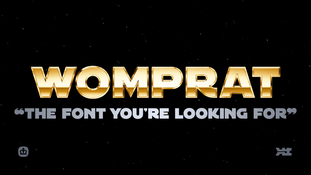
I can’t believe it. “The Font” is finally ready.
We (@AurekFonts and I) spent a year and a half making this, and I had a lot of fun doing it. It’s the most extensive font I’ll probably ever make
I’m really proud of what we made. I hope you enjoy it.
There’s a *lot* to talk about with regards to this font, so over the next week or so, I wanna do that.
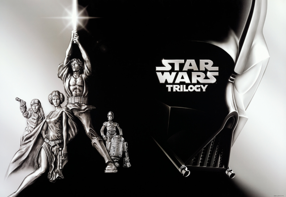
For as long as I’ve been making icons and wallpapers, I’ve been drawing Star Wars stuff. One of the wallpapers I made became more popular than it ever had the right to, ending up on so many fan-made and rumor-driven videos on YouTube. It’s even on Rotten Tomatoes for some reason as the actual logo for the Star Wars saga.
Maybe you’ve seen it. It’s a weirdo.
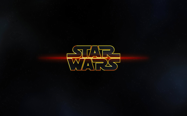
I made that almost 15 years ago.
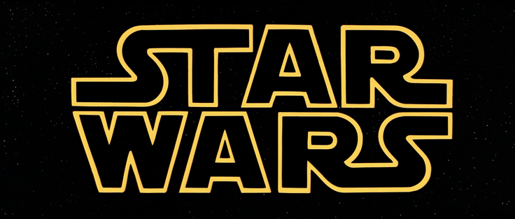
I continued to construct various logos in the style of Star Wars, mostly using fonts that were available at the time. There’s a bunch, but the one that seemed the best to me was called “Astro” by an old friend, David Occhino. I used it a lot to “make” logos, stretching, squashing, elongating letters to make ligatures. You kind of have to with a font like this, because it’s never “just a font,” it’s a tool.
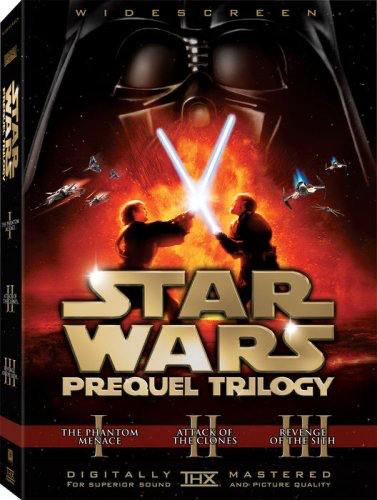
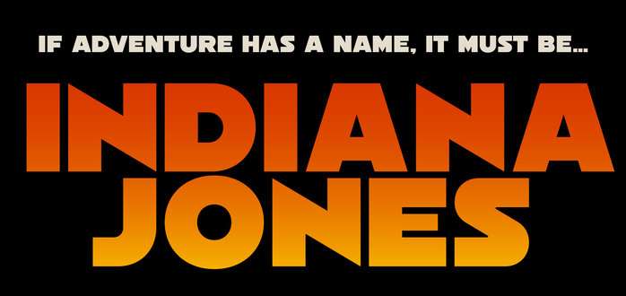
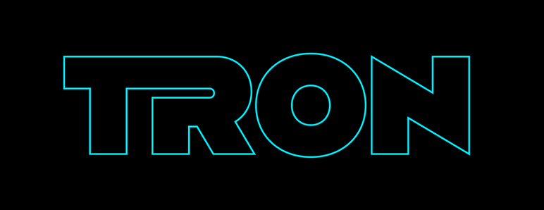
I won’t get into the detail but almost every font that exists for the logo style tries to emulate one aspect of the logo. Maybe one font focuses on the 1997 re-release. Or the 2017 “Solo” film. The truth is, over the years, every time this style was used officially, the letters used were clearly made for that release alone.
The shape of the S, the width of the letters. They’re never quite the same when you put them side by side. Take the original 1977 and put it against the prequels’ version.
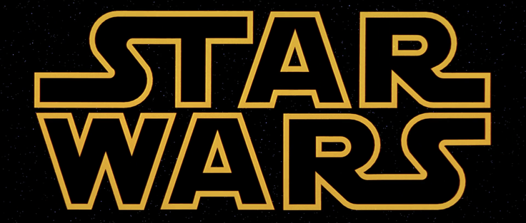
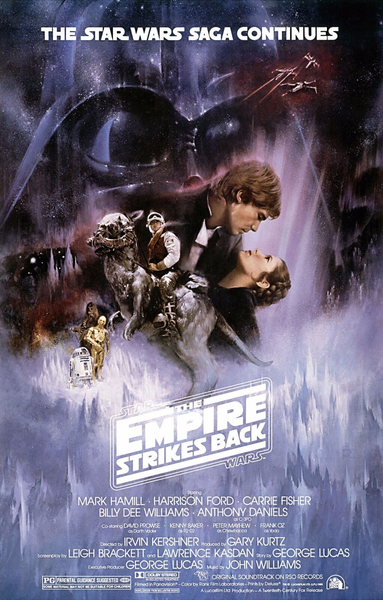
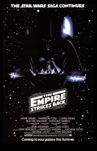
That’s only part of it. Star Wars only has 5 unique letters. For “The Empire Strikes Back” they added quite a few more: H,E,M,P,I,K,B,C. But the S was different, it’s squarer. Also, there were no ligatures. In the original logo, the ST and RS connect. But in ESB, nothing connects. Please try to ignore that incredible E, that’s another topic for another day.
Theatrical poster has a bottom bar in the logo, the teaser doesn’t. In the tagline on the top of each poster, the Ns and Cs are different.
So I started making some letter forms. To try it out. I used The Rise of Skywalker trailer cards as an example, and kicked out some logos for various movies to see how it played out. After I finished making the logos, I kinda felt it was done. I didn’t need a font, I just needed the ability to make my own logos.
After it sat dormant for a while, @AurekFonts contacted me. He asked if I was gonna make that into a font or not. And we talked about what would be needed to make it into one.
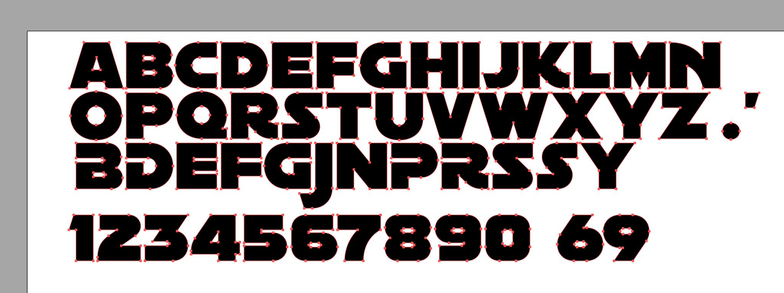
I was extremely naive, and thought all we needed was punctuation and “not that much kerning.”
I was extremely wrong. For the next year and a half, Ender and I worked sometimes every day of the week on this. Every letter was redrawn. And though we could’ve stopped at many points along the way, if this thread is any indication, we didn’t. Because in my head, I wanted to be able to emulate every version of this style that previously existed.
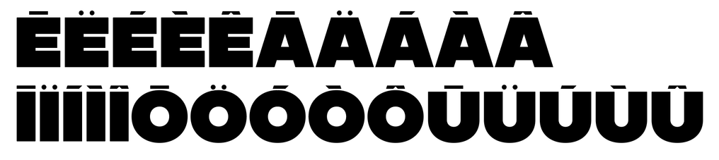
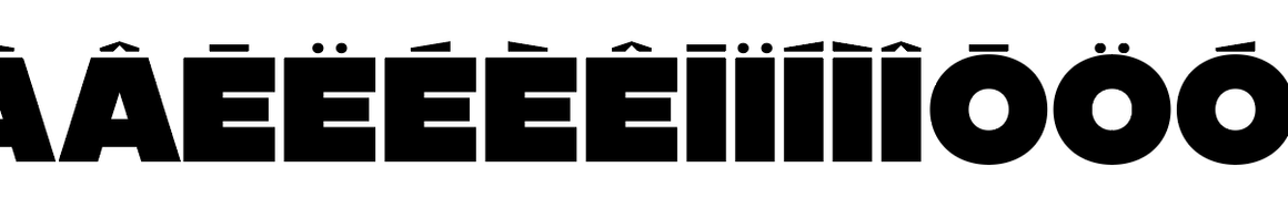
...and in multiple languages.
I’ll pick this up later, but that’s most of the “backstory.” In the meantime, go to https://crown.fontdue.com/fonts/womprat and check out the type testers. Open the “opentype features” drawer and click around as you type, trying out the different styles. And you’ll see exactly why this took the time it did.
I have so much more to say, so I’ll be back later.
Near the end of 2021, Ender and I started to develop a plan to make the font. He said I’d send him my Illustrator docs, we’d discuss how many more characters we’d need (punctuation, numerals, symbols, ligatures, alternates), draw everything else, and that he’d build the font and kern it.
At the time, it was called Parsec, and this is all I had. I sent over this document and Ender had a few questions that he visualized in dark blue. This is when I knew he was the right partner for this project.
If you’re eagle-eyed you can see a lot of things “wrong” with my initial design. The K is too narrow, the N is too wide. the X and Y were clumsy. The numerals were not cohesive. But at the time, I thought this was pretty good. It took getting it all into an actual font file to realize what was wrong.
Any type designer will tell you this is why you have to design inside the font-creation tool: you need to design in the context of words.
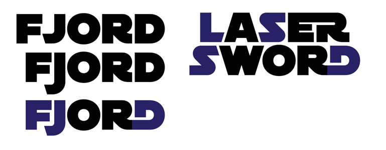
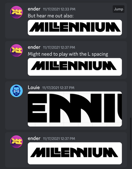
Ender sent over more questions. How would we handle ligatures that could happen more than one way? like EB, ED? Would we do ligatures that go from horizontal to vertical lines? What would a T look like if it were in the middle of a ligature? These were all things we’d continue discuss for over a year.
Another thing we were thinking about is how we would get “Star Wars” to render correctly in this font. The thing is, some of the letters (like S) would need to change for the logo version. Hm!
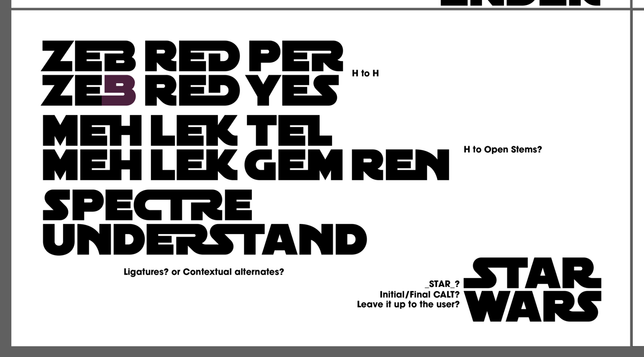
Some ideas survived. Others did not. lol
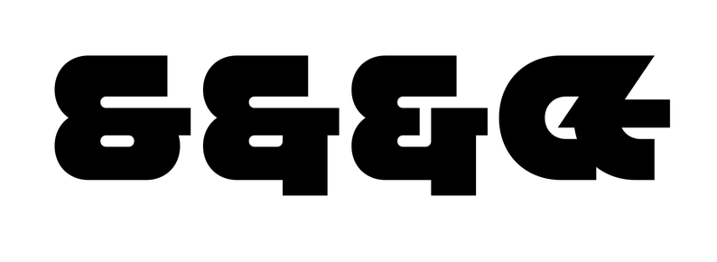
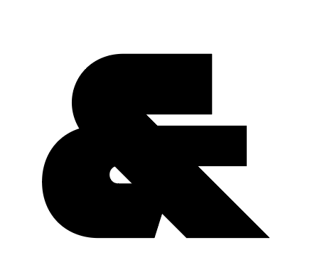
I never could get that style of ampersand to work.
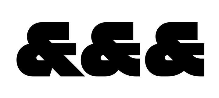
I don’t know what prompted this, but I think this is when we decided to fold Avant Garde style ligatures into our font.
Oh, and I’m glad we decided not to do lowercase.
After I made a bunch of icons, I realized we could do some cute patterns. But here’s the thing about icons for this. It’s like making a list of people to invite to your wedding. I made other R-series droids because we had R2 and R5. If you have those, you need R1, R3, R4, R6, R7, R8, R9, and R0. At least. But probably also C1 and—
...and then what about troopers? This conundrum led me down a path of making over 400 icons for Womprat, including helmets introduced into canon just a few weeks ago.
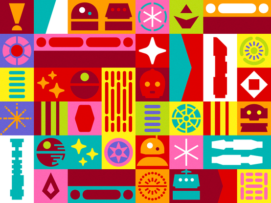
Having icons that matched the font was a huge win. There’s a lot of ways to draw these things, but doing so in a way that was synonymous with the type made it so fun to incorporate with text. I really hope people use it like that.
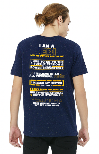
We made tons of samples like this during the creation of Womprat, and I will not apologize for this t-shirt design I made.

Gosh, looking through old images, I found this. An old sketch of manicules from December 2021.
I *did* end up doing a Wampa hand and Vader hand! But I honestly didn’t draw them in the font until a couple weeks ago.
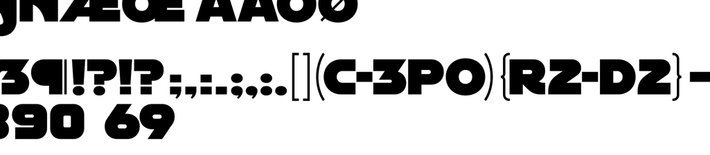
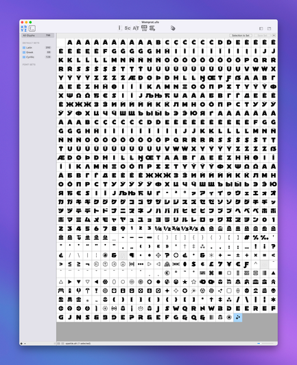
It’s charming to think of the time we had fewer than 1000 glyphs in the font.
...we shipped a font with almost 4000.
Could you make an entire video game only using a font?
I don’t see why not.
Oh. Latin, Greek, Cyrillic, and Katakana wasn’t the whole plan, either.
In January 2022, I was starting to work on Hebrew. But let me tell you: trying to make a font that has Hebrew in it (being right-to-left) is incredibly difficult and makes kerning a worse problem than it already was for this font. I wish we could figure it out, and maybe we will make it as a separate font, because I still kinda want it.
Whenever I showed friends this work-in-progress font, the first question was one of concern: doesn’t this have limited use cases? Only for Star Wars?
Over the last two years, I’ve collected all sorts of samples using “the Star Wars font” and— it’s not limited to Star Wars. I see it all the time. It makes me laugh because it’s so obvious to me. Either people have no idea what they’re using. Or they think it’s *cool*. Either way, it *does* get used a lot.
@louie It never occurred to me that of course there are localized versions of the movie titles, but for some reason I find this particular one hilarious.
(Hebrew reader/speaker here.)
(You made a cool typeface.)
@louie This reminds me of an X-Wing versus Tie Fighter game I made on my TI-83 during Geometry class that used capital X and I for ships.
Mrs. Gillmore thought I was wasting my time, but I showed her.
@louie Is this a mockup or a playable game? I like how this looks like centipede.
I remember a time when all games where just one font 😉 #ascii
@louie this is the way.
Love it!😄
