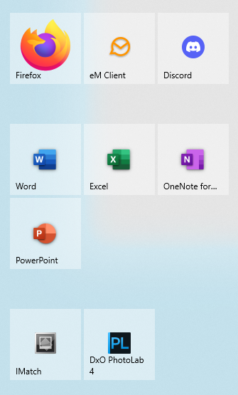
I'm convinced that the 2D auto-arranging grid menu (without spacing) is terrible UI design.

When you have a lot of applications, it's important to cluster related stuff together.

The problem with the 2D grid is that everything moves (and wraps around) in two directions every time you add or remove something. This hinders muscle memory, especially when using devices with similar but differing application loadouts.

The Windows 11 Start Menu is a UI disaster.

#UI #UIDesign #UX #UXDesign

On Windows 10, you could cluster things together into related blocks, which made things easy to access, yet predictable.

On Windows 11, you need third party software in order to do this.

I'm still running Windows 10 on my main machine, but when it reaches end of life, I suspect I may need to add something like Start11 to my PC, so that it doesn't become infuriating to use.

Apple don't get a free pass on this either.

After they switched from a four-across grid to five-across on iPadOS, it destroyed the ability to keep similar icon layouts across iPhone and iPad. Before you could at least make sure that applications common to both were in the same places within the grid. Now, you can't even do that.

It's infuriating.

@MouseAT
I've been running Linux on my desktop for over a decade and I've never looked back. New versions of the distro or switching distros may change the layout but you always have the option to install your own WM and replicate whatever you want.

@bobkmertz I’m a bit too tied to some of my software to adopt Linux myself, although I appreciate its benefits, and keep important data is in open formats, even if much of my software is proprietary.

That said, I’ve been around long enough to see Linux make some disruptive changes (e.g. Unity, Gnome 3), and know that forks and/or finding alternative solutions can still be an issue from time to time.

There are solutions on the MS side, but not quite as simple as with FOSS.