Two years since the new version of google icons and the struggle is still real
@Miriamm I have 4-5 apps I use regularly and they are all blue with white text on them and I have no idea which one Iโ€™m clicking on in the Mac menu. If I made a program I would do black and hot pink for the image because of this!
@queenofnewyork @Miriamm
I think many users have learned Google's icon system after more than a decade. My daughter looked at this pool picture yesterday and said, "look, that's where our car is." It took me some time to understand what she meant.
I agree, for new users or in situations where you want to quickly decide what to select, it remains a problem.
@queenofnewyork @Miriamm Something that pleased me so much about the @MonaApp Mastodon app is that it lets you change the color of the app icon. I have an icon that stands out! Is easy to find! Who would have dreamt such a thing possible?

@marick @queenofnewyork @Miriamm @MonaApp

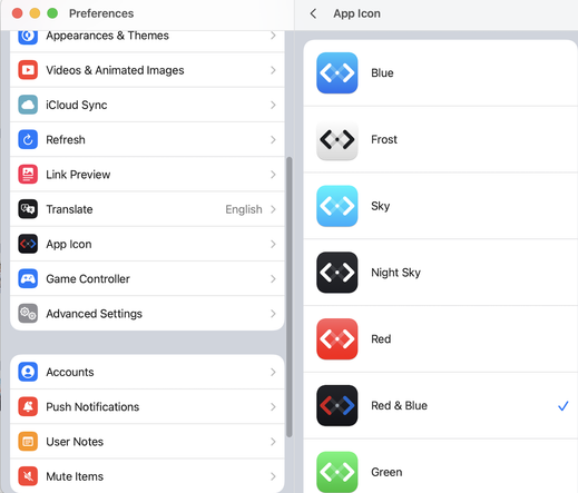
Android has a number of launchers (like Nova) which allow you to customize the icons of every app on your phone.

You can also download icon packs (from the app store) which give you visually consistent icon sets to use (neon, paper, old-school, etc).

@SirLich @queenofnewyork @Miriamm @MonaApp I am sufficiently old that I do my browsing on a laptop, not an IOS or Android device.
@SirLich @marick @queenofnewyork @Miriamm @MonaApp suspect it may be because I have Nova launcher on my tablet but that's the only device I have where the Google Calendar icon shows the actual date rather than fixed '31' I get on my phone.
On the other hand keeping a common colour 'set' at least allows me to pick out which are my Google apps.
@Miriamm deadass i just have their positions memorized because its so hard to tell which is which at a glance.
@Miriamm thank God for custom app icon packs on Android or I'd never find anything
@Conqy @Miriamm This. This is how I cope as well.

@Miriamm

Funny how the most skeuomorphic ones are the most distinguishable.

Remind me again how skeuomorphism in design is so evil and terrible and bad??

sigh.

Mac OS 8 didn't have these sort of problems.

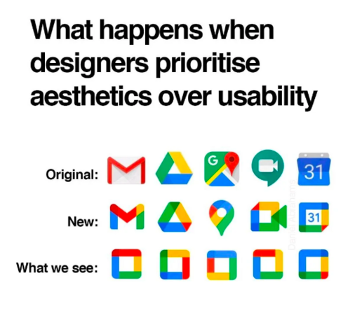
@Miriamm The colors camouflage the shape of the Google icons. This is the definition of style over substance. I'm grateful that MacOS and iOS still aren't that bad, even after the recent redesign.

I especially love Adobe CC's icon set, which stands out so in a bold and mostly unified way. MS Office deserves a little recognition too for its unified soulless corporate vibe.

@Miriamm The third row is just the 2024 refresh of those icons
@Miriamm for everyone that praises a design, there are probably just as many detractors.

@Miriamm holy shit yes.

Don't get me wrong, aesthetics are important. But clarity is equally important, and you must learn to balance them. I think there is a way to have a coherent theme throughout a set of app icons while maintaining clarity. What Google did was absolutely not it.

@Miriamm
So this is why I never click the right google app ฯˆ(._. )>
@Miriamm I honestly thought I would have gotten used to it and been able to tell them apart by now but nope
@Miriamm I have similar issues with the some of the app icons in Microsoft Office and Teams..
@VirginiaSOpossum @Miriamm Same. I don't know why they changed the colour for Outlook.
@Miriamm holy cow yes. Let me open up maps, shit thatโ€™s my photos. Let me try again, shit thatโ€™s my email
@Miriamm Literally my #1 use of customizing home screen icons is to revert my Google app icons to before that redesign ๐Ÿ˜‚
@Miriamm I miss material design
@Miriamm they failed at rainbow capitalism
@Miriamm Surely this is what happens when you prioritize *branding* over usability AND aesthetics.

@Miriamm
Reminds me of the late 90s and early aughts, when every company logo had to have a circle or a swoosh.

The flaming coffee ring of quality! Lucent.

https://en.m.wikipedia.org/wiki/Lucent

@Miriamm Yeah it's one of the many factors finally pushing me away from Google products. I used to be a Google fanboy because their software was good. But #opensource alternatives are slowly surpassing it in raw software quality.
@Miriamm Honestly that one really feels like "Was there really a designer in the team that made and validated this? Did they do any tests?"
@Miriamm They have not even the slightest care for accessibility.
Everything to them is Little Boxes.
https://en.wikipedia.org/wiki/Little_Boxes

@Miriamm I though I was stupid/brain damaged when I repeatedly tap on Gmail when I want maps (they're side by side on my home screen!)

(Well, I AM brain damaged, but that's beside the point)

@Miriamm the icons for google home and google tv are the worst...
@Miriamm my philosophy when it comes to design is that it should be simple, minimalist, and have its own identity, while prioritising utility and functionality above all else. Stylised designs can be โ€œcoolโ€, โ€œtrendyโ€, or create a striking identity, but they can be a disaster for daily use when functionality is thrown out the window.

@Miriamm @Kim_k19

Just before/around when the pandemic began my uni updated its student portal. Previously one logged in and had a menu of clear-text English words to choose from along one side.

Now? There is a grid of icon tiles that look like they were ripped from shareware clipart circa mid-1990s, 3/4 of which have an image of a person in a grad cap. Only the 'financial' one is quasi-visually distinct.

It makes the Google icons look highly functional in comparison. ๐Ÿ™„๐Ÿ˜ฌ๐Ÿ˜‚

@Miriamm @Kim_k19

Seriously, #yeg, if I didn't live here and know it's a real place, the #ualberta student portal interface is so astoundingly visually terrible that I would assume it's some sort of scam operation for prestigious fake diplomas or something. ๐Ÿ˜ณ๐Ÿ˜ฌ๐Ÿ˜‚

Shockingly, shockingly awful!

(Seriously, a sparkly animated-crawl header bar with autoplay music would be an improvement. It is THAT terrible!)

Node [[ualberta]] in anagora.org

The Agora is a crowdsourced distributed knowledge graph: anagora.org.

In fact, the first-ever webpage would be a significant improvement over #ualberta 's current student portal design. ๐Ÿ˜‚๐Ÿ˜‚๐Ÿ˜‚

#yeg
#abpse

https://mastodon.social/@mcnees/110011397651347919

Node [[abpse]] in anagora.org

The Agora is a crowdsourced distributed knowledge graph: anagora.org.

@Miriamm Ah yes, the Tartan era. Some Scotsman working at Google must be very happy.
@Miriamm sometimes i accidentally open youtube music instead of youtube studio
@tfae @Miriamm or YouTubeTV instead of YouTube in my case.
@Miriamm I feel the same when open-source software switch their icon theme to something fully monochromatic, like Gimp or Krita. I can't find anything at a glance anymore.

@Miriamm
They remind me of World War 1 dazzle camouflage (https://en.m.wikipedia.org/wiki/Dazzle_camouflage)

It's not just that they are all the same colours, but they've also managed to disrupt the perception of the shapes

Even worse, they've put the icons on my phone in circles so nobody else's app has a distinctive shape either, and there are plans to 'theme' them to the same colour

It's hard to make a unified set of icons while keeping them distinctive and meaningful, Google's camo paint makes it harder

Dazzle camouflage - Wikipedia

@Miriamm I wonder if greyscale print is still considered for creating icons/logos today. Well, maybe not for companies who are internet only, but maybe others.
@Miriamm
When looking for a product on the shelves in a supermarket, the first thing we notice is colour. There is a lot of research that supports this. Apps are the same.
@Miriamm who sees it like this
@Miriamm @Cleopatra I am so bloody confused all of the time. Bring back skeuomorphism!!!
@Miriamm I wonder if you saw #Proton services #icons after their rebranding โ€‹ When it was new, there were complaints about icons being basically all the same.
@madargon @Miriamm Has Proton been sold? They need to offer a classic interafce, and those of us who were lucky to get addresses in the .ch domain need to not be re-directed to the .me domain for our mailbox. It's looking more and more like they have been busted out, another war casualty.
@indyradio @Miriamm I didn't hear they have ben sold. Rather they did many upgrades to their sites last year (most of them rather good). I feel like things work well now. I was in beta tests when they announced first time new domain, found this info quickly and got it. (Never had .ch, as I remember it was possible when I created account but I didn't choose it. Should I?)
And finally they have U2F support, I waited for it long time.
And even they graphic design in web interface. In some ways it looks and feels pleasant.
@madargon @Miriamm too late now to get a Swiss domain :( Many things have changed. One of the servers I rented several years ago used to be one of Proton's - It was good - in the ways we especially want ๐Ÿ˜‰ but then my contact quit, and I think I'm lucky mine got ignored somehow, except for the monthly bill.
They (the company that rents the servers) claims not to have changed ownership - but it sure seems like it!
The whole regime of pricing, and how the machines are connected has changed and I am certain it is the Surveillance State at work.
They manage this by buying whole companies. My hope is that Proton now owns all of it's own servers. Sure, they're not totally untrustworthy, but they have changed and we are buried in cosmetic details. Where's the beef?
@madargon @Miriamm Do you trust Chrome? That would be a fatal error for some of us.
@indyradio @Miriamm Chrome? Never. Why should I do??
@madargon @Miriamm Yubikey is designed to work especially well with Chrome, just sayin'