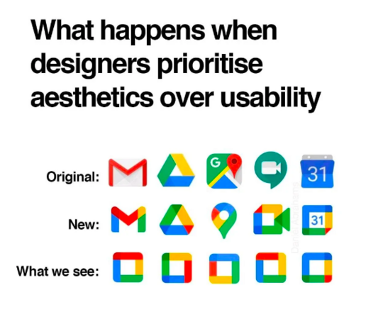
Two years since the new version of google icons and the struggle is still real
Just before/around when the pandemic began my uni updated its student portal. Previously one logged in and had a menu of clear-text English words to choose from along one side.
Now? There is a grid of icon tiles that look like they were ripped from shareware clipart circa mid-1990s, 3/4 of which have an image of a person in a grad cap. Only the 'financial' one is quasi-visually distinct.
It makes the Google icons look highly functional in comparison. 🙄😬😂
Seriously, #yeg, if I didn't live here and know it's a real place, the #ualberta student portal interface is so astoundingly visually terrible that I would assume it's some sort of scam operation for prestigious fake diplomas or something. 😳😬😂
Shockingly, shockingly awful!
(Seriously, a sparkly animated-crawl header bar with autoplay music would be an improvement. It is THAT terrible!)