The 12-bit rainbox palette is very pleasing to my eyes:

https://iamkate.com/data/12-bit-rainbow/

The 12-bit rainbow palette

A palette of twelve colours chosen with consideration for how we perceive luminance, chroma, and hue

Addendum: apparently @kate is the author so maybe go follow her!

@dznz this is so good!

I just tried it on this chord project I've got, and it looks pretty nice here too :)

@dznz looks like it might make a neat pixel art palette, even
@ariadne I think that’s what drew my eye to it to start with!
@dznz i... can pretty much distinguish all those colors, which is rare! awesome!
@tarajdactyl yes, I noticed that Kate had ensured that even in B&W there is variation, which surely helps the accessibility.
@dznz this is lovely! thank you @kate for making it. I just used the color palate to render this version of the fediverse logo and it works very well
@liaizon thank you for finding @kate so that we can credit where it’s due!
@dznz @thatandromeda HCL or HSL? And which HCL? Some are more closer to perceptual than others (of course if they’re close enough for your work, that’s what matters).
@dznz Would have been useful to see the actual calculations; there isn't enough for people to do anything similar themselves.
@dznz so pleasing to my eyes!!!
@dznz I'm replying to this post because my mobile client doesn't support bookmarking and I need to bookmark this when I get home. This is such a beautiful palette
@dznz
Finally a yellow that doesn't burn my eyes to look at.

@dznz This feels like a very good idea for scientists to use these colors!

I made this LaTeX code based on these colors, if it can be useful for anyone:

\definecolor{Rainbow1}{rgb}{0.53,0.07,0.47} % Dark red
\definecolor{Rainbow2}{rgb}{0.67,0.20,0.33}
\definecolor{Rainbow3}{rgb}{0.80,0.40,0.40}
\definecolor{Rainbow4}{rgb}{0.93,0.60,0.27}
\definecolor{Rainbow5}{rgb}{0.93,0.87,0} % Yellow
\definecolor{Rainbow6}{rgb}{0.60,0.87,0.33}
\definecolor{Rainbow7}{rgb}{0.27,0.87,0.53}
\definecolor{Rainbow8}{rgb}{0.13,0.80,0.73}
\definecolor{Rainbow9}{rgb}{0,0.73,0.80}
\definecolor{Rainbow10}{rgb}{0,0.60,0.80}
\definecolor{Rainbow11}{rgb}{0.20,0.40,0.73} % Dark blue
\definecolor{Rainbow12}{rgb}{0.40,0.20,0.60}

PAL/NTSC color space was very similar, due to the limitations of analog electronics when it was developed. If you strip chroma from the reference color bars you should get a grey scale from left to right. Yellow is closest to white and blue is closest to black. With chroma phase and level set properly, the blue component of the larger and smaller bars will match and the bars will blend.
@dznz To my eyes too. Good work! 😊
@herrthees all credit to the creator, @ kate@ fosstodon.org 😊
@dznz Oh, ok, right! Kudos to @kate 😊
@dznz I don’t know if this was intended, but as a red/green colorblind person, I can differentiate every color. Pretty awesome.
@dznz Only Amiga Makes it possible (with its 32 out of 4096 color palette) 🌈
@dznz I wonder if it's on lospec...
@dznz red red orangered orange yellow green bluegreen cyan cyan darkcyan blueish reddishviolet… hmm I find them not spread out and diverging enough
@mirabilos @dznz Yeah I love most of it, but could do with one or two fewer shades of cyan.
@dznz really interesting. I will also try it on my dataviz. Do you have a preference about the order of use of colors?
@styx31 I should emphasise that I’m not the creator; that said, I’d probably start towards the middle of the luminance range if I was sequentially picking, say, label colours.
@dznz Yes, I read that. Thanks @kate for this great article :)
Kate Rose Morley (@[email protected])

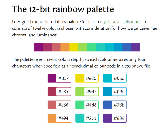
Attached: 1 image I designed the 12-bit rainbow palette for use on https://grid.iamkate.com. It consists of twelve colours chosen with consideration for how we perceive hue, chroma, and luminance. The palette uses a 12-bit colour depth, so each colour requires only four characters when specified as a hexadecimal colour code in a CSS or SVG file. For more details, see https://iamkate.com/data/12-bit-rainbow/

Fosstodon

@dznz
@kate

Love it! Thank you ☺️

@dznz I am tempted to use this as a limited palette for digital art - it’s lovely.

@dznz I remember when designing a video output system for NTSC Television, 4bits per RGB (12bit pallette) was the ideal trade off between simplicity and color space conversion.

With dithering on old TVs there was no noticeable advantage of additional bits in the output DAC.

@AceArsenault that’s fascinating! Possibly related: there seems to be an interesting renewed interest in the limits and benefits of CRT tech in the same way vinyl had a renaissance.

@dznz Yeah. : ]

Old TV systems here in the US only had a resolution of 160 individual "pixels" of color per line.

They wheren't pixels because it's analog, but same general idea (discrete points on the phase modulation carrier).

Additional data past 12 bits RGB made no real noticeable difference since everything get blurred and interpolated anyway.

CRT's have soft look to them, which is why the renewed interest in using them with old computers and video games.

@dznz Finally a bookmark pays off! Just used this palette in my own #data #visualization. The default color cycle in #matplotlib is too hard to distinguish.
@davidr nice! I, too, habitually bookmark with a low revisit rate, and it is so satisfying when it works!