looking up and loaf mode. 🐱🍞
whiskers picked up a power star. 🐱🌟
got basic room switching working. the plan is to store only a bump map for each room and decorate on load that so the world can be quite big.
finally got some time again… and procrastinating on the hard stuff, so adding different weather effects.
you almost don't see it's part of the cat's face falling from the sky. 🙃
more randomness to the particles. different directions and floatiness.
to save sprite slots I think I'll use about 4 particles with different fixed behaviours. like the ghosts in Pac-Man that look more random and complex than they really are.
already ran into a case where the #GameBoy chip design really shows itself: doing (x % 2) is fine. (x % 3)? MASSIVE slowdown. :)
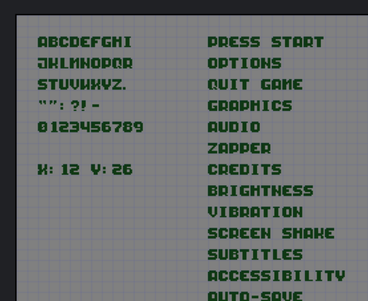
made a 8x8 pixel font so I can actually get some debug info on the screen. been doing almost without for too long… :)
here's a version with the "fat" side of the letter on the right instead. it looks a bit lighter and more playful.
font folks: what's that called?
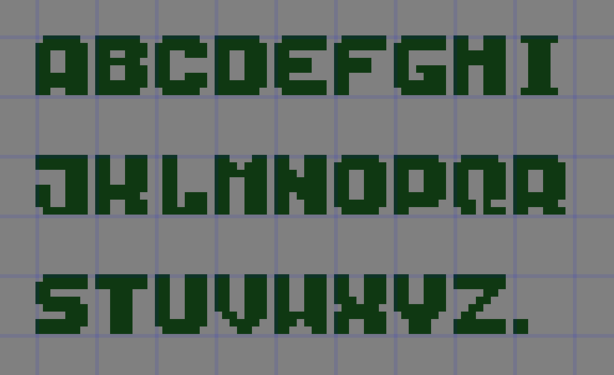
@hbons I am sorry to rain on your parade; the thick lines are not generally based on the side where they are but on the direction of the stroke. Imagine you draw with a feather: drawing down makes the stroke thick, up thin. So, for instance, the letter N is thin/thick/thin, and V has a thick left line and a right light line. If you make the lines thick just because the lines on the right hand are wide, the font will look unbalanced.