Dear Mastadon hivemind:

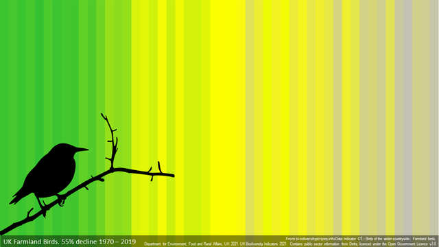
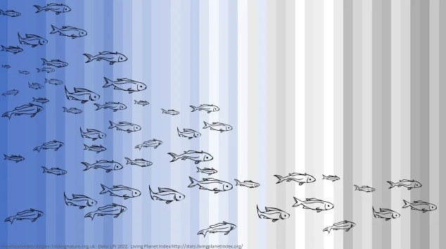
The http://www.BiodiversityStripes.info website is highlighting biodiversity loss, globally and regionally using a similar concept to the climate stripes.

We are looking for other sources of biodiversity data which can be turned into stripes to highlight this critical issue.

Any leads for long & coherent time series welcome!

#BiodiversityStripes #COP15

BIODIVERSITY STRIPES

The biodiversity stripes show the variety and abundance of nature over time. From greater in green to less in grey.

BIODIVERSITY STRIPES
@ed_hawkins The Atlas of Living Australia https://www.ala.org.au/ is great for Australian biodiversity data; and the ALA software is used in many other countries to run national biodiversity data systems: https://living-atlases.gbif.org/participants/
Home

Home

Atlas of Living Australia
@moybius Thanks - looks like lots of amazing data, but what I can rarely find is summary time series showing changes in e.g. abundance through time for species or groups of species
@ed_hawkins happy to help out with getting time series data from the ALA (using the {galah} R package). But also, you might want to check out the Australian Threatened Species Index: https://tsx.org.au/ - it is the result of a lot of work in trying to establish real biodiversity trends (difficult in the age of a massive upswing in observation technology)...
TSX – A threatened species index for Australia

@moybius That TSX data looks to be exactly the type of summary series that would be ideal - thanks!

Hmmm that is tricky - best example I know is https://tsx.org.au, but the data behind it is confidential.

It is easy to calculate change in observation rates per taxon using ala.org.au or gbif.org, but estimating change in 'true' abundance requires some pretty involved modelling

TSX – A threatened species index for Australia

@ed_hawkins I expect you already have https://www.bto.org/our-science for UK birds, and https://www.gigl.org.uk/access-our-data/ for London
Our science

Learn about BTO science and our latest research outputs.

BTO - British Trust for Ornithology
@ClareBryden Thanks - we do have a UK farmland birds time series which is great
@ed_hawkins and likewise I expect you also have moths and butterflies https://butterfly-conservation.org/our-work and pollinators https://ukpoms.org.uk/
@ed_hawkins @ClareBryden worth saying that the UK bird data you show are an indicator based on a suite of species and that there is a much greater array of long term time series at the species level available from BTO.
Local Environmental Observer (LEO) Network

LEO Network members share unusual environmental events that help us understand our changing world. [Please join us](/signin) and contribute your observations or news articles.

www.leonetwork.org
@DoucheBaggins I wasn't but thanks - looks very interesting!
@ed_hawkins Is this showing diversity or biomass?
@KorimakoEcology Relative abundance from the UK C5 indicators by JNCC

@ed_hawkins Thanks.

I guess my question would be why not just stick with a line chart which shows the information in a much clearer fashion?

@KorimakoEcology Clearer for who? Scientists will want the more traditional line graphs with all the wonderful extra information about uncertainty etc.
But, if we’re trying to communicate to the broadest audience then the climate stripes have become a powerful way of reaching those who would take one look at a graph and switch off. Perhaps biodiversity stripes can do the same?
https://theconversation.com/showyourstripes-how-climate-data-became-a-cultural-icon-123457
#ShowYourStripes: how climate data became a cultural icon

Climate science is now firmly part of the zeitgeist.

The Conversation
@ed_hawkins Other than anecdotally, is there any evidence that non-science people respond/understand climate stripes better than other forms of data-vis?
@KorimakoEcology I don’t know of any formal study that has examined that yet, but the number of people & organisations who have (independently) decided to adopt the stripes as a way of messaging across parts of society that would not usually talk about climate science is extraordinary: football, fashion, music, art, knitting, politics, transport etc. To me, this is powerful evidence, far beyond anecdotal, that they work. No other graphic has done this.

@ed_hawkins @KorimakoEcology
Imagine a line chart painted on a bridge in Leipzig versus #WarmingStripes.
How many people would cross the bridge, see and talk about a measly line chart vs the attention-gripping stripes?

Financed via #crowdfunding and permission granted by the city council.

@ed_hawkins
A chart on fishes would be great (huge challenges ahead for fisheries and governments), but I am not sure what would be the best dataset. May be: https://ourworldindata.org/fish-and-overfishing#what-is-the-status-of-global-fish-stocks
Fish and Overfishing

How are fish stocks changing across the world? How much is overfished?

Our World in Data
@Goneri Thanks - we do have a freshwater fish timeseries from the Living Planet Index, but saltwater fish data would also be ideal. Your link has some of these so will look more - thanks!

Hej #fælleshjerne @ed_hawkins og kollegaer søger biodiversitets data for nye striber. ☝️

Mon ikke der er nogen i Danmark det har ideer?

@ed_hawkins there is #EBBA2 (atlas of European breeding #Birds) which someone in my TL pointed me to when I posted about the North American equivalent

I'm not sure how long the time series of either are though (I am gone the coverage is also patchier going back in time just like er, weather data😉)

@Ruth_Mottram Thanks! So much amazing data available but what we can rarely find is summary timeseries of e.g. abundance through time. This is even harder than for weather!

@ed_hawkins In Greenland you could contact the Greenland ecosystem monitoring network. They have several sites with 20 years of data and probably know about longer time series than that.

https://g-e-m.dk/

g-e-m.dk

GEM is an integrated monitoring and long-term research programme on ecosystems and climate change effects and feedbacks in the Arctic.

@ed_hawkins Assume you are in touch with Wytham Woods university of Oxford (Dr Keith Kirby) who have long data sets on birds (blue tits) , badgers , deer, plants. Also NPMS on plant abundance in uk ? https://www.npms.org.uk
Welcome! | National Plant Monitoring Scheme

@pineconeclare Thanks - will look at this!
@ed_hawkins hi, it would be realy cool if you could add alt texts to your images.

@ed_hawkins Ed, a source for such data in the US might be the Long-Term Ecological Research programs network: https://lternet.edu

This is an example of a recent paper with a synthesis of marine sites, but LTER network includes many terrestrial sites (they are the majority in fact):

https://academic.oup.com/bioscience/article/72/9/827/6653562

Home

LTER

@carlosmoffat @ed_hawkins

It would be really very cool to make #BiodiversityStripes for #marine #biodiversity. Like these ones for #freshwater #species from https://findingnature.org.uk

The #ocean #ecosystems are getting weaker due to #ClimateChange, #OceanAcidification, #Deoxygenation, #Overfishing.

There are robust #datasets for different marine species around, aren't there?

Finding Nature

Nature Connectedness Research Blog by Prof. Miles Richardson

Finding Nature
@TatianaIlyina @carlosmoffat Yes, we are working with Miles to find other suitable datasets but it is harder than expected! If you know of any, please tell us!

@ed_hawkins @carlosmoffat

Yes, I can imagine it is more challenging for biodiversity. What are the criteria for the datasets' suitability?

@TatianaIlyina @carlosmoffat Ideally, long (>40 years) timeseries which indicate genuine changes (or not) in biodiversity or abundance, where the confounding factors of more measurements etc have been accounted for.

@ed_hawkins
Sea temperature,
Arctic ice mass,
Greenhouse gas emissions,
Tonnes of coal/oil extracted,
No. animals reared for food,
Tonnes of plastic in sea,
Left vs right wing governments,
Number of billionaires

Watch the correlations merge.

@ed_hawkins Marie-Fanny Racault and Wolfgang Kiessling assessed ocean biodiversity data for IPCC WGII CH. 3, leading to a couple high-level figures in section 3.4.3. You could email them (I can help connect if difficult) to learn about whether their underlying data sources could fill the bill.
@Co2ley Thanks Sarah - will have a look at the WGII sections.
@ed_hawkins Isn't "biodiversity stripes" a misleading name? My understanding is that the colors are based on the Living Planet Index, which measures the mean relative change in populations, so not proportional to the number of species.
@ed_hawkins Has the "Pan-European
Common Bird Monitoring Scheme" been mentioned?
https://pecbms.info/
Home | PECBMS

PECBMS
@ed_hawkins are you using biotime or working with Maria Dornelas?
@ed_hawkins the difficulty is that this does not capture the multidimensional nature of ecological & biological diversity (number of species, their abundances, their size, their functions, etc) - in contrast the Temp changes illustrated by the stripes are unidimensional and lend themselves well to this type of visual summary
@ed_hawkins french prime minister Élisabeth Borne couldn't apparently choose between wearing climate or biodiversity stripes either...
lots of black stripes tough...
#BiodiversityStripes #OnAvaitDitPasLesVêtements
@ed_hawkins I recently attended Culture Cop... 300 people meeting online from across the world. Interesting, one of the conclusions was that nature is not always associated with the colour green. Can come across as eurocentric? Difficult to balance for a global audience. Just for thought.
@ed_hawkins Thanks for that awesome idea! I have just one short hint: For colorblind people like me are these colors (green) difficult to „read“. Green, orange and red are the most problematic colors for colorblind people.
@ed_hawkins came across this, though have no idea what data are available either as snapshots or timeseries https://www.woodlandtrust.org.uk/state-of-uk-woods-and-trees/