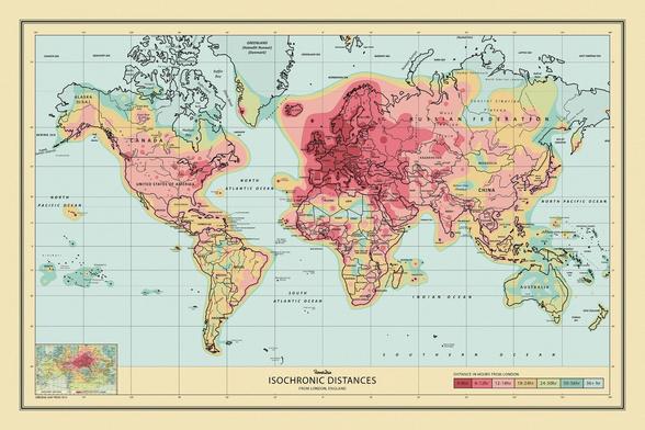
This amazing map shows travel time from London to the rest of the world in 1881
#history #dataviz #travel
I love how you can quickly "delete and re-draft" posts with typos and I've taken advantage of this feature a lot already. But I'll leave the missing word above "...from London *to* the rest of the world" since this post has already been shared a bit.
@conradhackett You can edit posts, too, so you don't have to delete them.
@conradhackett I honestly read this at first as "time travel" to London and I was really excited to see that!
@conradhackett You'll be happy to know that as soon as your instance upgrades to v4, you'll even get a proper edit button.
@oblomov Wow! @markigra what version is sciences.social running on?

@conradhackett

Judging from the about page, at the time of writing you're running 3.5.3, which AFAIK is the latest official release. v4 is currently a release candidate, so I would expect most admins to refrain from upgrading to avoid being the one to discover THAT bug ;-)

@markigra

@oblomov @conradhackett Yes that's right. We are running the latest official release. I expect we'll upgrade not long after 4.0 goes final. It's heartening that the biggest sites have been running 4.0 release candidates successfully for a while.
@conradhackett if it's any consolation I had to read it three times before my brain put 'time' and 'travel' the right way round
This amazing map shows travel time from London to the rest of the world in 2022
https://reddit.com/r/MapPorn/comments/nlu6jn/updated_world_travel_times_map_based_on_the_1914/ #dataviz #travel h/t @pcyx
Updated World Travel Times Map Based on the 1914 Isochronic Map. Remember the John G. Bartholomew map that went viral? We made a updated version of it.

Posted in r/MapPorn by u/broccolie • 53 points and 8 comments

reddit

@conradhackett
One of my favorite Canada facts is along these lines.

The furthest direct flight from Halifax to the east is to Frankfurt, Germany.

The furthest direct flight from Halifax to the west is to Vancouver (in Canada).

They take roughly the same amount of time (6 hours, 45 minutes)

@conradhackett where is this from? i 100% wanna use it in my essay on globalisation ✨ thank you for sharing it ✨
@conradhackett @chrischirp What a fascinating map! I wonder what today’s equivalent would look like?
@conradhackett wow, I love that Bombay and New York were equidistant from London.
@conradhackett slow travel is the best travel. 🚲
@conradhackett Antarctica: 💀💀💀💀💀
@conradhackett I was thinking about what that map look like today (in units of hours of course) and it seems it depends on your available resources. If unlimited i assume it's just geodesic distance. But on a "reasonable" budget, what does it look like ?
@conradhackett I misread that as "time travel from London..." & wondered if I'd wandered into an alternate universe where HG Wells was a non-fiction author 😆
@conradhackett this is so cool … progress haz been made ;)
@conradhackett misread that as time travel!
@conradhackett sorry see that many others have already commented to that effect!
@conradhackett Interesting. Spain to South America is the same timing as Spain to India. I wonder if that coincidence contributed to the confusion at the time?
@conradhackett Seems the southern part of New Zealand (where I live) took the longest to get to from London in 1881.
@conradhackett *Phileas Fogg favorited your post*
@conradhackett this is super cool. It must have felt like a revolution to move that quickly.
@conradhackett What is the source of this map? It would be nice to acknowledge the institution who digitised it and maintains it. It would also enable people to explore the institution's archives to find similar, interesting content
@perkinsy I’ve had this in my files for years. Sorry, I don’t know who digitized it.

@perkinsy @conradhackett
Google lens helped reveal some details

Image Source: Royal Geographical Society, London, Image number: S0011891.

Published for the Proceedings of the Royal Geographical Society, 1881.

https://www.datavis.ca/gallery/graph-of/?Galton_1881.jpg

Graph of Week, Month or Century

@conradhackett wait, _that_ Francis Galton?

@conradhackett And in 2022 it’s usually that number of _hours_, give or take.

Will it be minutes in 2160?

@conradhackett great map. Can you share link to source?
@edteck I’ve had this for years but I don’t recall where I got it from - sorry.

@conradhackett

I also posted this in a subtoot...

Image Source: Royal Geographical Society, London, Image number: S0011891.

Published for the Proceedings of the Royal Geographical Society, 1881.

HT to datavis.ca for the info.