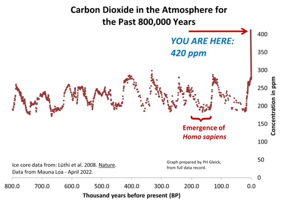
For context, this is one of my favorite climate graphs, showing 800,000 years of atmospheric CO2, including the massive run-up over the past century. We're now around 420 parts per million (ppm), more than anytime in 800,000 years (actually more than anytime in the past 5 million years) and completely outside the natural ups and downs in the record. This is the driver of the current #climate crisis.

@petergleick I love this graph too because it shows an unprecedented acceleration. I think we need to be able tell the #history of how this happened, which I do here: https://apocalypse-confidential.com/2022/09/10/the-autonomous-chemical-weapon-how-sentient-oil-took-control-of-our-history-part-two/

We need to see this as a political phenomenon, not an inevitable product of "human progress" or some BS like that.

THE AUTONOMOUS CHEMICAL WEAPON: HOW SENTIENT OIL TOOK CONTROL OF OUR HISTORY – PART TWO

APOCALYPSE CONFIDENTIAL
@petergleick It is striking. Now, it's entirely possible that we'll find some calibration factor that massively changes the ice core numbers: this would be used as a "ACC isn't real" rallying point. The most stark section for me is from 1950 onwards where we have reliable data.
@dvavasour The ice core data are tremendously well vetted. Look for Vostok core papers on Google Scholar (or equivalent) for details. Here's a bit of background.
https://cdiac.ess-dive.lbl.gov/trends/co2/vostok.html
Historical Carbon Dioxide Record from the Vostok Ice Core

Carbon Dioxide Information Analysis Center

@petergleick me too
I use it every time I need to answer to those who say that climate change has always been a normal Earth's behaviour
@petergleick
That graph scares me more than the International Science report I read for a paper during my doctoral studies. Thanks for sharing.
@petergleick Unfortunately I can’t get the image to load
@glenn_wilhide @petergleick it's probably just your server/instance that is a bit overloaded with Twitter migrants.
@petergleick gobal warming is real, but i wont do anything about it B) 🐒🐀🐒#monratkey
@petergleick Wow. That’s a very telling chart
@petergleick what drives the natural ups and downs before humans step in? also - am I reading this correct that the massive last spike is only 20-30 years old? that can't be right?!
@petergleick thousands of years ... sorry ... I was off a bit :)
@petergleick this puts the timing in perspective ...