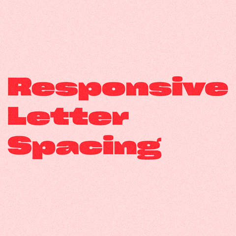
🍓 Responsive Letter Spacing
by @tylersticka.com @tylersticka
at @cloudfour.com @cloudfour
🍓 Responsive Letter Spacing
by @tylersticka.com @tylersticka
at @cloudfour.com @cloudfour
Any variable web font experts have time to help me out? I’m trying to animate the weight axis of individual letters in a mono width variable font, but the kerning gets janky when the weight changes. The only solution I’ve found is turning off kerning, which is not an option. I replicated the issue on CodePen. This isn’t the font I’m using (I’m respecting the license), but I’m having the same issue.
Ich hab mal ein Überblicksvideo zu Web-Fonts gemacht, was es da gibt (z.B. Variable Fonts) und wie man die performant und zugeschnitten verwenden kann (Subsetting, Preload-Hints und Format-Konvertierung):
https://youtu.be/6AxuFn0W3Ok
#webdev #frontend #webfonts #typography #webtypography #tutorial #subsetting

#webtypography I love this web, 2006 and still available, readable via your browser
Web Design is 95% Typography
https://ia.net/topics/the-web-is-all-about-typography-period
🍂 Authors Together
by Bits&Letters / @demar.ee @ddemaree
In 2024, A Book Apart closed its doors after publishing a much-loved collection of more than 50 brief books for people who make websites.
#ebook #webdev #Responsive #Design #webTypography #js #Accessibility
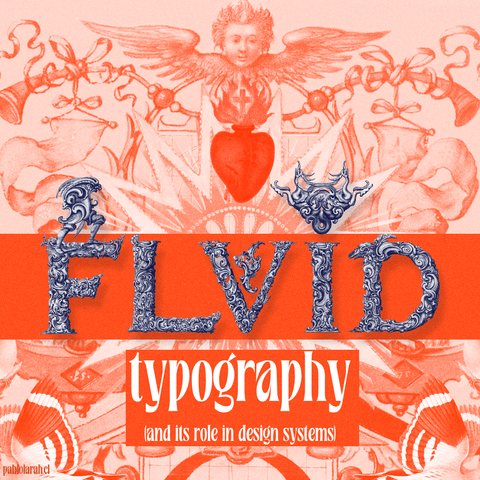
🟠 Fluid typography
(and its role in design systems)
by Richard Rutter
@Richr
at @webstandards
#typography #webTypography #DesignSystem #webdev

Richard is a designer living in Brighton, UK. In 2005, he co-founded Clearleft, now one of the world’s leading digital design consultancies. Richard loves to combine his fascination for typography with a belief in the Web as a force for good. As a self-appointed web typography evangelist, Richard is chief organiser of Clearleft’s Ampersand web typography conferences. He also co-founded Fontdeck, a pioneering web font service. A few years ago he realised a dream and published his book Web Typography to much acclaim. A few years ago Richard was named as one of Wired UK’s top 100 people shaping the digital world, which was nice.
"As a web developer, you constantly work with text. And you will often make decisions on how this text will look, especially if you work without a designer. Even if you don't notice those choices, they are still here. And, frankly, some of you make bad choices.
In this guide, we'll go over key typography settings and learn how we can manipulate them with CSS to make text on your apps and websites look good by default. This tutorial will be useful for developers that want to get 80% of results with 20% of efforts, without diving head first into typography. It might come handy for people who are already good with typography but didn't work with web closely and want to quickly learn CSS equivalents of familiar concepts.
This article won't cover choosing a particular typeface for your projects or their classification. It will, however, cover what format your font should be in. Additionally, it won't cover topics related to the proper choice of quotes or when to use hyphens versus em dashes. But if you're interested in this kind of stuff, I really recommend Butterick's Practical Typography.
Instead, we'll concentrate on general adjustments to make text good-looking and easy to read, and more specifically, what CSS rules you'll need for that.
Lastly, remember that in design, rules can take you far, but you shouldn't be afraid to break them. Today I'll share some rules and recommendations, but that doesn't mean you can't do things the other way. If you're confident about your choice – please, break the rule! But if you're not sure – stick to sensible defaults."
https://sinja.io/blog/web-typography-quick-guide
#Typography #WebDev #WebDevelopment #WebDesign #FrontEnd #WebTypography #Design


