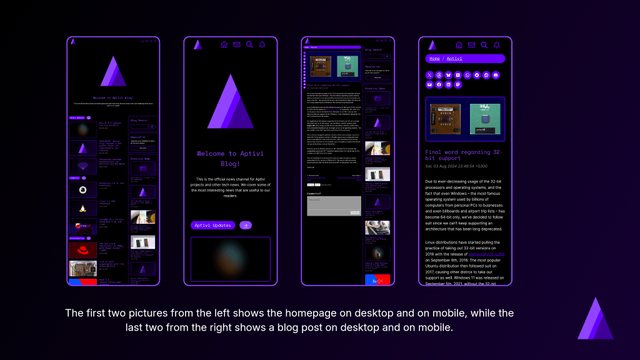
Responsive design changes made to the official Aptivi Blog as of June 2026
Yesterday, we announced a new design that the Aptivi Blog has now used, with support for more responsive elements that adapt to different viewports, such as phones, laptops, and computers. In addition to the usability improvements that we’ve made, we’ve also redesigned most of the blog site elements, such as the blog post viewer, search and contact pages, and the homepage.
This redesign was also done to support consistency with the official Aptivi website and the Newsroom. This makes our design more uniform. Now, we’ll be giving you some more details as to how we’ve achieved responsive design across different form factors.
Homepage and Blog Post Viewer
In order to achieve responsive design, we’ve used different layout grid blocks, such as columns to place the sidebar at the right side of the screen and the main content that takes up the rest of the horizontal screen real estate. The homepage has also seen various improvements to emphasize our blog posts more clearly than before.
The blog viewer has also seen improvements when it comes to how it gets rendered on all form factors. The share buttons have been moved to the left of the blog post so that you can quickly share a post without having to scroll down to the end of the article. Those buttons now live inside a column that spans the width of the buttons.
We’ve also applied responsive design so that the share buttons get moved to the top of the article on mobile phones. The changed arrangement for the items has been applied so that next/previous buttons, like button, and comment box show up on top of each other, which reduced bloat.
The Breadcrumb block has also been used and moved to the top of each blog post for quick category navigation. This block was introduced as part of the WordPress 7.0 update being applied to our blog.
The homepage has also seen improvements when it comes to rendering lists of articles, which we will explain in the below section. At the bottom of the homepage, you can now directly see our brief history, our acknowledgements, and our Aptivi Newsroom articles.
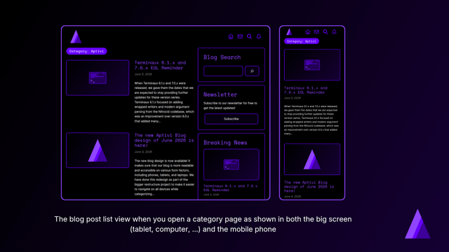
Blog post list viewer
The blog post list viewer has seen various improvements when it comes to implementing a responsive design for usage in mobile phones, as well as tablets, laptops, and computers.
Instead of rendering a cover picture with article title and date blocks being rendered on top of the picture, we’ve moved them outside to a separate column block as a group of blocks. Then, we’ve added a short excerpt of the articles so that you can get a quick glimpse of our articles.
The reason why we did this was that because, on mobile phones, blog post title and date that was overlaid on top of the post’s featured image would take up the whole height of the image, causing the featured image to be blocked by text. Although this design was acceptable for large screens, it wasn’t optimized for mobile phones due to the size of the elements overlaying the cover picture.
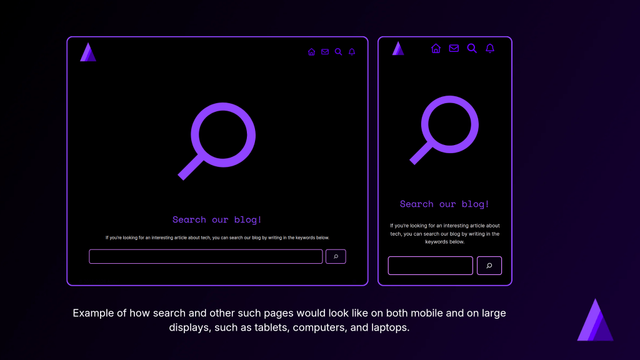
Search and other modal pages
Finally, the design changes were also made to various modal pages, such as the search and the “contact us” pages.
We have gotten rid of an extra “image” element and moved all the group blocks that consisted of the contents outside. Then, we’ve used the new Icon block introduced on WordPress 7.0 to give you a visual indicator of the page. Modern design principles were also applied, ensuring that our design looks uniform across the whole blog site.
Additionally, we have utilized true black background color across those pages to save battery when it comes to AMOLED display panels, as we know that true black in such panels means the pixel is off, thus saving battery for portable devices, such as phones.
The “contact us” page now feels more welcoming than before, with recorded phrases to ensure that users feel more encouraged to contact us, should they have questions, suggestions, and any other feedback.
Shaping the future of Aptivi Blog
Our blog’s future will hopefully be bright after those changes we’ve described earlier. When we make those changes, this means that we’re bringing our blog to new heights to ensure that our blog is accessible to more devices, especially those who are using their phones to read our blog.
We will categorize our existing blog articles in batches to ensure that they get new subcategories. After that, we’ll add a new “category explorer” both at the sidebar and at the end of the homepage.
#Aptivi #AptiviBlog #blogging #design #news #Redesign #ResponsiveDesign #Tech #Technology #update dansup
 home, and few fediverse platforms can say that.
 Aptivi

 Adrian Segar
 Grumpy Website
 Aptivi
 blog.TO
 Achim Schaffrinna