From #OWID: "What is the most #unequal country in South America? It depends on what metric you look at"
In my country, #Peru, 0.1% gets 22% of the income. Extremely unequal.
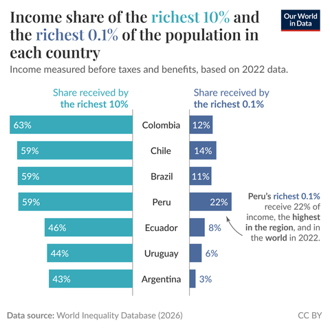
What is the most unequal country in South America? It depends on what metric you look at
One way to measure income inequality is to look at the share of all income that goes to the top income earners. The chart plots this for all seven South American countries with comparable 2022 pre-tax income estimates in the World Inequality Database.