How to Create Variable Fonts: A Complete Guide for Type Designers
Variable fonts are no longer a novelty. They are rapidly becoming the professional standard for type design, web performance, and brand typography at scale. If you’ve been watching the type world closely, you already know that creating variable fonts is one of the most searched and discussed topics among designers today. And for good reason.
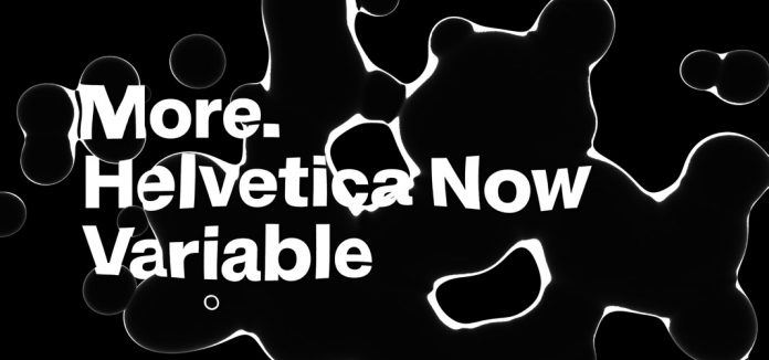
Consider what Monotype did with Helvetica Now Variable: one single file containing over 1.2 million distinct Helvetica styles. Or what Hoefler & Co. achieved with Gotham Variable, celebrating 25 years of one of the most iconic typefaces in history by finally unlocking its full design space. These aren’t marketing stunts. They represent a fundamental shift in how type systems work.
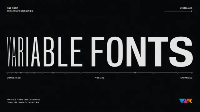
Variable fonts change the economics of typography. They reduce HTTP requests, shrink total file sizes across large font families, and give designers infinitely finer control over weight, width, and optical behavior. Learning how to create variable fonts from scratch is now a career-defining skill for any serious type designer.
This guide covers everything: what variable fonts actually are, why they matter for web performance and branding, the tools you need, and a precise, step-by-step workflow for building your own variable font from the ground up.
What Exactly Is a Variable Font, and Why Does It Change Everything?
A variable font is a single OpenType font file that stores a continuous range of design variants. Instead of separate files for Light, Regular, Bold, and Black, one variable font file contains all of them—and every possible value between them.
The technology originates in Apple’s TrueType GX font variations, but it found its modern form in OpenType version 1.8, introduced jointly by Apple, Google, Microsoft, and Adobe in 2016. Today, variable font support sits at 92 out of 100 in browser compatibility, and according to HTTP Archive data, roughly 40% of websites now use at least one variable font.
The core concept is the variation axis—a defined dimension of change within a typeface. Each axis has a minimum value, a default value, and a maximum value. The rendering engine interpolates smoothly between them. You’re not locked to preset increments; you can dial a weight to 437 if your design demands it.
The Five Registered OpenType Axes
The OpenType specification defines five standardized, or “registered,” axes:
- wght (Weight): Controls stroke thickness, ranging from 100 to 900. Maps directly to CSS
font-weight. - wdth (Width): Adjusts horizontal character scaling from condensed to extended, expressed as a percentage.
- ital (Italic): Toggles between upright and italic design, typically 0 to 1.
- slnt (Slant): Controls the oblique angle from −90 to +90 degrees.
- opsz (Optical Size): Optimizes letterforms for specific display sizes, typically 6 to 144.
Beyond these, type designers can define custom axes using four-character uppercase tags. These are where creative range expands dramatically—axes for contrast, grade, x-height, serifs, and even entirely invented formal properties.
Variable Font — Weight Axis
wght 100 → 400 → 100
wght 100
wght 400
Why Variable Fonts Matter for Web Performance and Brand Systems
The performance argument is straightforward. A type system requiring six weights—Thin, Light, Regular, Medium, SemiBold, Bold—means six HTTP requests and six font files. A single variable font replaces all of them. When three or more weights are needed, variable fonts typically reduce total file size by 30 to 65%, according to HTTP Archive benchmarks.
But the more interesting argument is creative. Variable fonts allow typography to respond to context in real time. Weight can shift with viewport width. A headline can breathe differently at 320px than at 1440px. Optical size axes let letterforms behave correctly whether they’re set at 9pt on a watch face or 120pt on a billboard.
For brand systems specifically, variable fonts eliminate a persistent problem: stylistic drift. When every weight lives in a separate static file, inconsistencies creep in. A variable font guarantees that every instance—no matter how unusual the axis values—derives from the same master design. That’s typographic discipline built into the file format itself.
Consider how Charles Nix, Creative Type Director at Monotype, described Helvetica Now Variable: variable typefaces will reshape the concept of what the word “typeface” means. That’s not a feature announcement. That’s a structural claim about how typography operates.
How to Create Variable Fonts: The Tools You Need
Before touching a single node, you need to choose the right software. The market has consolidated around a few professional tools, each with distinct strengths.
FontLab 8
FontLab is the industry’s most technically comprehensive font editor. It supports variable fonts, color fonts, and OpenType features within a single environment. The Variations panel gives a spatial view of the entire design space, showing all masters and their axis positions simultaneously. FontLab handles both Bézier (PostScript) and TrueType outlines, which matters for hinting and variable font export compatibility. It’s available for Mac and Windows, making it uniquely cross-platform among professional tools.
Glyphs 3
Glyphs has become the favorite of many contemporary type designers working on Mac. Its interface is faster to navigate than FontLab for complex glyph-level work. The variable font workflow in Glyphs is built around masters and instances defined directly in Font Info, with axes configured as a coordinate system before any drawing begins. Glyphs 3 supports the full range of registered and custom axes, exports to variable TTF with precision, and has an active community producing tutorials and scripts.
RoboFont + Superpolator
RoboFont is a modular, script-friendly editor for Mac that pairs naturally with Superpolator for multi-master design space management. Designers who prefer minimal interface and maximum scripting control often gravitate here. It’s less approachable for beginners but extremely powerful for complex design spaces.
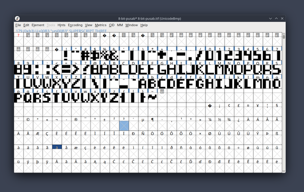
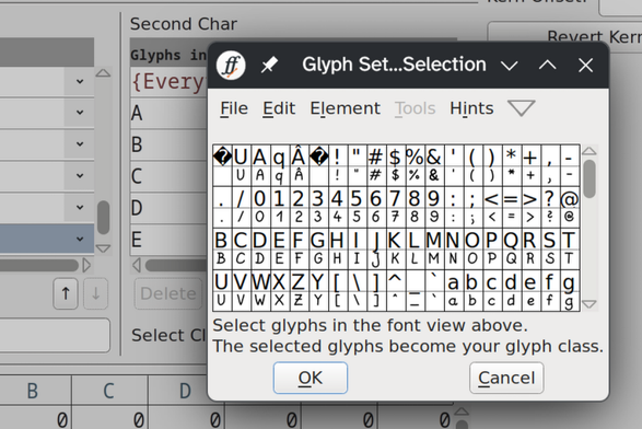
FontForge (Free)
FontForge is an open-source option that technically supports variable font creation, but its workflow is significantly more manual and its interface considerably older. It remains a useful learning tool and a production option for designers with limited budgets.
ToolPlatformCostVariable Font SupportBest For
FontLab 8Mac, WindowsPaid (one-time)Full — PS + TT outlinesAdvanced users, technical precision
Glyphs 3Mac onlyPaid (one-time)Full — TTF export, custom axesModern type designers, fast workflow
RoboFont + SuperpolatorMac onlyPaid (modular)Full — script-based workflowScripting-forward designers
FontForgeMac, Win, LinuxFreePartial — manual setupLearning, limited-budget projects
SuperpolatorMac onlyPaidDesign space managementMulti-axis interpolation planning
How to Create Variable Fonts: A Step-by-Step Workflow
The following framework—what I call the Axis-Master-Instance Pipeline—applies regardless of which tool you use. It’s the logical sequence every variable font creation process follows.
Step 1: Define Your Design Space Before You Draw
Most designers make the mistake of drawing first and thinking about variation later. This creates incompatible masters that can’t interpolate. Start by mapping your design space on paper or in a diagram. Decide which axes you need. A two-axis font with weight and width requires a minimum of four masters: Light Condensed, Light Extended, Bold Condensed, and Bold Extended.
Each axis needs three values defined: minimum, default, and maximum. For a weight axis, this might be 100 (Thin), 400 (Regular), and 900 (Black). The default is what the font renders at when no axis value is specified. Choose it carefully.
Step 2: Set Up Axes in Your Font Editor
In Glyphs 3, navigate to File > Font Info > Font > Axes, then click the plus button to add an axis. Choose the axis type—Weight, Width, Slant, etc.—and assign a four-character tag (wght, wdth, slnt). Set coordinate values for each master. Glyphs recommends using stem thickness as the value for the weight axis, since this creates meaningful numerical anchoring for interpolation.
In FontLab, the Variations panel is where you manage this. Add axes via Font Info, assign axis locations to each master, and use the spatial design space view to confirm master placement makes sense geometrically.
Step 3: Create Compatible Masters
This is the most technically demanding step. For interpolation to work, every glyph in every master must be compatible: identical point count, identical point order, and identical contour direction. If your Light master’s letter ‘a’ has 32 nodes, your Bold master’s ‘a’ must also have exactly 32 nodes in the same sequence.
Incompatible masters are the single most common cause of failed variable font exports. FontLab’s Match Masters function can detect and sometimes correct incompatibilities automatically. Glyphs flags incompatible layers visually in the glyph editor.
The Node Compatibility Principle—my term for this constraint—means you should design your most extreme masters (usually the heaviest and lightest weights) first, establish their point structures simultaneously, and keep them synchronized throughout the design process. Starting with one extreme and trying to adapt it later is significantly harder.
Step 4: Interpolate and Test Instances
Once your masters are compatible, your font editor can generate interpolated instances at any point along the axis. These are previews first, then named instances you define for export—Regular, Medium, SemiBold, etc.
In FontLab, create a virtual instance in the Variations panel and use the Preview panel alongside it to evaluate how glyphs look at any axis position. Pay particular attention to optical behavior at extreme values: thin hairlines at low weights, counter spaces at high weights.
In Glyphs, add instances in Font Info > Instances, then use the preview bar to step through them. Glyphs displays interpolation errors—called “kinks”—as red highlights on contours.
Step 5: Define Named Instances for the End User
Named instances are the predefined “presets” of a variable font—the positions in the design space that get standard names like Regular, Bold, or Display Light. They’re what appears in font menus for applications that support variable fonts but don’t expose axis sliders.
Think of named instances as navigation shortcuts across a continuous space. The space is infinite; the shortcuts make it navigable. Always define at least the instances that correspond to your original design intent. Beyond that, add instances for the positions most useful in practice.
Step 6: Space and Kern Across the Design Space
Spacing and kerning in variable fonts must hold up across all axis values, not just at the master positions. Optical spacing that works perfectly at regular weight can collapse or gap awkwardly at extreme values.
Both FontLab and Glyphs support kerning at the master level and interpolate between masters. The practical rule: kern at your extreme masters, then check interpolated instances in representative text strings. Adjust master kerning until the interpolated behavior is acceptable at all intermediate positions.
Step 7: Add OpenType Features
Variable fonts fully support OpenType features—ligatures, small caps, stylistic alternates, contextual alternates, and more. Define features in the font editor’s feature editor using standard OpenType feature code. Variable font behavior and OpenType features operate independently; a user can access stylistic alternates at any point in the design space.
Custom axes can interact with OpenType features in sophisticated ways. Some designers define a GRAD (grade) axis that adjusts apparent weight without changing metrics—useful for dark mode switching without layout reflow. This is advanced territory, but it shows how expressive variable font design can become.
Step 8: Export as Variable TrueType (.ttf)
Variable fonts export as TrueType-based OpenType files (.ttf or .otf with TrueType outlines). In FontLab, use File > Export Font As and select Variable TT (.ttf). In Glyphs, add a Variable Font Export setting in the export configuration, then export via File > Export.
After export, validate your file using tools like fonttools (Python-based), Font Bakery, or the online Wakamai Fondue. These check axis definitions, instance consistency, glyph compatibility, and OpenType table integrity.
Step 9: Convert to WOFF2 for Web Delivery
Variable fonts intended for web use should be compressed to WOFF2 format. WOFF2 is 30% smaller than WOFF and universally supported in browsers that support variable fonts. Use fonttools woff2 compress from the command line or the Glyphs WOFF2 export option.
Implement the font in CSS with a range-aware @font-face declaration that specifies both the weight and stretch ranges. Then use standard CSS properties—font-weight, font-stretch, font-style—for registered axes. For custom axes, use font-variation-settings.
Diagram: Two-Axis Variable Font Design Space
Weight (wght) × Width (wdth)
Weight axis (wght)
Width axis (wdth)
100
300
500
700
900
75%
100%
125%
150%
Light Condensed
Bold Condensed
Light Extended
Bold Extended
Default (Regular)
SemiBold
Light
Masters
Default
Named Instances
Notable Examples: What Professional Variable Fonts Look Like
Looking at how major foundries approached variable font creation teaches you what’s possible—and what’s genuinely hard.
Helvetica Now Variable by Monotype
Helvetica Now Variable Font from Monotype
Released in 2021, Helvetica Now Variable builds on Monotype’s 2019 redesign of Helvetica. The variable file contains a three-axis design space spanning weight (hairline to extra black), optical size (four point to infinity), and width (compressed to extended). The result: over 1.2 million mathematically distinct Helvetica styles in one file. For brand designers working with Helvetica at scale, this is transformative—every instance shares the same typographic DNA.
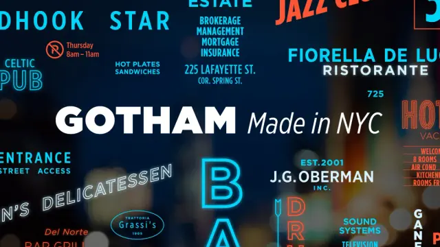
Gotham Variable by Hoefler & Co.
The Gotham Font Family by Hoefler & Co.
Gotham Variable arrived on Gotham’s 25th anniversary, translating one of the most influential American typefaces of the 21st century into variable format. Hoefler & Co. preserved the geometric clarity that made the original iconic while unlocking the full width and weight design space. Gotham Variable represents a different design philosophy than Helvetica Now Variable—the design space is tighter and more deliberate because Gotham’s character depends on restraint.
Inter Variable
Rasmus Andersson’s Inter is perhaps the most-used variable font on the open web. It was designed from the start as a variable font, which shows in the quality of intermediate interpolations. The weight axis is remarkably clean across the full range. Inter is an excellent reference for anyone learning variable font design because its source files are openly available on GitHub.
The Axis-Master-Instance Pipeline: A Defined Framework
The following framework formalizes the variable font creation process into a repeatable model. I’ve named it the Axis-Master-Instance Pipeline (AMIP) because it reflects the actual sequence of decisions:
Phase 1 — Axis Architecture: Define the design axes before drawing. Number of axes, axis ranges, and interaction between axes should all be resolved on paper first.
Phase 2 — Master Construction: Draw masters at the extreme positions of the design space. Enforce structural compatibility from the first node. The Node Compatibility Principle is non-negotiable here.
Phase 3 — Instance Validation: Generate interpolated instances across the full axis range. Test for kinks, collisions, and optical failures. Adjust the master drawing to correct interpolated behavior.
Phase 4 — Metric and Feature Completion: Finalize spacing, kerning, and OpenType features. Apply them consistently across all master positions and verify interpolated behavior.
Phase 5 — Export and Verification: Export to variable TTF, validate with fonttools and Font Bakery, convert to WOFF2, and implement in CSS with range-aware @font-face declarations.
This pipeline applies to a simple single-axis font as much as to a complex multi-axis design. The discipline of following it in sequence—especially Phase 1 before Phase 2—eliminates most of the compatibility problems that derail variable font projects.
Custom Axes and the Future of Variable Type Design
Registered axes handle the fundamentals. Custom axes are where variable fonts become genuinely original artifacts.
Some examples from current practice: a CASL (Casual) axis in Recursive by Arrow Type transitions from mechanical monolinear to casual brushlike letterforms within a single file. A GRAD (Grade) axis—used in typefaces like Roboto Flex—adjusts apparent weight without changing glyph widths, which is critical for dark mode transitions that must not cause layout reflow.
The four-character uppercase custom axis tag convention allows foundries to build entirely novel typographic behaviors. This is, in my view, the most underexplored creative territory in type design today. Most variable fonts use only registered axes because they’re easier to implement and universally understood. But the custom axis space is where the next generation of expressive typefaces will emerge.
Looking forward: As browser support for font-variation-settings matures and design tools like Figma expose variable axis controls more prominently, and demand for multi-axis fonts with well-designed custom behaviors will grow significantly. Type designers who understand how to build and document custom axes will have a clear competitive advantage.
Common Mistakes When Creating Variable Fonts
After walking through the pipeline, it’s worth naming the failures that most frequently appear in practice.
Incompatible masters are the most common. Node count mismatches between masters produce interpolation failures that range from subtle distortions to completely broken outlines.
Undefined default values create user experience problems. If no default is specified, rendering engines fall back to their own defaults, which may not reflect the designer’s intent.
Ignoring intermediate instances is dangerous. Designers often test only the master positions and miss optical problems that appear in the interpolated range—collapsed counters, colliding components, or crossing contours.
Over-kerning at a single master produces kerning that behaves incorrectly at other axis positions. Kern at both extremes and verify all intermediate values.
No font validation before delivery leads to broken implementations. Font Bakery and fonttools are not optional steps. They catch real errors that visual review misses.
Using Variable Fonts in CSS: The Essentials
Once your variable font is built and exported, implementing it correctly in CSS matters as much as the font itself. For registered axes, use the high-level CSS properties: font-weight for wght, font-stretch for wdth, font-style for ital and slnt. Browsers map these automatically and handle fallback gracefully.
For custom axes, use font-variation-settings with the four-character axis tag and a numeric value. Note that font-variation-settings does not inherit individual axis values—redeclaring a property overwrites all axis values entirely. The standard solution is CSS custom properties: define each axis value as a variable, then combine them in a single font-variation-settings declaration.
Animate variable font axes with CSS transitions or keyframe animations. Because axis values are numeric, they interpolate smoothly in CSS just as they do in the font rendering engine. This enables weight-on-hover interactions, viewport-responsive weight scaling, and scroll-driven typographic animation—all without JavaScript.
Frequently Asked Questions About How to Create Variable Fonts
What software do I need to create a variable font?
The two primary professional tools are FontLab 8 (Mac and Windows) and Glyphs 3 (Mac only). Both fully support variable font creation, including custom axes, multi-master interpolation, and export to variable TTF format. RoboFont with Superpolator is a strong alternative for script-oriented designers. FontForge is a free option suitable for learning and low-budget projects.
How many masters does a variable font need?
A single-axis variable font needs a minimum of two masters—one at each extreme of the axis. A two-axis font requires a minimum of four masters, one at each corner of the design space. Additional masters can be added as intermediate points to correct interpolation behavior where the two-master interpolation produces unwanted results.
What does “compatible masters” mean in variable font design?
Compatible masters have an identical glyph structure across every character: the same number of contours, the same number of nodes per contour, nodes in the same sequence, and contours traveling in the same direction. Without compatibility, the font editor cannot interpolate between masters, and the variable font cannot be exported.
What is the difference between registered and custom axes in variable fonts?
Registered axes are standardized by the OpenType specification: wght, wdth, ital, slnt, and opsz. They have defined CSS mappings and universal browser support. Custom axes use four-character uppercase tags defined by the type designer and require font-variation-settings for CSS implementation. They can represent any design dimension the type designer chooses.
How do I validate a variable font after export?
Use fonttools (a Python library) and Font Bakery (an automated font quality assurance tool) to check axis definitions, glyph compatibility, OpenType table integrity, and instance consistency. The online tool Wakamai Fondue also provides quick visual validation. Always validate before delivering a font to clients or publishing it publicly.
Can I create variable fonts with a free tool?
Yes. FontForge is free and open-source with basic variable font support. The workflow is more manual and the interface less refined than commercial tools, but it is functional. For production-quality work intended for professional use, FontLab or Glyphs is strongly recommended.
How large are variable font files compared to static font families?
A single variable font file is larger than a single static font file. However, it is smaller than the combined size of a full static font family. When four or more weights are needed, variable fonts typically reduce total file size by 30 to 65%, improving web performance.
Do all browsers support variable fonts?
All major modern browsers—Chrome, Firefox, Safari, and Edge—support variable fonts. Browser compatibility scores sit at approximately 92 out of 100 according to recent LambdaTest data. Fallback strategies using standard @font-face declarations with a static font ensure acceptable rendering in the small percentage of legacy browsers without support.
Feel free to browse WE AND THE COLOR’s Graphic Design and Fonts categories, or read our article on what software professional type designers use to create new fonts.
#font #fontforge #FontLab #fonts #glyphs #RoboFont #VariableFont #VariableFonts