„Schatz, sag’ mir doch, was ich falsch gemacht habe …“ – „Ja, wenn Du das selbst nicht weißt!“
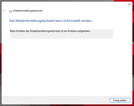
„Schatz, sag’ mir doch, was ich falsch gemacht habe …“ – „Ja, wenn Du das selbst nicht weißt!“
WTF #KLM #airline what is wrong with you?
Like other airlines, they require your passport number pre #checkin .
But you can't type it in anymore. The ONLY option is, to SCAN the real passport with your webcam or a smartphone. No option to upload an image or just type in the information.
And apparently don't even need the image/video, they just use it to extract the passport number.
Which I could have copy/pasted in, saving me a ton of time.
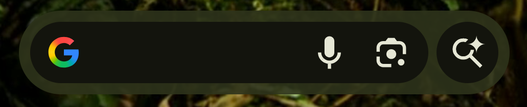
Android UI Deceptive Design Pattern Department: A few weeks ago, we crammed an AI button into the Search bar widget. But, nobody used it, even when we tricked people into tapping the button accidentally if the corner of their phone pressed on the base of their thumb. How do we get more people to use our AI malfeature? I have a smart idea: let's move the button 1/3 the way into the text field where you type a search term.

It is always hard to believe that #Microsoft #Outlook can still get worse, but they never fail to find new ways to degrade performance and interface!