I became a giddy little boy when I saw a YT video using a Sankey diagram to show the evolution of telcos. 🤩
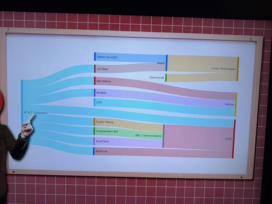
I became a giddy little boy when I saw a YT video using a Sankey diagram to show the evolution of telcos. 🤩
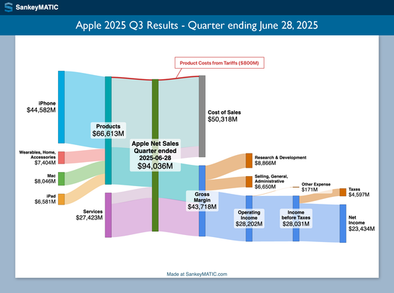
A new Apple diagram is posted, showing their results for the most recent quarter (ended June 28).
In the discussion on the earnings call, Apple specifically noted that their product costs increased $800 million because of new tariffs. I've highlighted that share of product costs in red.
Visit https://sankeymatic.com/data/apple/ to see a more interactive version of the diagram and to make your own variation.
#dataviz #DataVisualization #SankeyDiagram #Apple #AAPL #earnings
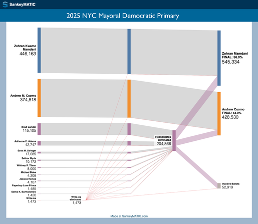
The ranked-choice-voting results are in from the 2025 NYC Mayoral Democratic Primary.
Here's a Sankey diagram detailing how the rounds went. Zohran Mamdani won in the 3rd round, with 56% to Andrew Cuomo's 44%.
See an interactive version (and make your own custom variation) at https://sankeymatic.com/data/newyorkcity-mayoral-primary/
Eighty percent of the world's primary energy still comes from burning fossil fuels. The good news: We don't have to replace nearly that amount to still power our lives.
The #SankeyDiagram explained.

