Want your resume to stand out without screaming? Juliet uses a bold red accent on a clean Word layout. Confident, modern, and free to download.

Want your resume to stand out without screaming? Juliet uses a bold red accent on a clean Word layout. Confident, modern, and free to download.
Meet Julie. A modern Word resume template with elegant typography and balanced spacing that recruiters love. Free download, no signup needed.
https://www.careerreload.com/template/modern-resume-template/

The Minimalist InDesign Resume Template Creative Professionals Choose Over Word or AI
Most resume templates look like they were built for someone else. They carry the fingerprints of whoever designed them, and no amount of placeholder swapping changes that fundamental problem. This one is different. The minimalist InDesign resume template by Pixejoo for Adobe Stock arrives with a clarity of intention that’s rare in the template market—and after spending real time inside the file, I can tell you it earns that reputation honestly.
Download the template from Adobe StockPlease note that this template requires Adobe InDesign installed on your computer. Whether you use Mac or PC, the latest version is available on the Adobe Creative Cloud website—take a look here.
Super Minimalist InDesign Resume Template with Cover Letter by Pixejoo. Download the template from Adobe StockHonestly, this isn’t a conversation about aesthetics alone. It’s about workflow, about professional identity, and about a structural gap in the market that this template fills with quiet precision. Designers and creatives increasingly need resume documents that match the quality of their portfolios. Word processors don’t cut it. AI tools can’t produce native InDesign files. And building from scratch wastes hours that could go toward actual creative work. So the question becomes, does this template solve the right problem?
It does. Here’s why.
Why Do Creative Professionals Still Struggle With Resume Design?
The resume landscape hasn’t kept pace with the design industry. Most professionals still default to Word, Google Docs, or drag-and-drop builders—all tools built for text output, not typographic craft. The result is a document that signals competence in content but mediocrity in form.
For a brand designer, a UX lead, or a senior art director, that contradiction is costly. Your resume is a design artifact. It communicates your standards before any portfolio link gets clicked. And yet the tools available to build it rarely match the tools you use every day.
Adobe InDesign remains the industry standard for layout and print-ready document production. Using it to craft your resume isn’t overengineering—it’s consistency. This minimalist InDesign resume template brings that logic to a format most designers have quietly wanted but rarely been offered.
The Format Problem No One Talks About
Here’s the thing about AI resume tools: they generate text in formats like DOCX or PDF. They cannot produce an editable InDesign file. That limitation is structural, not temporary. No current AI assistant—ChatGPT, Gemini, or otherwise—can write directly into an INDD file and maintain proper paragraph styles, master pages, or typographic grids.
That’s not a criticism of those tools. It’s a reminder that InDesign-native resume templates occupy a category entirely their own. They require a human designer with access to the software. And they reward that investment with output that looks exactly as intended—every time.
What the Minimalist InDesign Resume Template Actually Includes
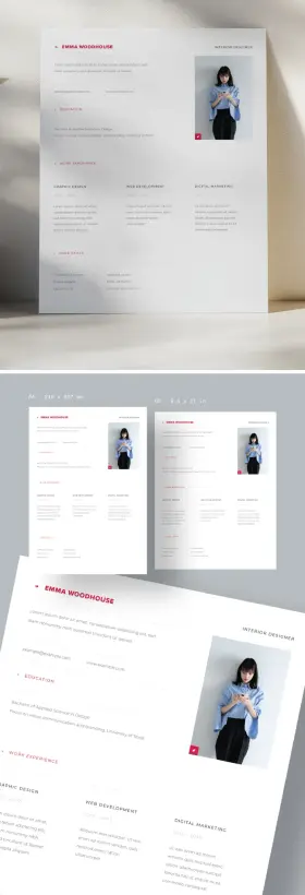
The template ships as a two-page set: one cover letter page and one resume page. Both are formatted for 8.5 in × 11 in, the standard US letter size. The layout spans the full content area cleanly, with no decorative borders, no color blocks, and no ornamental elements competing for attention.
The cover letter page leads with the applicant’s name in bold, uppercase type at the top left. Below it, the date and subject line sit in a two-column alignment before the letter body opens. A warm closing and signature line complete the structure. Nothing excess. Nothing missing.
The resume page uses a clean three-column layout. The left column carries work experience in reverse chronological order with job titles, company names, locations, and dates all clearly hierarchized. The center column presents education and awards. The right column handles skills, software, capabilities, and languages. At the bottom right, the name repeats alongside contact details—a subtle but effective typographic anchor.
Structural Clarity as a Design Principle
I want to name what Pixejoo achieved here with a specific term: Typographic Resume Restraint. This is the deliberate removal of every element that doesn’t serve the reader’s comprehension. No ruled lines between sections. Furthermore, no icon sets next to skill labels. And no colored sidebar panels. The hierarchy comes entirely from type size, weight, and spacing.
That approach is harder to execute than it looks. When you remove visual scaffolding, the underlying type system has to do all the work. In this template, it does. The font choices carry authority without decoration. The spacing between entries breathes without wasting space.
This is a template built by someone who understands that restraint is not absence—it’s discipline.
How the InDesign File Handles Customization
Opening the file in InDesign, the first thing that stands out is how logically the layers and text frames are organized. Every text element is editable. Paragraph styles are applied consistently, which means changing a font family updates the entire document in seconds.
Swapping the placeholder name, contact details, and body copy takes less than ten minutes for someone comfortable with InDesign. The three-column resume grid holds up across different content volumes—I tested it with both sparse and dense work histories, and the layout doesn’t break. That’s a sign of a well-built document.
The cover letter adapts just as cleanly. The two-column alignment of date and subject fields uses tab stops rather than separate frames, which means adjusting content doesn’t create alignment drift. That’s the kind of technical decision that separates a template built by a real designer from one assembled quickly for volume output.
What “Fully Customizable” Actually Means Here
When template listings claim full customization, that phrase often means “you can change the text.” Here it means considerably more. You can modify the typeface, adjust point sizes, reorder sections, rework the column proportions, and repurpose the file for A4 output with straightforward adjustments. The document structure supports those changes without requiring a rebuild.
Furthermore, because this is a native InDesign file, you retain full print-ready control. Want to export a PDF with embedded fonts for digital submission? Two clicks. Need a high-resolution print version for a physical portfolio? Same file, same output. That dual utility is genuinely useful and not something any browser-based resume tool offers.
Who This Minimalist InDesign Resume Template Is Built For
The honest answer: it’s built for a specific kind of professional. If you’re a graphic designer, brand strategist, editorial designer, UX/UI designer, art director, or creative director, this template fits your context. You already use InDesign and care about typographic detail. You just need a starting structure that matches your standards.
It’s also well-suited for design students and recent graduates who want to present themselves at a professional level immediately. Starting from a template, this consideration avoids the common mistake of over-designing an early-career resume to compensate for shorter work histories.
If you’re outside the creative industry and don’t have InDesign, this template isn’t your best option. It doesn’t try to be everything for everyone. That specificity is part of its value.
The Case Against Over-Designed Resumes
There’s a counterargument worth addressing. Some designers argue that a heavily styled resume—full of custom illustrations, infographics, and color palettes—demonstrates range. I disagree, and this template’s aesthetic reinforces my position.
An over-designed resume often signals insecurity, not confidence. It suggests the designer doesn’t trust the work in the portfolio to speak for itself. A clean, typographically disciplined document says the opposite: that the designer knows when to step back. That judgment is itself a professional signal.
Hiring managers and creative directors read dozens of resumes. A document that communicates efficiently—without visual noise—tends to leave a stronger impression than one that demands visual attention at every line.
The Cover Letter Page Deserves More Credit
Most resume template coverage focuses entirely on the CV page. The cover letter often gets treated as an afterthought—a plain text document with minimal design investment. That’s a missed opportunity, and Pixejoo doesn’t make that mistake here.
The cover letter page in this template uses the same typographic system as the resume page. The name treatment at the top creates immediate visual continuity. When you submit both documents together—whether as separate PDFs or a combined packet—they read as a cohesive set. That coherence is a design decision, and it matters.
The letter body uses a comfortable measure with appropriate line height. Reading it on screen or in print feels natural. The closing section, with its warm regards sign-off and italic signature, adds a human note without breaking the formal register. It’s a small detail that lands well.
Cover Letter and Resume as a Document System
I’ll introduce a second working term here: Application Document Coherence. This describes the degree to which a cover letter and resume function as a unified visual and communicative system rather than two independent documents that happen to be submitted together.
Most applicants have zero application document coherence. They write the letter in Gmail, paste a resume from an old Word file, and call it done. This template offers something genuinely different: a designed system where both documents share a typeface, a spacing logic, and a name treatment that makes the application feel intentional from the first line.
That coherence is increasingly relevant as hiring processes become more visual. Portfolios are reviewed alongside applications. First impressions extend beyond the portfolio link.
Comparing InDesign Resume Templates to Word and AI Alternatives
The comparison matters because the choice isn’t always obvious to someone newer to InDesign. Word templates offer convenience. AI-generated resumes offer speed. What does InDesign offer that neither of those does?
Control. Complete, uncompromised control over every typographic and layout variable. Word’s paragraph styles are limited and often behave unpredictably when formatting is copied or pasted. AI tools produce content, not layout—and they can’t output InDesign files under any current architecture.
InDesign also handles PDF export with a precision no word processor matches. Font embedding, color profiles, bleed settings, and resolution all remain within your control. For a document that represents your professional identity, that level of precision is appropriate.
Long-Term Value of an InDesign Resume File
A well-built InDesign resume template is a long-term asset. Unlike a Word file that degrades through version compatibility issues or a web-based builder that may discontinue features, an InDesign file remains stable. You update it as your career progresses. You export PDFs tailored to specific applications—longer, shorter, or reordered by relevance. The file grows with you.
That long-term utility makes the one-time cost of a quality template from Adobe Stock particularly reasonable. You’re not buying a document—you’re buying a design system you’ll use across years of job applications, client pitches, and professional introductions.
My Personal Take on This Template
I’ve reviewed a significant number of resume templates across platforms. The tendency in the market is toward embellishment—more colors, more icons, more visual complexity. That tendency often produces templates that are impressive for about thirty seconds and then become difficult to actually use.
This template does the opposite. It becomes more impressive the longer you work with it. The restraint feels increasingly correct the more you test it against real content. And the cover letter page—often the weakest element in template sets—holds up to close scrutiny.
My one honest observation: the template is built for a US context (letter-size format, US-style resume conventions with employer descriptions). European applicants using A4 and CV conventions will need to make layout adjustments. That’s a minor and entirely manageable limitation given InDesign’s flexibility.
Overall, this is among the most professionally considered resume templates I’ve encountered. For designers who want a document that communicates the same standards their work does, it’s a strong and specific choice.
Practical Tips for Getting the Most From This Template
A few observations from working through the file that will save you time:
Set Up Paragraph Styles Before You Write
Before replacing any placeholder text, open the Paragraph Styles panel and review the existing style definitions. Understanding the style hierarchy first means you’ll apply edits consistently rather than manually reformatting sections after the fact.
Use InDesign’s Find/Change for Placeholder Text
The Edit → Find/Change function (Ctrl+H / Cmd+H) lets you replace all instances of placeholder text simultaneously. Use it for repeating elements like the name, email, and phone number that appear in multiple locations across both pages.
Package the File Before Sharing
If you ever share the InDesign source file with a collaborator or a print vendor, use File → Package to bundle all linked fonts and assets into a single folder. This prevents the missing-font problem that breaks layouts on other machines.
Export Two PDF Versions
Export one PDF optimized for screen viewing (smaller file size, RGB color) and one for print (PDF/X-1a, CMYK, embedded fonts). Keep both. Different application contexts require different file types, and having both ready saves time under deadline pressure.
Download the template from Adobe StockFrequently Asked Questions
What software do I need to use this minimalist InDesign resume template?
You need Adobe InDesign, available through Adobe Creative Cloud. The template is a native INDD file and requires InDesign to open, edit, and export. It is not compatible with Word, Affinity Publisher, or browser-based design tools without conversion.
Can I use this template if I’m not a designer?
You can use it if you’re comfortable navigating InDesign’s interface. However, the template is primarily designed for creative professionals who already use InDesign as part of their regular workflow. If you’re new to the software, expect a learning curve before you can customize the file efficiently.
Can AI tools like ChatGPT or Gemini create InDesign resume templates?
No. AI content tools currently generate text and can export to Word, plain text, or PDF formats. They cannot produce native InDesign files (.indd). This structural limitation makes professionally designed InDesign resume templates like this one uniquely valuable for designers who need InDesign-native output.
Is the template customizable for A4 paper size?
Yes. The file is built at 8.5 in × 11 in (US letter), but you can adjust the document setup to A4 (210 mm × 297 mm) in InDesign’s File → Document Setup menu. Some minor layout adjustments may be needed to compensate for the slightly taller and narrower A4 proportions.
What does “fully customizable InDesign template” mean in practice?
It means every text element, typeface, color, spacing value, and layout proportion is editable in InDesign. You can change the font family globally through paragraph style edits, reorder sections, adjust column widths, and modify the document for different output formats. The file is not locked or restricted.
How long does it take to customize this resume template?
For a designer familiar with InDesign, replacing placeholder content with real information typically takes 15 to 30 minutes. More substantial adjustments—typeface changes, section reordering, or layout modifications—may take an additional 30 to 60 minutes depending on scope.
Does this template include both a resume and a cover letter?
Yes. The template is a two-page set that includes a cover letter page and a full resume page. Both pages use the same typographic system, which creates visual coherence when submitted together as part of a job application package.
Where can I get this minimalist InDesign resume template?
The template is available on Adobe Stock, designed by contributor Pixejoo. It can be licensed directly through Adobe Stock with a subscription or single-purchase license and downloaded as a ready-to-edit InDesign file.
Take a look at WE AND THE COLOR’s templates category to find other design assets.
#AdobeStock #cv #minimal #resume #resumeDesign #resumeTemplate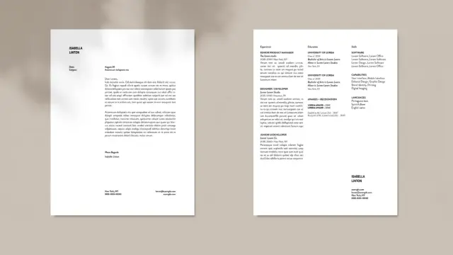

Clean Resume Design Template: A Minimalist InDesign Layout That Actually Gets Results
I’ve seen too many of them, and I honestly think that most resume templates try too hard. They pile on color blocks, icon sets, sidebar gradients, and decorative borders—all in an attempt to stand out. The result is visual noise that distracts hiring managers from what actually matters: your experience, your clarity of thought, and your professional identity. This clean resume InDesign template by designer Phillip takes the opposite approach. And honestly, it works.
The template is available on Adobe Stock as a fully customizable InDesign file in both A4 and US Letter formats. It spans two pages and strips away every unnecessary element. What remains is a structured, calm, immediately readable layout that communicates confidence without shouting. If you’ve been searching for a minimal resume template InDesign professionals actually use, this one belongs on your shortlist.
But beyond the practical value, this template raises a design question worth sitting with. What does restraint communicate about a candidate? And when does simplicity become the most strategic visual choice you can make?
Download the template from Adobe StockPlease note that this template requires Adobe InDesign installed on your computer. Whether you use Mac or PC, the latest version is available on the Adobe Creative Cloud website—take a look here.
Download a simple and clean resume design as a fully customizable Adobe InDesign template in A4 and US Letter size. Download the template from Adobe StockWhy Does Minimalism Keep Winning in Resume Design?
The answer isn’t an aesthetic trend. It’s cognitive science. Hiring managers spend an average of six to ten seconds on initial resume screening. Dense layouts slow reading. Heavy design competes with content. A cluttered resume forces the reader to work harder—and that friction often leads to rejection before the content even registers.
Minimalist resume design removes friction. It creates clear visual pathways. The eye knows exactly where to go next. That’s not an accident; it’s the result of deliberate typographic hierarchy and spatial discipline.
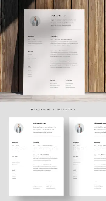
Phillip’s template applies these principles without fuss. The layout relies on a two-column structure that separates credentials from experience. The left column holds education, pro tools, and skills. The right column carries work history. Both columns read independently and in tandem. That’s a structural achievement most templates fail to pull off cleanly.
The Typography Does the Heavy Lifting
Typography is the invisible architecture of any document. In this template, the type choices establish clear hierarchy across three distinct levels. The candidate’s name anchors the top of the page in bold, immediately establishing identity. Section labels like “Experience” and “Education” carry enough weight to guide scanning without overwhelming the body text. And role titles—set in uppercase, small caps, or bold—create a secondary rhythm inside the experience section.
This three-tier typographic system is what I’d call Credential Layering: a structural approach where typographic weight directly maps to information priority, allowing the reader’s eye to self-navigate without explicit visual cues like icons or color codes.
Credential Layering works because it mirrors how readers already process professional documents. You scan for names, then roles, then dates, then details. The template never fights that instinct. It supports it.
The Profile Section Sets the Tone Immediately
The top section of page one includes a circular profile photo, the candidate’s name, and a short bio or positioning statement. This combination accomplishes something subtle but important. It humanizes the document before the reader reaches credentials. It also frontloads personal positioning—your own framing of who you are professionally—before a recruiter fills in any blanks themselves.
Not every industry welcomes photos on resumes. In the US, for instance, photo-free resumes remain the professional standard to avoid unconscious bias concerns. But in creative industries, architecture, design, media, and many European markets, a professional photo signals confidence and personal brand awareness. The template handles this intelligently by positioning the photo as an optional design element rather than a structural dependency.
How the Two-Column Layout Solves a Classic Resume Problem
Every resume designer faces the same spatial challenge. You need to show credentials and experience without the document feeling front-heavy or lopsided. Most templates solve this by extending to a second page and hoping it looks balanced. This template takes a more deliberate route.
The two-column layout assigns spatial roles. Left is context. Right is narrative. Together, they create a reading experience that feels more like a designed publication than a formatted list. The horizontal rule below the intro section acts as a visual threshold—once you cross it, you’re in the substantive body of the document.
This structural pattern reflects what I’d call the Threshold Divide Principle: the intentional use of a single horizontal element to signal the transition from personal identity to professional record. It’s a small design decision with a significant psychological effect. The reader registers the shift instinctively.
The Contact and Reference Block at the Bottom
One detail worth calling out specifically: the contact and reference section sits at the very bottom of page one, formatted in two parallel mini-columns. This placement is unusual. Many templates put contact information at the top or in a sidebar. Phillip’s layout keeps it at the foot of the page, which has an interesting effect.
It signals that contact details are the conclusion, not the introduction. By the time a recruiter reaches the phone number and email, they’ve already moved through your credentials, your experience, and your references. The contact information feels like an invitation extended after you’ve made your case—not a cold open.
That sequencing is a form of persuasive architecture. And it’s rare to see it executed this cleanly in a downloadable InDesign resume template.
Clean Resume Design Principles This Template Demonstrates
Let’s name these principles clearly, because they’re worth internalizing whether you’re using this template or building your own.
White Space as Structural Element
This template treats white space as an active design component, not empty filler. The breathing room between sections prevents cognitive overload. It lets each content block register independently before the eye moves on. Heavy margins and generous line spacing are not wasted space—they’re doing real structural work.
Restrained Color Palette
The template uses near-black for primary text and a warm light gray for the background or secondary elements. There are no accent colors, no gradient headers, no colored sidebar panels. This restraint means the document will print correctly across every printer, reproduce cleanly in PDF, and never feel dated. Color trends cycle fast. A neutral palette never goes out of style.
Grid Discipline
Everything on this page aligns to an invisible grid. Columns sit at consistent widths. Section labels fall at predictable vertical intervals. Dates and role titles align horizontally within their rows. This grid discipline is what separates professional design from amateur formatting. It’s the difference between a document that feels authoritative and one that feels assembled.
Consistent Typographic Scale
The template maintains a predictable typographic scale across all text elements. Moving from the name to the section headers to the body copy, each step down in hierarchy corresponds to a proportional reduction in type size or weight. There are no random jumps in size that break the visual rhythm. That consistency creates the impression of a single, coherent voice throughout the document.
Who Should Use This Clean Resume InDesign Template
This template works best for professionals who want their work to speak for itself. Designers, architects, creative strategists, brand consultants, UX professionals, editors, and communications specialists will find it especially fitting. The minimal design signals that you understand visual hierarchy—because you’ve applied it to your own professional identity.
It also works well for professionals in finance, consulting, law, and academia who want a polished, non-flashy presentation. The layout conveys seriousness and precision. It never looks like a template—and that’s the highest compliment a template can receive.
If you’re applying for roles in highly visual industries, this template gives you exactly the right foundation. You can add one strategic accent color if your personal brand calls for it, swap to a different typeface, or scale the layout to a single page. Because everything lives in InDesign with clean layer organization, those adjustments take minutes.
Customizing the InDesign Resume Template: What You Can Change
Customization in InDesign operates at a different level than Word or Google Docs. You’re working with a professional page layout application that gives you precise control over every element. Here’s what’s fully flexible in this template.
Typography
Swap the font stack entirely by updating the Paragraph Styles panel. Every text element in the template maps to a named style. Change the style once, and every instance updates automatically. You can move from a serif to a sans-serif personality, shift from geometric to humanist, or adjust scale across the entire document in a few clicks.
Layout Proportions
The column widths, margins, and spacing values are all adjustable. If you need to accommodate more content in the right column, you can nudge the column divide slightly. If your experience section needs three pages, InDesign’s master page system makes that extension straightforward.
Color
The Swatches panel holds the template’s color values. Replace them globally to shift the document’s character. A deep navy, a muted terracotta, or even a true black can completely change the personality of the same layout without touching the structure.
Photo and Profile Section
The profile photo frame is a standard InDesign graphic frame. Replace the placeholder with your own image, adjust the frame shape from circular to square or oval, or remove it entirely. The layout compensates gracefully because the name and bio block are structured independently.
Adobe InDesign Resume Templates vs. Word: What’s the Real Difference?
This question comes up often, and the honest answer depends on your context. For fast turnaround and easy editing on any device, a Word or Google Docs resume template wins on convenience. But convenience has a ceiling.
InDesign gives you typographic precision that Word simply cannot match. Optical margin alignment, superior kerning control, consistent baseline grids, and master-page-driven consistency all contribute to a document that looks designed rather than typed. That difference is immediately visible to anyone with a trained eye.
For creative professionals, submitting an InDesign-crafted PDF resume versus a Word-exported one is a portfolio signal in itself. It tells the reviewer you understand production tools, you care about output quality, and you treat your own professional presentation with the same rigor you’d apply to client work.
That’s not a small thing. In design hiring, everything is a sample.
The Quiet Confidence of a Minimal Resume: A Personal Take
Here’s my honest read on this template. The design says something before the reader processes a single credential. It says, “I know what to leave out.” That judgment—knowing what not to include—is one of the hardest skills in any creative discipline. A resume that exercises it effectively signals editorial maturity.
There’s also something psychologically grounding about a clean, white-space-rich document. It doesn’t feel desperate. Furthermore, it doesn’t feel like it’s performing. And it holds its ground quietly and lets the content make the case. That quality is increasingly rare, and increasingly valuable, precisely because so many templates trend toward maximalism to compensate for thin content.
If your experience is strong, a minimal resume template is almost always the right call. Let the layout trust your credentials. Let the design get out of the way.
Technical Specifications: A4 and US Letter Formats
The template ships in both A4 (210 × 297 mm) and US Letter (8.5 × 11 in) page sizes. This matters more than it sounds. A document designed for A4 often looks slightly wrong when printed on US Letter: margins shift, text feels crowded, and proportions lose their precision. Having both format variants means you get a layout specifically calibrated for each page size, not a retrofitted conversion.
For international applicants, this dual-format availability removes a common friction point. Whether you’re applying in Frankfurt, London, Toronto, or New York, you have the correct layout ready.
Download the template from Adobe StockFrequently Asked Questions
What software do I need to edit this resume template?
You need Adobe InDesign. The template is a native InDesign file (.indd), which requires InDesign to open and edit. Adobe offers a free trial, and InDesign is available as part of a Creative Cloud subscription. Once edited, you export the final file as a PDF for submission.
Can I use this resume template if I’m not a designer?
Yes. InDesign has a learning curve, but this template is clean and logically organized. If you’re comfortable with basic text editing and understand how to replace placeholder text, you can customize it without formal design training. Adobe also offers beginner tutorials specifically for InDesign document editing.
Does this clean resume InDesign template work for all industries?
It works exceptionally well for creative, professional services, and knowledge-based industries. For highly technical fields like engineering or data science, you may want to adapt the skills section to accommodate more technical taxonomies. For entry-level positions or academia, minor layout adjustments handle those contexts well. The neutral design doesn’t lock you into a niche.
Can I change the fonts in this InDesign resume template?
Absolutely. Font swaps are among the fastest customizations in InDesign. Use the Paragraph Styles panel to update the font globally across all instances. You can shift the entire typographic personality of the template in minutes without touching individual text frames.
What’s the difference between A4 and US Letter resume formats?
A4 (210 × 297 mm) is the standard page size in Europe, Australia, and most of Asia. US Letter (8.5 × 11 in) is the standard in North America. This template includes both versions, each properly proportioned for its respective page size. Choose based on where you’re submitting.
Should I include a photo on my resume?
This depends entirely on your industry and target market. In the US, resume photos are generally avoided due to anti-discrimination hiring practices. In Europe, Scandinavia, and many creative fields globally, a professional headshot is expected and adds credibility. The template accommodates both approaches—the photo frame is easy to remove if your target market calls for it.
Is this resume template compatible with Adobe InDesign CC?
Yes. The template is designed for use with Adobe InDesign CC (Creative Cloud). It works across recent versions of InDesign on both Mac and Windows. If you’re using an older version, verify compatibility before purchasing.
Where can I download this clean resume InDesign template?
The template is available from Adobe Stock, created by contributor Phillip. You can access it through an Adobe Stock subscription or as a single-purchase download. It includes both the A4 and US Letter format files, fully layered and ready to customize.
Check out WE AND THE COLOR’s Templates category to find more design applications.
#AdobeInDesign #AdobeStock #cv #InDesignTemplate #resume #resumeDesign #resumeTemplate #resumes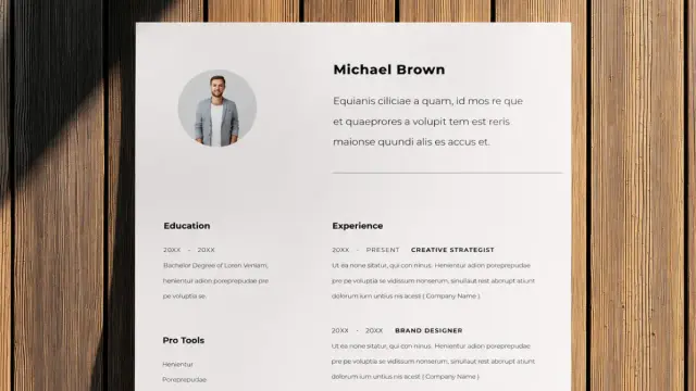
I am so genuinely happy I will most likely teach the "Creative Resume" course at IUT Haguenau of University of Strasbourg next year!
My colleague, and friend, who taught it these past years said I'm the perfect fit for the role cause "nobody blends aesthetic and rigour the way you do". 
(for me it's a compliment, but I know she also referred to my almost disturbing attention to details lol)
#cv #cvdesign #resume #resumedesign #resumelayout #iut #unistra #curriculum
This Professional Resume Template Proves Clean Design Still Wins
Your resume has about six seconds. That’s roughly how long a hiring manager glances at it before deciding whether to keep reading. Six seconds. And yet most people still hand off their career story in a cluttered, typographically inconsistent document that looks like it was built in 2009. That’s the problem this professional resume template solves — and it solves it with confidence.
Designed by Adobe Stock contributor Phillip and built entirely in Adobe Illustrator, this template is one of the cleaner, more structurally intelligent layouts available right now. It’s available in both A4 and US Letter formats, which immediately signals that it was built for a global audience. So whether you’re applying to a studio in Berlin or an agency in New York, the formatting holds up.
But there’s more going on here than just good proportions. This is a template that understands what a resume actually needs to do — and that understanding is visible in every design decision.
Download the template from Adobe StockPlease note that to edit this template, you need professional graphic design software like Adobe Illustrator installed on your computer. You can get the latest version from the Adobe Creative Cloud website. Just have a look here.
A professional resume template with an organized structure for Adobe Illustrator in A4 and US Letter. Download the template from Adobe StockWhat Makes a Resume Template Truly Professional in 2025?
The word “professional” gets thrown around so casually that it’s nearly lost its meaning. But in resume design, it has a precise definition. A truly professional resume template does three things simultaneously: it communicates hierarchy, it guides the eye, and it gets out of the way of the content.
Most templates fail at least one of those. They either over-design the layout to compensate for weak content, or they strip out so much personality that the result reads as forgettable. This template, however, walks that line with unusual skill.
The layout uses a restrained two-column structure at the top — name and job title on the left, a professional photo block on the right — then expands into a clean, full-width body below. That top section anchors the reader immediately. You know exactly who this person is at first glance. That’s not accidental. It’s the result of deliberate visual hierarchy, a principle I’d call Anchor-Then-Expand: establish identity fast, then let the depth follow.
The Role of Accent Color in Resume Credibility
Notice the red. It’s not aggressive — it’s controlled. A small arrow-style marker appears before each section heading: Education, Work Experience, Hard Skills. That’s it. One accent color, used sparingly, is placed precisely where the eye needs a cue.
This approach follows what I call the Single-Signal Color Rule: in a document where the goal is legibility and trust, using more than one accent color almost always backfires. It introduces visual competition. The template avoids that entirely. The red functions as a navigation system, not a decoration — and that distinction matters enormously.
Think of it this way: every color decision in a resume either earns trust or costs it. Red, used this way, earns it.
How the Professional Resume Template Uses White Space as a Design Tool
White space is one of the most misunderstood concepts in document design. People often mistake it for emptiness, as if unused space represents wasted real estate. It doesn’t. White space is structure. It’s the pause between ideas that gives the reader room to process information.
This template uses white space aggressively — and I mean that as a compliment. The margins breathe. The section gaps are generous. The text columns in the Work Experience section don’t crowd each other. The result is a document that feels calm, organized, and in control.
For professional creatives — interior designers, graphic designers, art directors, brand consultants — that sense of control is part of the message. Your resume isn’t just a list of your accomplishments. It’s evidence of how you think about visual communication. A cluttered resume from a designer is a contradiction. This template removes that contradiction entirely.
Three-Column Work Experience: A Structure That Scales
The Work Experience section uses a three-column horizontal layout. Each column represents a separate role: Graphic Design, Web Development, and Digital Marketing in the sample. That structure is worth examining closely.
Traditional resume layouts stack work experience vertically, which works fine for linear careers. But for creatives with parallel or overlapping skill sets, a horizontal layout tells a more accurate story. It says: these things happened together, these competencies reinforce each other. That’s a fundamentally different — and often more honest — professional narrative.
I call this the Parallel Competency Model: rather than implying a rigid progression from one role to the next, the layout acknowledges that real creative careers are rarely that linear. The three-column format reflects how multi-skilled professionals actually work.
Professional Resume Template for Adobe Illustrator: What You Can Customize
The file format here is Adobe Illustrator (.AI). That’s a deliberate choice, and it’s the right one for this type of document. Illustrator gives you full vector control over every element — the typography, the spacing, the color values, the photo placeholder, the section markers. Nothing is locked. Nothing is approximate.
If you don’t have Illustrator, Adobe Photoshop can open .AI files, though with some limitations on vector editing. Adobe Acrobat can open .AI files as PDFs if saved with PDF compatibility enabled. Inkscape, the free open-source vector editor, also opens Illustrator files, though complex formatting may shift slightly. For the cleanest editing experience, Adobe Illustrator CC is the recommended tool — and if you’re a Creative Cloud subscriber, you already have it.
What can you actually change? Everything. The name, job title, and contact details are straightforward text swaps. The photo placeholder accepts any image you drop in — just match the crop proportions. The section headings, body copy, and skills list are all editable text. The accent color can be changed globally in minutes by editing the swatches panel. Want navy instead of red? Three clicks.
A4 vs. US Letter: Which Format Should You Choose?
The template comes in both A4 (210 × 297 mm) and US Letter (8.5 × 11 in). If you’re applying to companies in Europe, the Middle East, Asia, or Australia, use A4. If you’re applying in the United States or Canada, use US Letter. The difference is subtle but visible — particularly if a recruiter prints your resume. A misformatted page with awkward white bars at the bottom or sides reads as careless. Both formats are included, so there’s no reason to compromise.
Who Is This Resume Template Actually For?
Let’s be specific, because “professional creatives” covers a wide range. This template is particularly well-suited for graphic designers, UX/UI designers, brand strategists, interior designers, architects, art directors, photographers, motion designers, and creative directors. The layout is clean enough to work across industries, but its visual intelligence speaks directly to hiring managers in design-adjacent fields.
That said, it would also serve professionals in marketing, communications, and digital media effectively. The structure is universal. The aesthetic is elevated but not niche.
What this template is not: it’s not designed for heavily technical roles like software engineering or data science, where dense, ATS-optimized formats often perform better. The visual sophistication here is a feature for some applications and a potential mismatch for others. Know your audience.
The ATS Question: Does a Beautiful Resume Still Get Parsed?
Applicant Tracking Systems (ATS) are the first gatekeepers at most large companies. They parse resume text before a human ever reads it. A purely vector-based Illustrator file, submitted as-is, can confuse some ATS platforms.
The practical solution: after customizing your template in Illustrator, export a clean PDF. Most modern ATS tools handle PDF text extraction reliably if the fonts are embedded and the text isn’t converted to outlines. Keep your text as live text — don’t flatten it. Test your exported PDF with a free ATS checker tool before submitting to large organizations. For smaller studios and agencies, where a human opens your resume directly, the visual impact of this template is a clear advantage.
What This Template Gets Right That Most Don’t
Here’s my honest take: the majority of resume templates available online make the same mistakes. They overuse color to compensate for weak structure, stack columns awkwardly, or use decorative fonts that undermine readability at small sizes. They ignore the relationship between the header and the body.
This template avoids all of those. The typography is clean and consistent. The hierarchy is logical. The color use is disciplined. The section system is intuitive without being predictable. And the decision to include a photo placeholder — handled tastefully in the top-right quadrant — reflects how European and international hiring norms often differ from North American conventions.
What I find most impressive is what I’d call the Quiet Confidence Principle: this layout doesn’t try to impress you. It simply performs. There’s no gradient, no decorative border, no icon overload. Just structure, space, and clarity. In a sea of overdesigned templates, that restraint is its own form of sophistication.
Why Modern Resume Design Is Moving Toward Minimalism
The trend is clear and it’s accelerating. As hiring becomes more digital and resumes are viewed more often on screens than on paper, clutter becomes a liability. Small screens and compressed PDF previews punish dense layouts. Clean, high-contrast, well-spaced documents read better everywhere — on a MacBook display, on a recruiter’s phone, printed on an office laser printer.
This template was designed with that reality in mind. The generous white space and clear section breaks hold up across viewing conditions. That’s not a minor point. That’s the difference between a resume that works and one that only looks good in its own preview image.
How to Download and Use This Professional Resume Template from Adobe Stock
The template is available through Adobe Stock, where it can be licensed for personal and commercial use. Adobe Stock subscribers can access it as part of their existing plan. Non-subscribers can purchase a standard license directly.
Once downloaded, open the .AI file in Adobe Illustrator. If you’re using Creative Cloud, you’ll have the most current version of Illustrator with full compatibility. Replace the placeholder text with your own information, swap in your photo, adjust the accent color if needed, and export as PDF. The whole process, once you’re comfortable in Illustrator, takes under an hour.
For those newer to Illustrator, Adobe’s own tutorial library covers the basics of text editing and color adjustments. The template is structured in clearly labeled layers, which makes navigation straightforward even for intermediate users.
Comparing This Template to Competing Formats
Canva templates are fast and browser-based, but they offer limited typographic precision. Google Docs templates are ATS-friendly but visually generic. Microsoft Word templates are widely used but rarely elegant. InDesign templates offer similar quality to this Illustrator file but require more advanced skills.
The Illustrator format sits in a sweet spot: more precise and visually sophisticated than Word or Canva, more accessible than InDesign for most creatives. It’s the right tool for a document that needs to look polished at the professional level this template is designed for.
The Forward-Looking Case for Investing in Your Resume Design
Here’s a prediction worth stating clearly: as AI-generated application materials flood hiring pipelines, the quality of visual presentation will become a stronger differentiator, not a weaker one. When every candidate’s cover letter sounds similar, the physical document — the PDF that a creative director actually opens — carries more weight.
Hiring for creative roles is partly about taste. A resume that demonstrates visual intelligence before the portfolio is even opened sends a signal. It says: this person understands presentation, proportion, and communication. That signal starts with the template you choose.
This particular template — clean, structured, globally formatted, and fully customizable — is a strong foundation for that signal. It doesn’t make decisions for you. It gives you a system that works and then gets out of the way.
That’s exactly what good design should do.
Download the template from Adobe StockCommon Questions:
What software do I need to open this resume template?
The template comes as an Adobe Illustrator (.AI) file. Adobe Illustrator is the recommended application for full editing capabilities. Adobe Photoshop and Inkscape can also open .AI files, though with some limitations. Saving with PDF compatibility enabled also allows the file to open in Adobe Acrobat.
Is this resume template available in both A4 and US Letter sizes?
Yes. The template includes both A4 (210 × 297 mm) and US Letter (8.5 × 11 in) formats, making it suitable for job applications worldwide.
Can I change the accent color in this professional resume template?
Absolutely. The red accent used for section markers and decorative elements is fully editable in Adobe Illustrator. You can change it to any color using the swatches panel, and applying it globally takes only a few clicks.
Is this resume template ATS-compatible?
The template is designed as a visual layout in Illustrator. For ATS compatibility, export your completed resume as a PDF with embedded fonts and live (non-outlined) text. Most modern ATS platforms can extract text from well-structured PDFs. Avoid flattening or converting text to outlines before export.
Who is this professional resume template best suited for?
This template is ideal for graphic designers, UX/UI designers, interior designers, art directors, photographers, brand strategists, and other visual creatives. Its clean, elevated layout is also suitable for marketing and communications professionals.
Where can I download this resume template?
The template is available on Adobe Stock, created by contributor Phillip. It can be licensed individually or accessed through an active Adobe Stock subscription.
Can I use this template for commercial purposes?
Adobe Stock licenses cover both personal and commercial use, depending on the license type selected at purchase. Review the specific license terms on Adobe Stock before using the file in commercial contexts.
Do I need advanced Illustrator skills to customize this template?
Intermediate Illustrator skills are sufficient. The template uses clearly structured layers and standard text editing tools. Basic tasks like replacing placeholder text, swapping the photo, and adjusting colors are straightforward. Adobe’s tutorial library can help if you’re building your Illustrator skills.
Don’t hesitate to find other trending design templates for creative professionals here at WE AND THE COLOR.
#AdobeInDesign #AdobeStock #cv #InDesignTemplate #resume #resumeDesign #resumeTemplate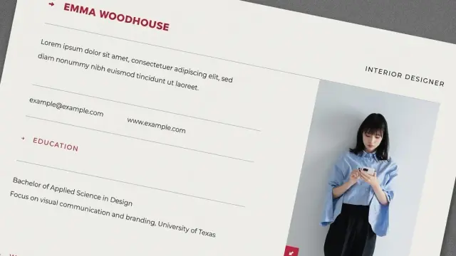
Step-by-step instructions on how to create a resume in Apple Pages, including formatting tips and font choices.
Read more: https://www.careerreload.com/how-to-create-resume-in-apple-pages/
How to Create a Resume in Apple Pages (Step-by-Step Guide)
👉 https://www.careerreload.com/how-to-create-resume-in-apple-pages/

How to Build a Professional Resume Fast With Adobe InDesign Templates https://weandthecolor.com/how-to-build-a-professional-resume-fast-with-adobe-indesign-templates/208590
A blinking cursor in an empty document can be one of the most intimidating sights for any creative professional. You know the quality of your work.
#resume #adobeindesign #cv #design #graphicdesign #resumedesign

Resume Formatting in Adobe InDesign Is the Creative Career Move You’ve Been Sleeping On in 2026 https://weandthecolor.com/resume-formatting-in-adobe-indesign-is-the-creative-career-move-youve-been-sleeping-on-in-2026/208235
Resume design has become a high-stakes exercise in visual communication. With recruiters spending less than seven seconds scanning a CV, generic Word templates no longer suffice—especially for creatives whose careers depend on strong presentation.
