The Mistakes Healing Centers Make—And How We Fixed Them!
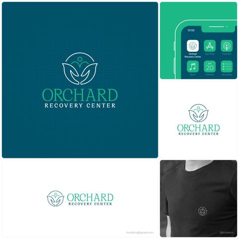
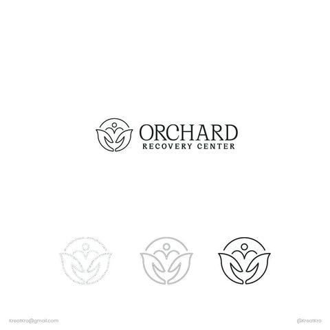
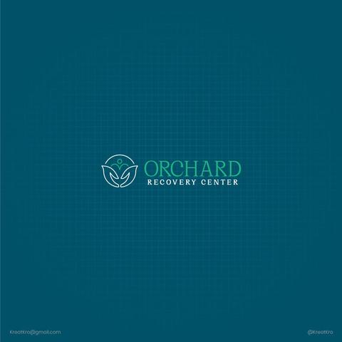
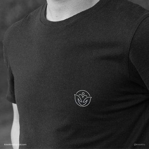
Orchard Recovery Center needed a logo reflecting healing and compassion.
I created an "O" for unity, caring hands for support, and a person with a heart for emotional healing.
Teal and turquoise colors symbolize calmness and renewal.
The team loved it: “This isn’t just a logo; it’s who we are.” #LogoDesign #BrandIdentity #RecoveryCenterBranding