Handmade Café Branding Proves One Clear Idea Is All You Need
Most café branding tries to say too many things at once. Artisanal. Community-focused. Instagrammable. Sustainable. The result is a visual identity that communicates everything and means nothing. Handmade Café in Pune, India, does the opposite — and the branding project by studio Rare Ideas is one of the more quietly confident identity systems to come out of the South Asian design scene in recent years.
The brief was built around a single phrase: made-from-scratch. Three founders, all mothers, wanted a neighbourhood space where families could genuinely slow down — where parents could relax, and children could engage without a screen in sight. That is not a complicated idea. But translating it into a brand system that actually feels that way? That takes real craft.
What Rare Ideas delivered is a case study in constraint as a creative strategy. Every decision — the mark, the palette, the material touchpoints — traces back to one principle: make care visible.
What Does “Made-From-Scratch” Really Mean as a Brand Identity?
In food, made-from-scratch means no shortcuts. Nothing prepackaged. Everything is built up from its most basic ingredients. Rare Ideas took that idea and expanded it beyond the menu. Here, made-from-scratch becomes a design philosophy — a standard that governs how the café looks, how it operates, and how it includes the people inside it.
This reframing is worth paying attention to. Too often, café branding borrows craft cues — linen textures, hand-drawn type, warm tones — without any real connection to the business underneath. The visual language signals craft without actually embodying it. Handmade Café avoids this trap because the made-from-scratch idea was not applied after the fact. It shaped the brief from the start.
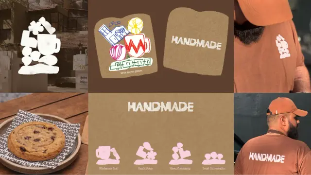
The identity draws directly from block-printing and clay-based craft traditions. The primary mark has the quality of a stamp — soft edges, subtle irregularities, a slight imperfection that communicates human touch without looking sloppy. This is a difficult balance to strike in logo design. Too clean, and it feels corporate. Too rough, and it reads as amateur. The Handmade Café mark lands precisely in the middle.
The broader visual system builds on this with organic forms stacked in balance and textured surfaces referencing relief printing. These elements do not just look tactile — they signal process. They remind you that something was made by hand, deliberately, with attention.
The Handmade Palette: Why Restraint Is the Right Call
Color is one of the easiest places for brand identity to go wrong. A colour palette that tries too hard announces itself constantly, fighting for attention against the space itself. The palette Rare Ideas chose for Handmade Café does the opposite.
Browns anchor the system. They carry material weight — think clay, wood, baked bread, worn leather. They are grounded in a way that feels instinctive rather than designed. White provides clarity and breathing room, preventing the warmth from tipping into heaviness. Muted accents appear sparingly, adding quiet interest without ever becoming noise.
The result is a colour system that recedes when it needs to. You notice it, but it does not compete with the experience of being in the space. That is exactly what a neighbourhood café identity should do. It should support the atmosphere, not define it.
There is a term worth coining here: Passive Brand Presence. It describes a visual identity designed to feel like an ambient condition rather than an active assertion. Handmade Café achieves Passive Brand Presence because its palette is calibrated to support mood, not to perform it.
Handmade Café Branding by Rare IdeasNatural Tone Palettes in Café Branding: A Design Decision Worth Defending
Some critics might say earth-tone café branding is overdone. And they are not entirely wrong. Scroll through Behance or Dribbble, and you will find dozens of warm-palette café identities that blur together. So why does Handmade feel different?
Because the palette is not carrying the concept on its own, it works in service of a coherent idea. The browns are not just “warm” — they are specifically connected to the craft tradition the brand draws from. The restraint is not aesthetic minimalism for its own sake — it is a deliberate choice to keep the space calm and family-appropriate. Context makes the difference between a cliché and a considered decision.
Branded Touchpoints That Actually Do Something
Here is where the Handmade Café project gets genuinely interesting. The identity does not stop at a logo and a colour palette. It extends into the physical experience of the café through functional, participatory touchpoints — and this is where Rare Ideas demonstrates a sharper understanding of hospitality branding than most studios working in this space.
The coasters are shaped like slices of bread. Simple enough. But they are also designed as drawing surfaces. Guests — particularly children — can draw on them. Over time, those drawings were collected and displayed on a wall inside the café. What started as a single clever detail evolved into an ongoing, guest-created installation.
Think about what that does. It turns a passive visitor into an active participant, gives children something meaningful to do without a screen, and creates a reason to come back — to see if your drawing made the wall. And it produces a layer of content that is entirely authentic, owned by the community, and impossible to fake.
This is what I would call Participatory Brand Architecture — a framework where brand touchpoints are designed not just to communicate a value, but to invite people to actively demonstrate it. The made-from-scratch idea is not told to guests; it is handed to them as an activity.
Why Most Cafés Get Experiential Branding Wrong
Experiential branding is a phrase that gets misused constantly. More often than not, it means “we installed a neon sign and called it an experience.” A compelling photo opportunity is not a brand experience. An interaction that creates genuine memory and emotional investment is.
The drawing coaster achieves the latter because it is functional first. It does not feel like marketing. It feels like something the café gives you. That distinction matters enormously to how guests receive it and how willingly they participate. When a brand touchpoint disguises itself as a gift, it stops feeling like branding and starts feeling like hospitality.
Rare Ideas and the Case for Concept-Led Café Branding
Rare Ideas, led by Vijeta Singh as Founder and Creative Head, built the entire Handmade Café system around a single guiding concept. This is rarer than it should be. Most branding projects involve a brief that begins with a vision and ends with a compromise — the concept gets diluted by committee, softened by client anxiety, or simply overtaken by trend-chasing.
The Handmade Café project shows what happens when a studio and client align around one clear idea and hold it. The made-from-scratch principle is present in the logo, the palette, the materials, the coasters, the wall installation, and the fundamental promise of what the café serves. That kind of consistency does not happen by accident. It requires discipline from both the studio and the client.
This is a concept I want to name: Single-Thread Brand Coherence. It refers to an identity system where every element — visual, experiential, communicative — can be traced back to a single founding idea. Single-Thread Brand Coherence is rare because it requires saying no to good ideas that do not serve the thread. Handmade Café is a strong example of what it produces when executed well.
How Handmade Café Branding Addresses Family-Friendly Design
There is an underserved design problem at the centre of this project. Families — specifically parents with young children — are a highly valuable café demographic. They want longer dwell time, comfort, and engagement for their kids, which is not a tablet shoved across the table.
Very few cafés are designed for this need at a brand identity level. They might include a play corner as an afterthought. They might claim to be family-friendly without building it into the experience. Handmade Café integrates the family-facing offer into the brand’s core DNA.
The drawing coasters are not a kids’ activity tacked onto an adult space. They are a brand expression. The calm, warm, unhurried visual language is not just aesthetically pleasing — it is emotionally calibrated for the kind of family that wants to slow down on a Sunday morning without being hurried along. Every design decision quietly says: you are welcome to stay.
That is meaningful family café branding. And it is an area where this project sets a genuinely useful precedent for designers and café owners thinking about community-focused hospitality spaces.
What the Design World Can Learn From Handmade Café
Handmade Café is not trying to be a national chain. It is not chasing a global aesthetic. It is a neighbourhood café in Pune, India, built for the community around it — and its branding reflects that with honesty and precision. That local specificity is actually what makes it worth studying.
A few lessons worth taking seriously:
Specificity Beats Versatility
A brand identity designed to work everywhere often resonates nowhere. The Handmade Café identity works because it is designed for a specific community, a specific set of values, and a specific kind of experience. Its craft references connect directly to the culture it is embedded in. That precision is a strength, not a limitation.
Brand Systems Should Invite Participation
The most memorable brand experiences are the ones people help create. Handmade Café’s guest-drawn coaster wall is a masterclass in this — low investment, high authenticity, genuinely community-building. More designers should ask: where in this system can the audience become a contributor?
Restraint Is a Creative Choice
The Handmade palette could have been bolder. The mark could have been more elaborate. The touchpoints could have been more ambitious. But restraint, applied consistently, creates something more powerful than complexity: legibility. You understand Handmade Café within seconds of encountering it. That clarity is the most underrated quality in brand design.
Handmade Café Branding: Key Takeaways for Designers
If you work in brand identity, hospitality design, or café branding, here is what this project offers as practical guidance:
One strong idea, applied everywhere, beats ten mediocre ideas applied inconsistently. Made-from-scratch is simple. Its application throughout every touchpoint is what makes it powerful.
Material references should connect to actual craft traditions. The block-printing and clay influences in Handmade’s identity are not decorative — they are culturally and conceptually specific. That specificity is what separates authentic craft-influenced design from aesthetic appropriation.
Participatory touchpoints create dwell time and return visits. The drawing coasters are a business decision as much as a design decision. They give people a reason to stay longer and come back — and that directly affects the café’s commercial performance.
Family-friendly branding can be sophisticated. Designing for families does not mean designing down. Handmade Café’s identity is warm, calm, and considered — qualities that serve both adults and children without sacrificing visual intelligence.
Frequently Asked Questions About the Handmade Café Branding
Who designed the Handmade Café brand identity?
The Handmade Café brand identity was designed by Rare Ideas, a branding studio. Vijeta Singh served as Founder and Creative Head on the project.
Where is Handmade Café located?
Handmade Café is located in Pune, India. It was conceived as a neighbourhood café designed for families and community use.
What is the core concept behind the Handmade Café brand?
The brand is built around a single idea: made-from-scratch. This concept informed not only the food offering, but the visual identity, the physical touchpoints, and the overall guest experience.
What craft traditions influenced the Handmade Café’s visual identity?
The identity draws from block-printing and clay-based craft traditions. The primary mark has the quality of a stamp, with soft edges and subtle irregularities that signal human touch and process.
What makes the Handmade Café branding unique?
The project stands out because it extends the brand concept into participatory physical touchpoints — specifically, bread-shaped drawing coasters that guests can draw on, with collected works displayed on a wall inside the café. This creates an ongoing, guest-generated brand experience that is both authentic and community-building.
What is Participatory Brand Architecture?
Participatory Brand Architecture is a framework coined in this article to describe brand touchpoints designed not just to communicate a value, but to invite guests to actively demonstrate it. The Handmade Café coasters are a clear example: they do not tell guests the café is made-from-scratch — they hand guests a surface and let them make something.
What is Single-Thread Brand Coherence?
Single-Thread Brand Coherence refers to a brand identity system where every element — visual, experiential, and communicative — traces back to a single founding idea. Handmade Café demonstrates this through the consistent application of made-from-scratch across its logo, palette, materials, and guest touchpoints.
Project Credits: Handmade Café, Pune — Branding by Rare Ideas. Vijeta Singh, Founder & Creative Head. Check out WE AND THE COLOR’s Graphic Design and Branding categories for more creative inspiration.
#branding #cafeBranding #design #graphicDesign #HandmadeCafé #RareIdeas