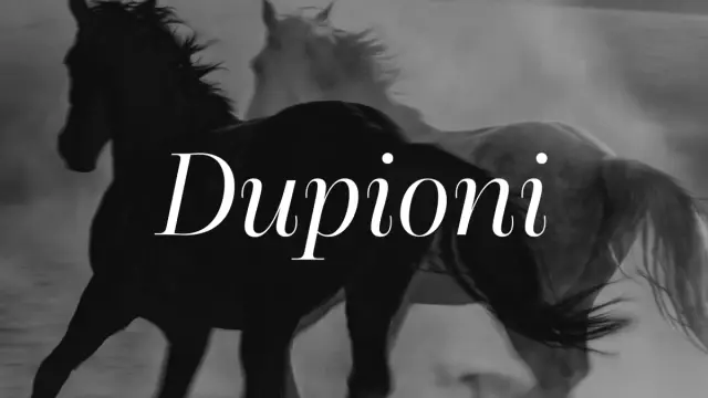
Dupioni Font Family by SilkType
SilkType’s Dupioni Font Family Is the High-Contrast Display Typeface Fashion Branding Has Been Waiting For.
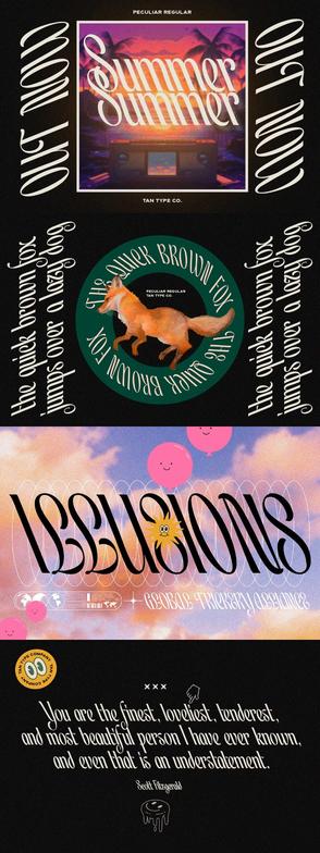
Some typefaces announce themselves quietly. Dupioni does not. The moment you set a headline in it—even in regular weight—something shifts in the reading experience. The contrast is immediate. The serifs are sharp, almost aggressive, and yet the overall impression is one of controlled elegance. That tension is the whole point. Dupioni, designed by Rakel Tómasdóttir and published by her Reykjavik-based foundry SilkType in 2026, is a high-contrast display serif built for exactly the kind of work where typography has to carry real visual weight. Fashion editorials, luxury packaging, brand identity systems, expressive headline type—this is where Dupioni earns its place.
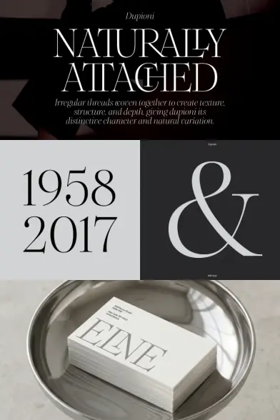
The name comes from dupioni silk, a fabric woven from threads of two different silkworms. The result is a textile with an irregular, slightly slubbed texture—smooth from a distance, richly detailed up close. That is a precise description of what this typeface does typographically. Furthermore, it explains why the design feels simultaneously refined and alive.
The font family is available on MyFontsWith 16 styles spanning eight weights from thin to extra bold, each with a matching italic, Dupioni is a complete editorial system. It also ships with over 80 decorative ligatures, OpenType alternates, and broad language support, including Vietnamese. So the question is not whether Dupioni is technically capable. The question is what makes it typographically distinctive—and whether it lives up to the source material that inspired it.
Dupioni font family by SilkType The font family is available on MyFontsWhat Makes Dupioni Different From Other High-Contrast Display Fonts?
High-contrast display serifs are everywhere. Didone revivals, editorial modernists, fashion-oriented grotesque hybrids—the market is saturated. So when a new family enters this space, the burden of proof is real. Dupioni meets it by doing something specific: it introduces what I call controlled organic contrast.
Most high-contrast serifs achieve their drama through mathematical precision. The thin strokes are thin because the software says so. Dupioni feels different. The contrast is equally rigorous, but the transitions between thick and thin strokes carry a slightly hand-drawn quality—a micro-irregularity that references the slub texture of its source material. This is not an accident. Tómasdóttir built this quality directly into the design. Consequently, Dupioni avoids the sterile brittleness that can make extreme-contrast fonts feel cold.
The serifs themselves are sharp and bracketed, with a precise geometry that gives each letterform a strong finish. At display sizes, the serifs read as decisive marks. At mid-sizes, they hold the rhythm of a line together without dominating. This range of behavior across sizes is one of the key indicators of a well-engineered display font. Many fonts designed for headlines fall apart when you try to use them at 28px instead of 80px. Dupioni does not.
The Role of the Italic in the Dupioni System
Italics in display serifs are often an afterthought—sloped versions of the roman with minimal independent design thinking. Dupioni’s italics are a different matter entirely. They flow rather than tilt. The forms shift from geometric to calligraphic without losing the core contrast logic. Set a line in Dupioni Light Italic, and you get something that reads as genuinely cursive—not obliqued.
This matters for practical editorial use. When you pair a Dupioni Bold Roman headline with a Dupioni Light Italic subhead, you get a dynamic two-voice system within a single family. The contrast between the two is not just weight-based. It’s also structural. Additionally, the interplay between roman rigidity and italic fluidity mirrors the dual-thread construction of dupioni silk itself. That kind of conceptual coherence in a typeface is rare.
Dupioni’s Weight System: Eight Weights Built for Real Editorial Workflows
Let’s talk about the weight range, because it matters operationally. Dupioni runs from Thin through Extra Light, Light, Regular, Medium, Semibold, Bold, and Extra Bold—each with a companion italic. That gives you 16 styles in total. This is a complete working system, not a showcase family.
The thin and extra light weights are where Dupioni shows its most delicate side. The contrast at these weights is extreme—the thick strokes are slender, which means the thin strokes are almost hairline. At large display sizes, this is visually stunning. It’s the kind of weight you reach for when you’re designing a luxury fashion lookbook cover or a perfume advertisement headline. Handle with care: at small sizes or on low-resolution screens, these weights need tracking adjustments to hold their structure.
The middle register—light through medium—is where Dupioni earns its utility as a working editorial font. These weights are versatile enough for magazine feature headlines, brand logotype work, and packaging hierarchies. The regular weight, specifically, is the backbone of the family. It sits at a contrast level that is dramatic without being fragile. Moreover, it sets the baseline for how the font reads across both print and screen.
Bold and Extra Bold: When Dupioni Gets Dramatic
The heavier weights of Dupioni push into territory that most display serifs handle poorly. Extra contrast at heavy weights often becomes muddy—the thick strokes swell, the thin strokes disappear, and the result looks optically unbalanced. Dupioni manages this transition well. The Bold and Extra Bold weights maintain the hairline quality of the thin strokes even as the thick strokes become genuinely massive. Therefore, you retain the visual grammar of the font across its entire weight range.
This consistency is what I call cross-weight contrast coherence—the property of a font family where the fundamental contrast logic remains readable and intentional regardless of which weight you’re using. It’s a hard thing to achieve. Dupioni achieves it.
Dupioni’s Ligature System: Over 80 Decorative Connections
Here is where Dupioni becomes genuinely exciting for editorial and branding designers. The family ships with over 80 decorative ligatures. That number alone signals serious typographic ambition. But the more important question is what kind of ligatures these are and how they behave in practice.
Dupioni’s ligatures are not simply collision-avoidance pairs like fi and fl. They are expressive connections—letterforms that flow into each other in ways that would be impossible without deliberate design. Furthermore, these ligatures are available as OpenType features, which means they activate correctly in professional design applications like Adobe InDesign and Illustrator.
In practice, these ligatures do something specific for brand typography. They add a handcrafted, custom quality to wordmarks and logotypes. A brand name set in Dupioni Bold with strategic ligatures engaged can read as a bespoke custom lettering piece while being technically a standard typeface. For packaging designers and brand identity creators working at scale, this capability has real commercial value.
OpenType Alternates and the Customization Layer
Beyond ligatures, Dupioni also provides OpenType alternates—individual character variants that allow you to change the visual character of specific letterforms. These alternates let designers modulate the typographic personality of a setting without switching fonts. Consequently, two headlines set in Dupioni can look meaningfully different depending on which alternates are active. This is particularly useful for brand systems that need to express range within a single typographic identity.
Where Dupioni Performs Best: Use Case Analysis
Understanding a typeface means using it across different contexts and watching where it thrives—and where it does not. After thorough testing, here is an honest account of Dupioni’s best and worst use cases.
Fashion Branding and Luxury Packaging
This is Dupioni’s primary territory, and it owns it. The combination of extreme contrast, sharp serifs, and flowing italics gives it exactly the visual register that luxury fashion brands require. Notably, SilkType fonts have already appeared in publications including Vogue, Bergdorf Goodman, and Glamour—which tells you something about the aesthetic company Dupioni keeps. Set a perfume brand logotype in Dupioni Semibold. Pair it with a thin italic descriptor. The result is immediately luxury-coded.
Editorial Typography and Magazine Headlines
Dupioni handles editorial headlines extremely well. The weight range supports complex typographic hierarchies—something that simpler display families cannot manage. You can build a complete article header system using only Dupioni: extra bold for the main headline, regular for the kicker, and light italic for the pull quote. The family has enough internal range to sustain an entire editorial layout without needing a second display font.
Expressive Poster and Campaign Typography
At large poster sizes, Dupioni is spectacular. The thin and extra light weights produce hairline serifs that look almost architectural against a clean background. The extra bold condensed applications—while not a separate condensed variant, the weights compress usefully with tracking adjustments—create commanding visual anchors. Additionally, the decorative ligatures unlock genuinely custom-feeling typographic compositions.
Body Text: Where Dupioni Steps Back
Dupioni is not a text font. Its extreme contrast is designed for display sizes. At body text sizes (8–12pt), the thin strokes become difficult to read, especially on screen. This is a feature of the design, not a flaw—it reflects exactly how dupioni silk looks: magnificent at a distance, textural up close. Use Dupioni for headlines and display settings. Pair it with a high-legibility text companion for body copy.
Language Support: Dupioni’s Global Reach
One of the more surprising aspects of Dupioni is its language coverage. The family supports Western, Central, and South-Eastern European languages, South American and Oceanian scripts, and—distinctively—Vietnamese. Vietnamese requires a complex set of diacritic stacking marks that many display fonts handle poorly or omit entirely. The inclusion of Vietnamese support signals genuine typographic thoughtfulness from Tómasdóttir and SilkType.
For designers working on global brand projects, this matters immediately. A luxury fashion brand with Vietnamese market presence can use Dupioni consistently across all language versions of its materials. That kind of cross-lingual typographic consistency is commercially valuable and technically demanding to deliver.
SilkType and the Textile Typographic Method
Understanding Dupioni fully requires understanding where it comes from. SilkType is a Reykjavik-based foundry that Rakel Tómasdóttir established in 2017. The foundry’s founding typeface was Silk Serif—a high-contrast display serif that became the foundation for everything that followed. Crucially, SilkType names every typeface after a textile: Silk Serif, Chiffon, Velour, Ponte, and now Dupioni.
This naming system is not decorative. It reflects a design methodology that I call the Textile Typographic Method: the practice of drawing typographic inspiration from the physical properties of textile materials—their weight, drape, texture, and surface behavior—and translating those properties into letterform decisions. Each SilkType font therefore carries a material logic that informs its proportions, contrast levels, and personality.
Dupioni silk is specifically notable for its irregular, slubbed surface—the result of weaving threads from two different silkworm cocoons. This produces a fabric that is luxurious but not perfectly smooth. It has character. Tómasdóttir translated this quality into the micro-irregularities of Dupioni’s stroke transitions and the organic quality of its letterform details. This is a more sophisticated design approach than simply naming a font after something beautiful. It’s a structural methodology.
Dupioni Compared to Its Closest Competitors
How does Dupioni sit against other high-contrast editorial display serifs? Let’s look at the relevant field. Fonts like Canela (Commercial Type), Cormorant (Christian Thalmann), and Noe Display (Schick Toikka) occupy adjacent territory. Each has a distinct personality.
Canela operates in a softer, more humanist register. Its contrast is high, but its forms are warmer. Cormorant pushes further into the extreme contrast zone but carries a more historic, calligraphic DNA. Noe Display is more geometric and Swiss-influenced. Dupioni sits in a specific position among these: it is sharper and more editorial than Canela, more structured and contemporary than Cormorant, and more organically inflected than Noe Display.
Furthermore, Dupioni’s ligature system is more extensive than any of the above-mentioned alternatives at its price point. The over-80-ligature count gives it a customization capability that positions it above generic display serifs for branding applications. For designers who need a single display family that can handle both editorial hierarchy and brand identity work, Dupioni is a strong candidate—arguably the most versatile new entry in this category in 2026.
The Dupioni Contrast Spectrum Framework
Based on testing Dupioni across diverse design applications, I want to introduce a framework for thinking about how it functions: the Dupioni Contrast Spectrum. This framework describes the typographic register that Dupioni occupies depending on weight and context.
At the delicate end of the spectrum (thin through light), Dupioni operates as a whisper font—its extreme contrast creates visual tension at low weights that reads as restrained luxury. And at the middle register (Regular through Semi Bold), it operates as an editorial anchor—reliable, structured, and authoritative without being loud. Last but not least, at the heavy end (Bold through Extra Bold), it becomes a declaration font—commanding, structural, and impossible to ignore.
The value of this spectrum is practical. When you approach a new project, you can ask, “Does this headline need to whisper, anchor, or declare?” Your answer determines which weight of Dupioni to reach for. Most high-contrast display fonts offer only the declaration register convincingly. Dupioni performs genuinely well across all three.
Technical Specifications and Format Availability
Dupioni is available in OpenType (.otf), TrueType (.ttf), and web font formats (.woff and .woff2). This covers the full range of professional design and web use cases. The .woff2 format specifically is important for web performance—it delivers superior compression and therefore faster load times on digital editorial platforms.
The family ships with 16 styles (8 weights × roman and italic), over 80 ligatures, and OpenType features, including decorative ligatures and character alternates. Language support covers Western and Central European, South-Eastern European, South American, Oceanian, and Vietnamese. Released in 2026, Dupioni is the most technically complete display serif in the current SilkType catalog.
My Personal Verdict on Dupioni
Typeface reviews can get abstract quickly. So here is a direct assessment after thorough testing: Dupioni is one of the most compelling new display serif releases of 2026. It is not a font that tries to appeal to everyone. Its extreme contrast, sharp serifs, and fashion-adjacent personality make it very specifically suited to a certain kind of work. But within that work, it is exceptional.
What I find most convincing is the conceptual discipline behind it. Tómasdóttir did not simply design a high-contrast serif and name it after a fabric. She built the properties of dupioni silk—its structure, its irregularity, its dual-thread construction—into the typography itself. The result is a font family where form and concept are genuinely unified. That alignment is harder to achieve than it looks.
The ligature system is a particular standout. Over 80 decorative connections give Dupioni a creative depth that most display families simply do not offer. For brand designers and art directors, this transforms it from a display font into a typographic tool capable of producing work that reads as custom lettering. That practical creative leverage is rare and valuable.
The font family is available on MyFontsIf you work in luxury fashion branding, editorial design, or expressive campaign typography, Dupioni belongs in your type library. It is the kind of typeface that changes the visual register of a project immediately—and does so with enough structural discipline that it remains controllable across complex design systems.
Frequently Asked Questions About the Dupioni Font Family
What is Dupioni, and who designed it?
Dupioni is a high-contrast display serif typeface designed by Rakel Tómasdóttir and published by her Reykjavik-based foundry SilkType in 2026. The font takes its name and design inspiration from dupioni silk, a textile woven from two different silkworm threads. The family spans 16 styles across eight weights, each with a matching italic, plus over 80 decorative ligatures and OpenType alternates.
How many styles does the Dupioni font family include?
Dupioni includes 16 styles in total: eight weights (Thin, Extra Light, Light, Regular, Medium, Semi Bold, Bold, and Extra Bold), each paired with a matching italic. Additionally, the family ships with over 80 decorative ligatures and OpenType character alternates.
What is Dupioni best used for in design?
Dupioni performs best in fashion branding, luxury packaging, editorial headline typography, expressive poster design, and brand identity work. Its high contrast, sharp serifs, and extensive ligature system make it particularly suited to projects where typography must carry significant visual authority. It is not recommended for body text at small sizes due to its extreme stroke contrast.
Does Dupioni support non-Latin languages?
Yes. Dupioni offers broad language support covering Western, Central, and South Eastern European languages; South American and Oceanian scripts; and Vietnamese. The inclusion of Vietnamese—which requires complex diacritic stacking—makes it a strong choice for global brand projects with multilingual typographic requirements.
What file formats does Dupioni come in?
Dupioni is available in .otf (OpenType), .ttf (TrueType), .woff, and .woff2 formats. This covers professional desktop design applications, print production, and web font use, including performance-optimized digital editorial platforms.
How does Dupioni compare to other high-contrast display serifs?
Dupioni occupies a distinct position in the high-contrast display serif category. Compared to Canela, it is sharper and more structurally precise. Compared to Cormorant, it is more contemporary and less historically inflected. Its ligature system is more extensive than most competing families at its price point, giving it additional capability for brand identity and custom logotype work.
What makes SilkType’s approach to type design unique?
SilkType, founded by Rakel Tómasdóttir in Reykjavik in 2017, names every typeface after a textile and derives design decisions from the physical properties of that material. This textile typographic method—where textile weight, texture, and structure inform letterform design—gives each SilkType font a material logic and conceptual coherence that distinguishes the foundry from purely aesthetic display-serif producers. SilkType fonts have been used by brands including Vogue, Bergdorf Goodman, and Glamour.
Where can I buy or try the Dupioni font?
Dupioni is available through MyFonts. Trial fonts are also available through the SilkType website for designers who want to test the family before purchasing a license.
Feel free to browse WE AND THE COLOR’s Fonts category for more.
#Dupioni #font #fontFamily #myfonts #serifFont #SilkType