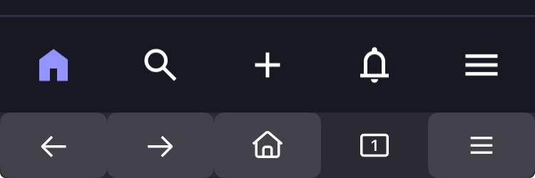
Is it just me who feels these two buttons serve the same purpose and should be grouped into one?

@stefan My verdict currently:
Compactness 👍
Logic changes and toggles 👎
I've been preferring the "show all at once with the least clicks" approach on my UI. I really don't know what was wrong with the old sidebar hashtag approach.
Is it just me who feels these two buttons serve the same purpose and should be grouped into one?
Vừa ra mắt Mastodon UI - framework render template bằng Python thuần, tích hợp JIT CSS và quản lý state, hỗ trợ Django. Viết HTML như thao tác đối tượng Python, tự động sinh CSS tối ưu và tương thích với HTMX, Bootstrap. Thích hợp cho dev muốn giảm context-switching.
#Python #Django #WebDevelopment #OpenSource #TemplateEngine #MastodonUI #Frontend #Backend
pip install mastodon-ui | Repo GitHub kèm hướng dẫn chi tiết.
https://www.reddit.com/r/opensource/comments/1pyn3lh/i_built_a_pythonnat
@wariat @rcz Tutaj tę sprawę już kiedyś rozkminialiśmy: https://101010.pl/@chlopmarcin/111543511440547074 😎
#tłumaczenie #publiczny #niewidoczny #interfejs #interfejsMastodona #MastodonPL #tłumaczenieMastodona #MastodonUI
I can't be alone in just not liking this bit of layout. The thing I want most in the right-hand column is *always* going to be what they're now calling "Live feeds" (a name that feels impersonal and corporate).
I don't need "Home" over there, I already have it on the left! Trending is a sometimes food. Put it towards the bottom.
Honestly this all feels like unnecessary streamlining and removal of "personality" from the menu, and I hate it.
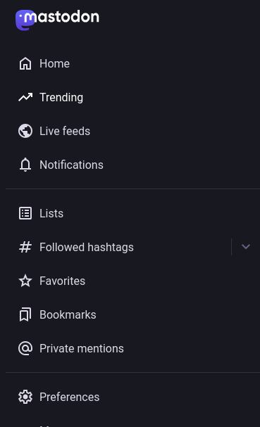
... on the same line, #uBlockOrigin filter for piddly list of "Lists" ...
! List toggle button.
freeradical.zone## div > div.navigation-panel__list-panel__header button.icon-button[aria-label="Expand list menu"]
!
! List list.
freeradical.zone## div > div[aria-labelledby=":r0:-title"]
#mastodon v4.4.1 #mastodonUX #mastodonUI
... #uBlockOrigin filter to remove "Trending" item from the column ...
! https://freeradical.zone - Hide "Trending" link.
freeradical.zone##a.column-link--transparent.column-link:nth-of-type(3)
#mastodon v4.4.1 #mastodonUX #mastodonUI
... #uBlockOrigin filters to remove piddly tag list ...
! Remove piddly list of tags being followed.
!
! List toggle button.
freeradical.zone## div > div.navigation-panel__list-panel__header button.icon-button[aria-label="Expand followed hashtags menu"]
!
! The list.
freeradical.zone## div > div[aria-labelledby*=":r1:-title"]
#mastodon v4.4.1 #mastodonUI
#Mastodon v4.4.1 UI widgets look like those of the browser, which are stacked; makes for confusing use😒😫
I'm not thrilled that pinned posts are now allocated to a single space, and readers have to know to hit some tiny right/left arrows to view the other pinned posts. It looks like there's only one pinned post when I actually have 5. Anyone who doesn't already know that won't know to go looking for the tiny arrows in the upper right corner. Because there have never been arrows there before.