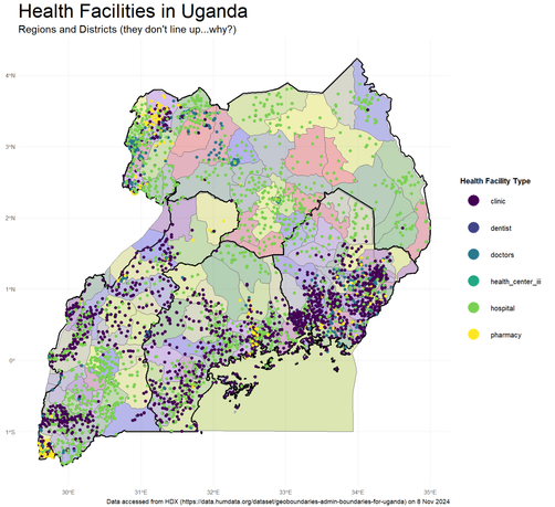
I used #rstats to create this map of Uganda that shows distribution of various types of health services. The data are from #HumanitarianDataExchange (HDX) but I struggled with the regions (adm1) and districts (adm3) as they don't quite line up. The pharmacies form intriguing clusters in the NW and SW on the border with the DRC. As always, I wish I had heaps more time to work on this map! 🗺️ #30DayMapChallenge

Day 8 of #30DayMapChallenge (HDX):

🥕 Accessibility to Food Markets 🥕

This map shows the travel time to the nearest market in Somalia.

The map is part of a project in collaboration with the Somali Red Crescent Society and the @roteskreuz_de.

👉 More info on this and other #AnticipatoryAction projects we have been working on: https://heigit.org/proactive-disaster-management-pioneering-forecast-based-financing-across-global-challenges-2/

🗺 Map created by Marcel Reinmuth using https://openrouteservice.org with data from the @wfp published on the #HumanitarianDataExchange platform

Proactive Disaster Management: Pioneering Forecast-based Financing Across Global Challenges | Heidelberg Institute for Geoinformation Technology

#30DayMapChallenge 🗺️ Day 8️⃣: #HumanitarianDataExchange (#HDX)

I have questions. 🙋

I was browsing the HDX data on #ClimateChange and found this wind speed hazard data from #ETHZürich Weather and Climate Risks group generated using their Climada tool. What’s interesting was they provided wind speeds in a ~4×4–km grid but as a CSV file! I had no idea what the data looked like and so I rendered it as a map with the speed colored using the #Viridis Mako palette (originally from seaborne).

🧵 1/3