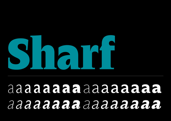
In our multilingual Font Reviews 2024 series @flaviazim features one of my other favourites from last year, Stringer by Emily Klaebe (mastered by @veryrobin). Text available in Portuguese and English
https://www.alphabettes.org/font-reviews-2024-stringer/
#fontreview #typereview #typedesign #typeface
Font Reviews 2024: Stringer | Alphabettes

Font review of Stringer, a typeface family designed by Emily Klaebe and distributed by Order Type Foundry

Kick-off of Font Reviews 2024 on @alphabettes πŸ’₯ I’ve put together a few thoughts about one of my favourite releases (and favourite foundries) last year, Sharf by Barbara BigosiΕ„ska.
It feels great to write in Galician about type for an international audience ✍️ https://www.alphabettes.org/font-reviews-2024-sharf/
#fontreview #fonts2024
Font Reviews 2024: Sharf | Alphabettes

Font review of Sharf, a typeface family designed by Barbara BigosiΕ„ska

Originality β˜…β˜…β˜†β˜†β˜†
Fit β˜…β˜…β˜…β˜†β˜†
Legibility β˜…β˜…β˜…β˜†β˜†
Design quality β˜…β˜…β˜…β˜†β˜†
Uniqueness ♻️♻️

Same numerals as Qatar (https://typo.social/@sportsfonts/109381035709651733), same letters as France in 2020.

β€”β€”β€”
Conclusion: πŸ‘ŽπŸΏ
One recycles Nike numerals and letters from different years and designs.

Closer look: https://twitter.com/Niuzekor/status/1596159966498680832

#Cameroon #WorldCup #FIFAWorldCup #Fontreview #typography

sportsfonts (@[email protected])

Attached: 2 images Β· Content warning: Wold Cup Font Review (1): Qatar πŸ‡ΆπŸ‡¦

typo.social

Originality β˜…β˜†β˜†β˜†β˜†
Close your eyes & imagine a typeface on a US sports jersey. Yep.

Fit β˜…β˜…β˜…β˜…β˜…
Close your eyes & imagine a typeface on a US sports jersey. Yep.

Legibility β˜…β˜…β˜…β˜†β˜†
Not too legible, but one is used to it.

Design quality β˜…β˜…β˜…β˜†β˜†
Can’t do much wrong here.

Uniqueness πŸ«₯
Unique at least among the Nike teams.

β€”β€”β€”
Conclusion: πŸ”
Exactly what you would expect.

#nike #USA #WorldCup #FIFAWorldCup #Fontreview #typography

Originality β˜…β˜…β˜†β˜†β˜†
Rather subtle details instead of β€žWummsβ€œ (oomph)

Fit β˜…β˜…β˜…β˜†β˜†
Fits to the DFB’s CI, not that sporty though

Legibility β˜…β˜…β˜…β˜…β˜…
Distinguishable & open shapes, very legible

Design quality β˜…β˜…β˜…β˜…β˜…
Professional typeface

Uniqueness 🌭
β€žExtrawurstβ€œ – unique especially among the Adidas teams

β€”β€”β€”
Conclusion: πŸ§‘β€πŸ’Ό
4 years ago you couldn’t read it, now it’s super legible but a bit conservative

#adidas #GERJPN #WorldCup #FIFAWorldCup #Fontreview #typography

Originality β˜…β˜…β˜…β˜†β˜†
Classic chamfered athletics with a little twist

Fit β˜…β˜…β˜…β˜†β˜†
Sporty, contemporary. No reference to the country/culture

Legibility β˜…β˜…β˜…β˜…β˜†
Numerals good distinguishable, letters a bit less

Design quality β˜…β˜…β˜…β˜†β˜†
A rather common receipe, solidly executed

Uniqueness πŸ‘―
Unique for quite some countries: πŸ‡¦πŸ‡·πŸ‡§πŸ‡ͺπŸ‡ͺπŸ‡ΈπŸ‡―πŸ‡΅πŸ‡²πŸ‡½πŸ΄σ §σ ’σ ·σ ¬σ ³σ Ώ

β€”β€”β€”
Conclusion: 🀝
Modernized classic, one design fits all.

#adidas #ARGKSA #WorldCup #FIFAWorldCup #Fontreview #typography

Originality β˜…β˜…β˜…β˜…β˜†
Bespoke typeface. Classic chamfered athletics meet blackletter

Fit β˜…β˜…β˜…β˜†β˜†
Sporty, contemporary, loud. No reference to the country/culture

Legibility β˜…β˜…β˜†β˜†β˜†
Unusual shapes = distinguishable yet a bit fluttered

Design quality β˜…β˜…β˜†β˜†β˜†
Generic construction that hasn’t seen a broad nib

Uniqueness πŸ’―
In-your-face bespoke font

β€”β€”β€”
Conclusion: πŸ’₯
Loudness won against British understatement.

#nike #ENGIRN #WorldCup #FIFAWorldCup #Fontreview

Originality β˜…β˜…β˜†β˜†β˜†
A rather classic design β‰ˆ β€œYou can’t go wrong”

Fit β˜…β˜…β˜…β˜†β˜†
Sporty, contemporary. No reference to the country/culture

Legibility β˜…β˜…β˜…β˜†β˜†
βŒ€ (In the actual tournament it looks like Helvetica instead of Arial)

Design quality β˜…β˜…β˜…β˜†β˜†
solid

Uniqueness ♻️
Recycled Nike USA 2018 typeface

β€”β€”β€”
Conclusion: πŸ₯±
Choosing USA 2018 font + combining it with Helvetica is perfect football mediocrity.

#nike #QTRECU #WorldCup #FIFAWorldCup #Fontreview

Kp-Fonts (otf), a font family for text and math

From Mind to Type
Playfair Display: A transitional typeface for headings

From Mind to Type