Found This Week #430:
The climate of your city in 60 years map, National Library of Scotland maps, grid aware website constraints case study, quantum navigation space test, & the commodity of US national debt!

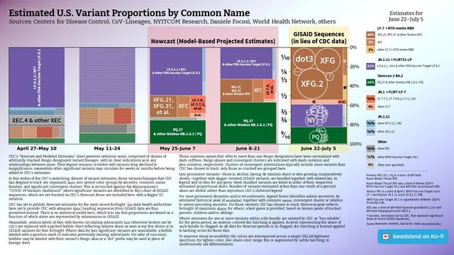
Raj's dashboard, updated yesterday, shows Stratus XFG in close competition with two if its children, as XFG.3 has spawned a child of its own.
GISAID data for the most recent fortnight is dominated by submissions from New York (149 sequences), followed by California (97), Colorado (66), and Illinois (41).
#CDC's most recent Friday dataset, updated June 24, showed Nimbus NB.1.8.1 / PQ taking plurality, with Stratus XFG family also gaining share.
Weaker showing for Nimbus in GISAID data reflects the fact that much available data is from New York. Were it not for California data, Nimbus would be barely evident.
❖ #ThisIsOurPolio #variants #CovidIsNotOver #dataviz #datavis
Found This Week #430:
The climate of your city in 60 years map, National Library of Scotland maps, grid aware website constraints case study, quantum navigation space test, & the commodity of US national debt!
Passend zu den sommerlichen Temperaturen veröffentlicht der Tagesspiegel heute eine Datenstory zur räumlichen Verteilung privater Pools in Berlin und was diese über Hitze, Dichte und soziale Ungleichheit verrät:
https://interaktiv.tagesspiegel.de/lab/wo-berlins-private-pools-stehen-und-was-das-uber-die-stadt-verraet-luftbilder-hitze-wasser-ungleichheit-datenanalyse/
Die Analyse basiert auf einem Projekt aus dem Kurs »Mapping Cities – Making Cities«, in dem #InterfaceDesign und #UrbaneZukunft Studierende gemeinsam urbane Daten visualisieren und reflektieren: https://uclab.fh-potsdam.de/mapping/
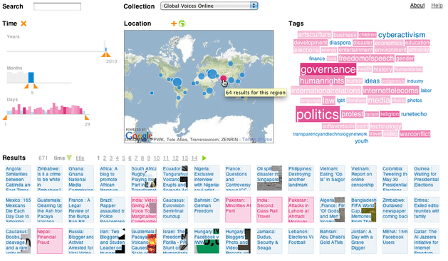
Just resurrected the demo of my first-ever visualization project from 2008 (which was part of my Dipl.-Ing thesis):
https://mariandoerk.de/visgets/
It is not mobile-friendly, but should work fine on desktop browsers featuring early @globalvoices posts (2008-2010).
Had to untangle the code from outdated CakePHP and a deprecated Google Maps API in favor of @leaflet. Hope to revive all my early vis projects that fell through the cracks due to server updates and site migrations…
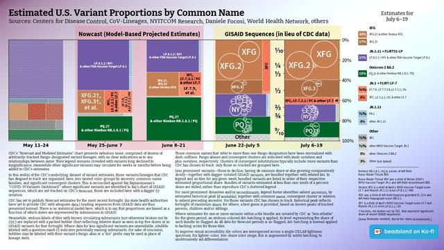
Raj's dashboard, updated yesterday, shows Stratus XFG overtaken by child XFG.2, as XFG.3 has spawned a child.
GISAID data for the most recent fortnight is dominated by submissions from California (328 sequences), followed by New York (234), Colorado (81), and New Jersey (53).
#CDC's most recent Friday dataset, updated June 24, showed Nimbus NB.1.8.1 / PQ taking plurality, with Stratus XFG family also gaining share.
Weaker showing for Nimbus in GISAID data reflects the fact that much available data is from New York. Were it not for California data, Nimbus would be barely evident.
[Edited to correct sequence counts.]
❖ #ThisIsOurPolio #variants #CovidIsNotOver #dataviz #datavis
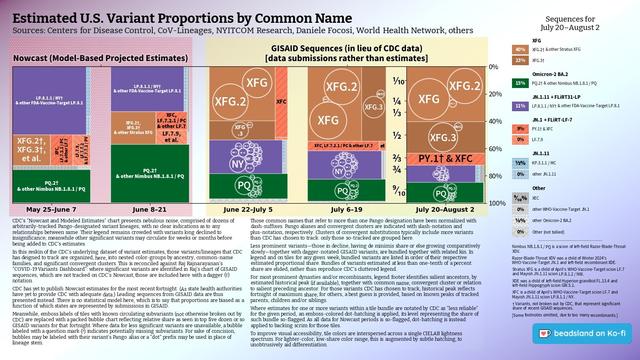
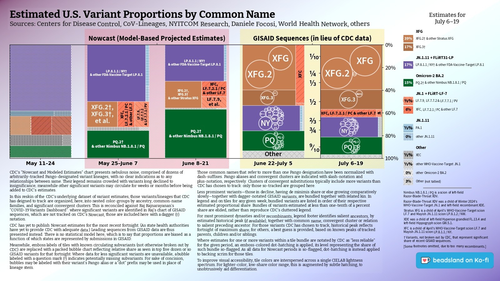
Raj's dashboard, updated yesterday, shows Stratus XFG overtaken by child XFG.2; PQ.2 as standout child of Nimbus NB.1.8.1 / PQ; and LP.8.1 long ago overshadowed by LP.8.1.1/ NY.
GISAID data for the most recent fortnight is dominated by submissions from California (245 sequences—up 108 from ten days prior), followed by New York (227—ten more), Colorado (97—sixteen more), and Virginia (35).
#CDC's most recent Friday dataset, updated Tuesday June 24, showed Nimbus taking plurality, with Stratus XFG family also gaining share.
FDA vaccine target LP.8.1, dominant since March, plateaued in April. June saw Nimbus NB.1.8.1 / PQ, scion of "razor-blade throat" XDV, push LP.8.1 out of majority.
[Edited to correct sequence counts.]
❖ #ThisIsOurPolio #variants #CovidIsNotOver #dataviz #datavis
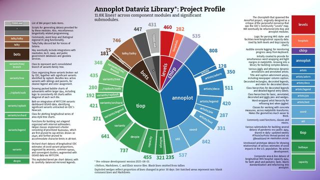
Another three hundred lines for #AnnoPlot #dataviz project since last round of work in June:
https://hcommons.social/@beadsland/114788341947558989
Work in July focused on:
• streamline variants #datavis alt-text generation
• extensive refactoring across multiple annoplot and tiop modules
• build out option for using GISAID for tree chart, in lieu of recent estimates
• prototype dynamic offsets for flanking artists
With other tasks including:
• refine flattening of variants lineages
• resume TODO tracking
• tweak log messages in various methods
• tweak title adornment overhang
• tweak legend to better accommodate footnotes
• address data import issues
• tweak inclusion of ancestor variants on legend
• conform throughout to non-specific reporting periods
• add option for dropping most recent period
• migrate hatchmask suppression for scrim periods
• bugfixing of paragraph artist
• copy editing and revisions of captions
• tweak captions to better reflect runtime options
• tweak emboss edge collision detection
✨Retina: A free open source web application to share network visualizations online.
"Retina is developed by OuestWare for Tommaso Venturini from CNRS Center Internet et Société. It is released under the GNU GPLv3 license. Retina was created on January 12, 2022"
👉Check out all the details about this tool and a tutorial I’ve prepared on my Medium! (Aug, 2025)
https://medium.com/@vespinozag/retina-a-free-open-source-web-application-to-share-network-visualizations-online-9fe11454ddc1
In our latest blog post, our Data Scientist Osheen MacOscar shares a great overview of how to use {ggplot2} and {gganimate}, when dealing with spatial data.
#rstats #datavis #spatialdata #maps
https://www.jumpingrivers.com/blog/animated-map/
In this blog we are creating an animated map of the gapminder data using {ggplot2} and {gganimate}. In the process we will cover some of the common pitfalls when working with spatial data and how to get round them!
Raj's dashboard, updated yesterday, shows Stratus XFG overtaken by child XFG.2, as XFG.3 has spawned a child.
GISAID data for the most recent fortnight is dominated by submissions from California (328 sequences), followed by New York (234), Colorado (81), and New Jersey (53).
#CDC's most recent Friday dataset, updated June 24, showed Nimbus NB.1.8.1 / PQ taking plurality, with Stratus XFG family also gaining share.
Weaker showing for Nimbus in GISAID data reflects the fact that much available data is from New York. Were it not for California data, Nimbus would be barely evident.
[Edited to correct sequence counts.]
❖ #ThisIsOurPolio #variants #CovidIsNotOver #dataviz #datavis
Raj's dashboard, updated yesterday, shows Stratus XFG in close competition with two if its children, as XFG.3 has spawned a child of its own.
GISAID data for the most recent fortnight is dominated by submissions from New York (149 sequences), followed by California (97), Colorado (66), and Illinois (41).
#CDC's most recent Friday dataset, updated June 24, showed Nimbus NB.1.8.1 / PQ taking plurality, with Stratus XFG family also gaining share.
Weaker showing for Nimbus in GISAID data reflects the fact that much available data is from New York. Were it not for California data, Nimbus would be barely evident.
❖ #ThisIsOurPolio #variants #CovidIsNotOver #dataviz #datavis