Lars

@zhcet@mastodon.design
35 Followers
146 Following
109 Posts
design and building design tools
student; developer at @glyphsapp
🌸 šŸ³ļøā€šŸŒˆ šŸŒ„
Type Designhttps://typo.social/@superposition
Appshttps://larztech.com
Photographyhttps://glass.photo/zhcet4

@pasi Saw this article yesterday. Seems like it’s becoming a real issue for API design. However maybe the AI is just picking up on patterns and conventions which irritate people too when they are broken.

https://tonsky.me/blog/gaslight-driven-development/

Gaslight-driven development

Computers are starting to have opinions on how our APIs should look like

tonsky.me
@marioguzman Moved to a Kobo Libra Color a while ago and the hardware is super nice (although the color doesn’t really add much). It’s definitely more gadget-y than the Kindle, but not to a degree where it’s distracting. If you buy books outside their store, you might need to fiddle with Calibre though
It’s kinda crazy Kobo e-readers still struggle with epub 3 books. The format has existed for more than a decade and displaying ebook files is literally the only purpose of the devices. How has this not been fixed?

We learn from history.

Save this for the Saturday – a treat of Mac UI timeline spelunking:

https://aresluna.org/frame-of-preference/

Frame of preference

A story of early Mac settings told by 10 emulators.

@mrudokas @marioguzman I second that idea… let’s just have a ā€œalan modeā€ and a ā€œpeople who need to use this modeā€.
@marioguzman Oh totally, don’t disagree with you there. But even for their stupid direction, the actual implementation is rather bad. Like you, I’d also love to see a general shift in direction though, but it seems of the software industry is also moving in the same direction as Apple.
@mrudokas Let’s hope so! Would be great to have more competition and some new takes
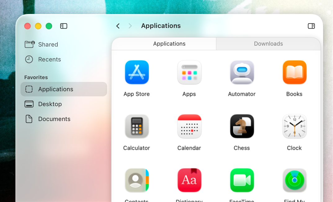
@marioguzman Still wonder why they constructed the windows this way. If the content was floating on the window instead, it would solve so many problems with this design. The glass effect would then just be on the window itself. (The mockup is kinda sloppy, but should get the idea across.)

Promised a while ago to share some sketches from my sketchbook and never delivered … so let’s try this again.
#sketchbook

With Glitch shutting down, I’ve been sorting through some old projects. A few years ago I made a thing that was basically a microblogging system, but very simple and you could post from the Shortcuts app. It was kinda fun. Not sure if I’m just nostalgic for the time when I was just getting into programming, or for a better area of the web…
Ɨ
@marioguzman Still wonder why they constructed the windows this way. If the content was floating on the window instead, it would solve so many problems with this design. The glass effect would then just be on the window itself. (The mockup is kinda sloppy, but should get the idea across.)

@zhcet I think this gets the point better of how it is laid out but I am just so done/over with translucent windows. They're a readability nightmare and just an awful fad.

We need LESS translucency and a bit less "white space." This doesn't lend well to pro apps which are dense by nature.

The sooner they get this implemented and out of their systems, the sooner we can get desktop computing back on track.

@marioguzman Oh totally, don’t disagree with you there. But even for their stupid direction, the actual implementation is rather bad. Like you, I’d also love to see a general shift in direction though, but it seems of the software industry is also moving in the same direction as Apple.

@zhcet @marioguzman Just give me not butchered Reduced Transparency (including the UI structure to make sense with it) and I will shut my mouth.

You can have those translucencies for the fancy kids and for screenshotting for marketing materials. Alan can use it too, as he is with the fancy kids.

@mrudokas @marioguzman I second that idea… let’s just have a ā€œalan modeā€ and a ā€œpeople who need to use this modeā€.
@zhcet @marioguzman
That definitely looks a *ton* better. It also reveals to me that I don't really care for the design even when all the obvious issues are fixed because it looks childish with those extremely rounded corners, but I'd still be fine with it