Mr. Bitterness

@wdormann@infosec.exchange
3.8K Followers
544 Following
2.2K Posts
I play with vulnerabilities and exploits.
I used to be https://twitter.com/wdormann but Twitter has become unbearable, so here I am.

See also:

Ask me how I feel, knowing that Dairy Queen paid good money to have a marketing/advertising team to come up with the Five Dollar Buck Lunch deal.

I assume that some people think I choose to be pedantic just to be diffcult.

I assure you, it's just how my brain is wired.

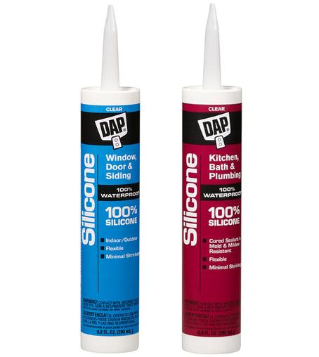
Me at my local hardware store: What fresh hell is this? How on earth can two products that are both "100% silicone" be different?

The rest of the world (presumably): OK.

and macOS...

The colored buttons in the top left corner, which I struggle to think of the last time I've clicked any of them:
1) Are larger
2) Have more space between them
3) Have a larger/rounder corner

Was the goal here to minimize usable space?

Also good to see that Apple has figured out some way to make System Settings search now useless.
natural? I can't imagine what you're even looking for. 🤦‍♂️

A job done, Apple.

I struggle to imagine how Apple managed to make iOS 26 so ugly.

"Let's capture in our platform the widespread acclaim of Windows Vista!" And everybody just went along with it.

Common People was pretty good.
Eulogy was pretty good.
The rest were quite terrible, IMO.
Hopefully they're done milking this cow. 😕
@oli
I'm so old I can recall when you could Google math problems and it would give you correct answers.
As opposed to AI-generated vibe answers.
I've always liked Black Mirror.
But this season... I'm not even sure that I want to bother watching all of the episodes.
Quite disappointing. 😕
Gee, I wonder if there's any way possible for congresspeople to know what's in the bills that they vote on? 🤔
We all know that one of these is a good deal and the other is just OK.
This is why companies do things like this.
You need to check all four flowers of a feeder to compare them.
×

and macOS...

The colored buttons in the top left corner, which I struggle to think of the last time I've clicked any of them:
1) Are larger
2) Have more space between them
3) Have a larger/rounder corner

Was the goal here to minimize usable space?

Also good to see that Apple has figured out some way to make System Settings search now useless.
natural? I can't imagine what you're even looking for. 🤦‍♂️

A job done, Apple.

@wdormann
I am not a macOS user, I knew about the OS lever menu bar (that may have some merits though I would still argue puts too many constraints on program UI), but are you telling me that there is another OS bar on top that just says the OS name and has fixed resizing buttons (I guess for the selected window)?
@wdormann did the hire the person that made Windows search?
@wdormann that’s AI-assisted search, no doubt
@wdormann Kinda looks like Gnome desktop 😅