ֆիլմս ուղարկեցի Իսպանական ֆեստիւալի


| devblog | https://def.am |
ոնց որ եէկ լինէր, որ սրանով սուրճ էի սարքում։ հիմա զարգացել եմ՝ ֆրենչպրես ու մոկա եմ սարքում մենակ։

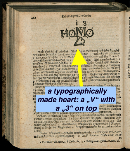
A printed ❤️ symbol from a 1702 text about the Holy Trinity. That's an #earlymodern #emoticon <3
ինչ որ հետաքրքիր նախագիծ եմ գտել, քարտէզի վրայ տարբեր պատմութիւններ կան՝
https://metaport.ai/stories/Teodor-Ter-Mikayelyan-2a1ca1e6a7cd8533/

A printed ❤️ symbol from a 1702 text about the Holy Trinity. That's an #earlymodern #emoticon <3
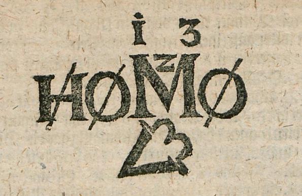
Here is a little story about the #earlymodern emoticon "<3" and the complex symbolic meaning of this typographical entity that I posted yesterday. Follow me, for catholic symbolism and some #bookhistory, dear #skystorians of the blue skies. Here we go... [contains quote post or other embedded content]
Any comments on the rest of the heading and it's meaning?
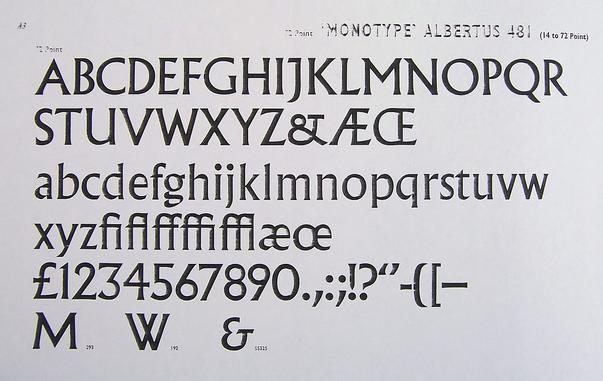
@kbm0 Ampersands are one of my favorite characters in physical type because there are so many forms, and very few of them look anything like the modern printed form.
My personal favorite when I’m writing is a large lowercase epsilon with a little cross at the lower terminal, turning it into an “Et”, like the lower ampersand on this type specimen:
https://commons.wikimedia.org/wiki/File:Albertus_481_100_1936_(5637417032).jpg
@dbellingradt Whoever set this had quite the repository. My goodness. Gothic, Roman, several sizes, traditional S, at least two forms of medial S, plus sharp S, what looks like a ch ligature in a bunch of places …
It’s also interesting how the grammar of what I can read is practically modern German. I just have trouble distinguishing some of the letterforms. Gothic type is so awful for legibility.
Here is a little story about the #earlymodern emoticon "<3" and the complex symbolic meaning of this typographical entity that I posted yesterday. Follow me, for catholic symbolism and some #bookhistory, dear #skystorians of the blue skies. Here we go... [contains quote post or other embedded content]
@dbellingradt vaguely related anecdote, my grandmother's Scottish birth certificate has a little heart instead of the dot over the i in her name.
I was somewhat shocked to see that on a formal document. Which I have for the very formal 'prove you have UK ancestry' stuff.


 "Homo <3"