Humans are never good at repetitive tasks, but we have been seeing this for centuries.
Now, time has changed, and a few outliers, like Maive, are in the market that is solving factory workflow inefficiency
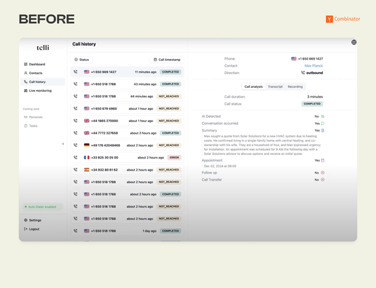
I looked into it and did what we do!

| Website | www.saasfactor.co |
| https://www.linkedin.com/in/mafruhur-rahman-faruqi | |
| X | https://cal.com/saasfactor.co/30min |
| Youtube | https://www.youtube.com/@mafruhfaruqi |
Humans are never good at repetitive tasks, but we have been seeing this for centuries.
Now, time has changed, and a few outliers, like Maive, are in the market that is solving factory workflow inefficiency
I looked into it and did what we do!

What can AI do at its best? Save human lives from both physical and financial suffering!
That's what I believe, and a lot of AI techs are already working on that, but not how @Ambyhealth is doing!
It simplifies EMS services for the patients by analyzing patients' data for maximum accuracy and minimum care risks.
So we did what we usually do, spot UX issues and redesigned them.
UX Fix #35
Before vs After 👇
Reimagined MechaHealth's AI radiology platform.
Added color-coded diagnostic zones, voice + text AI assistant, and expandable evidence blocks.
Result: Radiologists go from 1 scan/hour to 1 every 5 minutes with preserved clinical accuracy.
When it comes to critical logistics operations, UX matters even more.
Getcho is the last mile delivery service platform that focuses on reliability.
We looked into it and boosted some ux issues
It’s UX Fix case no.43
hashtag#getcho hashtag#bottomlineUX hashtag#ux hashtag#delivery hashtag#logistics hashtag#parcel
Before vs After 👇
Transformed Godela's AI physics engine from linear Q&A to an interactive workspace.
Engineers adjust parameters in real-time with sliders—no re-prompting needed. Click any car part for instant analysis.
Result: Dynamic exploration replaces constant back-and-forth questioning.
Before vs After 👇
Redesigned dScribe AI's inventory dashboard for bulk material tracking.
Added visual volume bars, time-frame filters, and realistic site maps with size indicators.
Result: Reduced cognitive overload and confident decision-making across multiple stockpile sites.
Before vs after 👇
Redesigned Tecto's AI governance dashboard. Added scalable side navigation, 6-month trend charts, and visual compliance status with logos. Prioritized risk alerts by severity with "Fix Now" buttons.
Result: Clear visibility into AI agent compliance, risks, and performance.
#bottomlineux #uxdesign #aicopilot #aisaas #yc #ux #copilot #TactoAI
Redesigned Forge Automation’s CNC manufacturing platform for improved workflow efficiency. Optimized file upload, added visual file type icons, 3D model enhancements, and clearer status indicators.
Watch the video demo for before & after views!
Before vs After 👇
Transformed Sira's time-off system from lists to visual planning. HR managers see employees' availability via timeline bars showing overlaps. Added status dashboard and tabbed leave categories.
Result: Proactive workforce planning replaces reactive approvals.
#bottomlineux #uxdesign #yc #aisaas #ux #copilot #saasfactor #Sira #medical