If Apple still had courage they would've opened the keynote with this. @atpfm

📝 Another blog post!
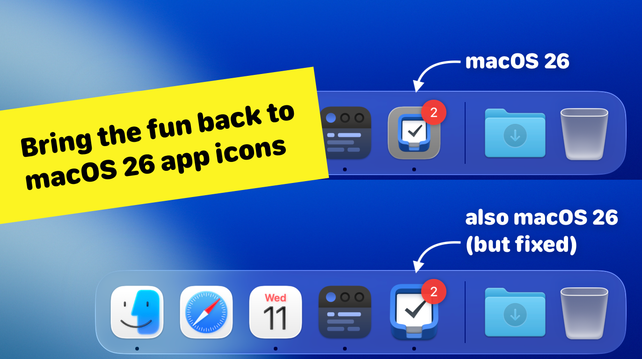
macOS 26 Tahoe swaps out quirky, characterful app icons in the Dock for uniform iOS-style squircles.
I wrote a quick guide for users and developers on how to bring back the personality and charm of custom icon shapes in macOS:
https://simonbs.dev/posts/how-to-bring-back-oddly-shaped-app-icons-on-macos-26-tahoe/
People here might think I’m a negative person. I’m really not. Those that know me have seen that I get easily and overly excited about cool tech and nice things. I love it when I see work done well.
Apple today just doesn’t do that and it bums me out.
@stroughtonsmith I think there is a a fundamental difference between aqua and this.
With aqua they were trying to bring an aesthetic we thought was not technically possible in an OS. It was flashy and needed lots of refinement as the first album of an (later) iconic band
This is over the top as a late stage album of a once great band, acting all flashy just to ape their former selves decades ago
Nothing here is new/fresh for the industry, they are just ideas that didn’t work again and again
@iKyle that is astute observation! These are the same people that have nothing to pursue but thinner bezels on the hardware side. As they sadly have no vision further than less UI / less chrome/ less bezel. They think these lead to better results in and of themselves.
The OG iPad had huge bezels (with iOS 3.2 UI in it) and I never had a problem in focusing into my “content” because of them.