If Apple still had courage they would've opened the keynote with this. @atpfm

📝 Another blog post!
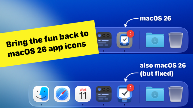
macOS 26 Tahoe swaps out quirky, characterful app icons in the Dock for uniform iOS-style squircles.
I wrote a quick guide for users and developers on how to bring back the personality and charm of custom icon shapes in macOS:
https://simonbs.dev/posts/how-to-bring-back-oddly-shaped-app-icons-on-macos-26-tahoe/
People here might think I’m a negative person. I’m really not. Those that know me have seen that I get easily and overly excited about cool tech and nice things. I love it when I see work done well.
Apple today just doesn’t do that and it bums me out.
UI that can be clearly seen and told apart from the content helps me as a user to "focus on the content" because I don't have to search for it and try and understand what is content and what is UI.
Stable consistent UI stays put and isn't constantly hiding and appearing and rearranging itself lets me develop muscle memory and a spacial sense of "where" everything is, so I can learn to get used to the app.
Instead of having to constantly relearn where everything is because it rearranges itself.