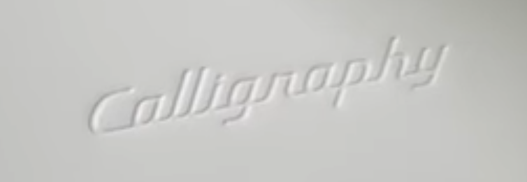
“Calligraphy” is the name of the top luxury trim available on the 2026 Hyundai Palisade. Which essentially comes across the way Doug Demuro pronounces it.
You might be impersonating a police officer if you’re also impersonating a font.
The preview mechanism on MyFonts seems to center each glyph vertically in its square, making for a rather jarring presentation. Example: Van Dijck.
Here is Inkscape’s approach: no feature serrings names, just all affected glyphs. Note the multiple selectors in the character variants near the bottom.
If you add the correct name table entries in your fonts for stylistic sets and character variants, they show up in the font features dialog in recent versions of LibreOffice. This example shows Junicode. Note the character variant selctions have names, but the stylistic sets only show up as “None” or “1”.
It’s just about 2025, and Amazon’s Kindle Reader is still embracing pseudoscience.
Here’s the reverse of Einstürzende Neubauten’s latest album Rampen. I wonder whether the textura is a font. Looking forward to its release in April
I found this 1975 paperback edition of a 1969 book in my local Little Free Library. Dig the old Palatino original swash caps and foundry (or phototype?) lowercase. And the diagonal crop on the lowercase e.
I adore both the particular long ſ treatment in Nordhäuſer and the seemingly capital K in -korn and struggle to find an unobsstructed view of that particular K. Most other photos of this label use different label versions with type instead of custom drawn lettering.
Nostalgia: in 1991, still in high school, I got my first PC. That September, PC Magazine published an incredibly technical 28-page article on scalable font technology. That’s where I first saw Adobe Caslon. The following year I bought the full package including the Expert Set from my college bookstore. It led me down the type rabbit hole. It remains my favorite typeface.