Me when asked which type foundry I want to be when I grow up.

| Dashes | en/em |
| Micro-Reviews (on hold) | @366fonts |
| Bluesky | https://bsky.app/profile/typographer.bsky.social |
| Don’t visit | https://lopez-ayala.eu |

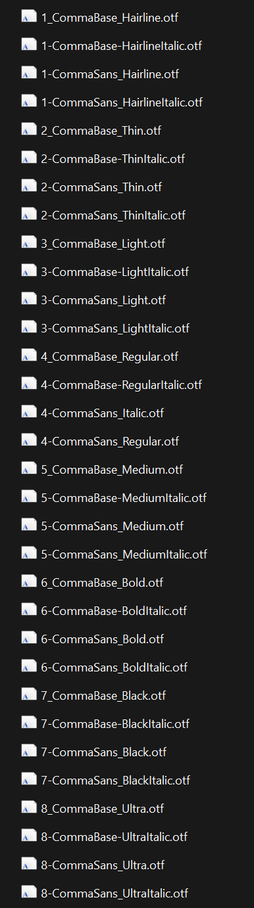
I’m curious about the story behind the peculiar file naming, @martinmajoor. I’ve never seen anything like it in thousands of font files. Did you intend to ensure your fonts to be at the top of the font folder? ;)
Congratulations on releasing Comma Sans, by the way!
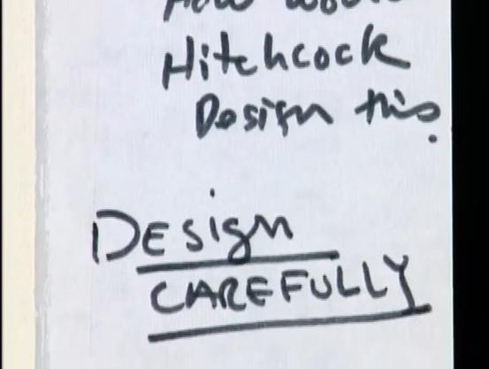
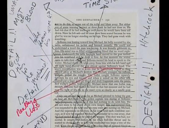
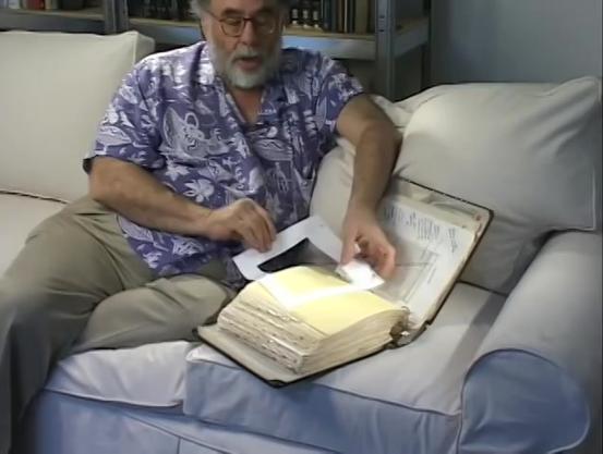
Francis Ford Coppola’s The Godfather Notebook must be the most impressive working document I‘ve ever seen—carefully cut, pasted, perforated, reinforced, highlighted, underlined, annotated and commented all by himself in what must have been an endless, meditative venture.
https://archive.org/details/francis-ford-coppolas-godfather-notebook_202205
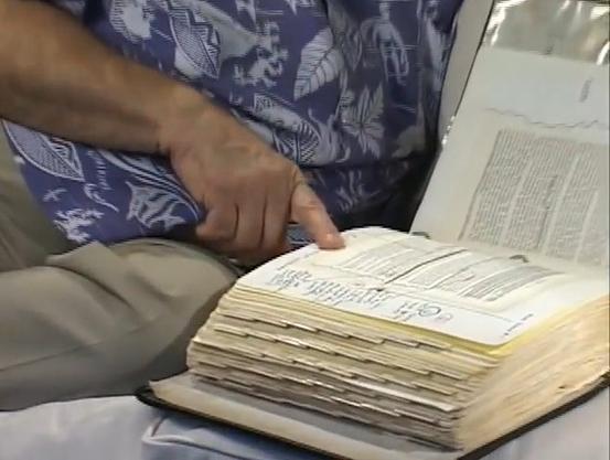
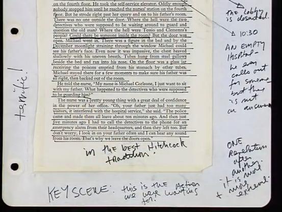
Francis Ford Coppola shows his original prompt book he created using his copy of Mario Puzo's The Godfather, containing all his notes and observations that...
“Rudolf Koch began drawing the Offenbach typeface in 1928 … The type was published posthumously by Gebr. Klingspor foundry in 1935. Stylistically, Offenbach is a hybrid, pairing wide roman capitals with narrow gothic minuscules (…) Poem publishes a faithful revival of Offenbach Mager, the initial thin weight, based on a one-week workshop in 2022 … The Offenbach typeface is freely usable by anyone … under the Creative Commons CC BY-ND 4.0 license.”
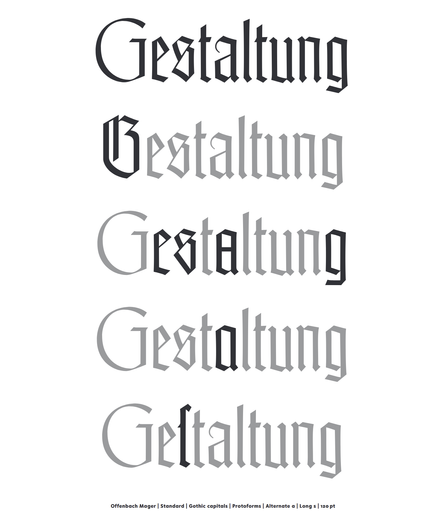
Rudolf Koch began drawing the Offenbach typeface in 1928, the first size was cut in 1931, and Koch made final corrections on his deathbed in 1934. The type was published from 6 to 60 pt posthumously by Gebr. Klingspor foundry in 1935. Stylistically, Offenbach is a hybrid, pairing wide roman…
It’s not a bug, it’s a feature: “Ringi is a sans serif design whose horizontal as well as vertical strokes have the same width – a true monolinear design … Ringi’s (very) slanted styles are truly just slanted without any correction of the curves”

I am using the Berlin public transport a lot, especially the Ringbahn. I have even nicknamed it, it’s not “Ringbahn”, sometimes it’s just Ringi. This typeface is inspired by the LED typeface of Berlin S-Bahn displays. I’ve been looking at it for years, and what I liked about it is the engineered and pragmatic look of it. I always felt that with just a few tweaks it could look so so much better, even within the limits of the LED grid it was stuck to. Anyway, the person – probably an engineer – who made this, inspired me to design less and be more pragmatic on this project. So, Ringi is a sans serif design whose horizontal as well as vertical strokes have the same width – a true monolinear design (although there are some few exceptions, where it was really really needed). Ringi’s (very) slanted styles are truly just slanted without any correction of the curves, matching the rest of the stoically engineered aesthetic. The font package includes a variable font, too, making every style across the slant axis accessible.